Plotting/Graphing
Defining and Exploring Common Distributions
Übersicht
Purpose
This module introduces students to some common plots and graphs and discusses when to use each depending on the data and the context. It also defines and explores various distributions with analysis of their properties and examples from the real world.
Lessons
- Plotting helps us spot trends, determine centrality, find outliers, etc. Good plots will utilize the data’s inherent structure and what humans can easily and quickly observe to present the data.
- There are multiple options when representing multivariate data (e.g. size, color, etc.) but each comes with its own drawbacks so a good plot will use several methods of representation at once to make the information accessible to everyone.
- Outliers are often hard to spot just from looking at the raw data and plotting the data can make this task easier, but it can still be difficult to know if something is an outlier or if the dataset is just incomplete.
- The normal distribution is a distribution that occurs naturally everywhere, and it can look vastly different depending on the exact values for its mean and standard deviation.
- It can be hard to determine when something is normally distributed, even if it appears to be normal to the naked eye, since data must be infinite and symmetric in order to even qualify as normal. However, when the standard deviation is sufficiently small relative to the mean, we can “waive” the infinity requirement since the tails are incredibly unlikely.
- Other distributions, such as the exponential distribution, also appear naturally and many have long tails which can make it easy to mistake them for the normal distribution.
Table of Contents
Introduction to Plotting and Graphing
Exercise: Exploring Plots and Graphs
Advanced Topic: Introduction to Distributions
Other Distributions (Optional)
Introduction to Plotting and Graphing
Plot vs. Graph
Although “plot” and “graph” are often used interchangeably, there is a technical difference between the two. A plot is a visualization of a data set composed of finite points while a graph is a visualization of a function that can have infinite points. Usually, when we are analyzing data, we are using plots to visualize the dataset. Later, when we talk about distributions, we will be talking about functions and, therefore, using graphs to visualize the functions.
“Plot” and “graph” are also verbs that are used to describe making the plot or graph e.g. “plotting” a dataset or “graphing” a function. For the rest of this section, we will focus on plots.
Why Do We Plot?
It is often difficult for humans to stare at a dataset and observe trends or patterns immediately. However, there are certain characteristics that the human eye notices quickly and easily, such as size, color, and relative positioning. Therefore, plots allow us to take advantage of this fact to make analyzing a dataset easier.
Once we plot a dataset, it becomes easier to spot trends, determine centrality, find outliers, etc. For example, the scatter plot below plots the prevalence of coronary heart disease and difference in projected max temperature relative to 2006 for every county in the United States.

This figure plots the max temperature difference relative to 2006 and coronary heart disease prevalence for every county in the United States. We can observe two outliers in the upper right that would otherwise be difficult to spot by just looking at the numerical data. Try clicking “Source” below to determine which counties the outliers represent and what they have in common.
[Source]
In general, a good plot will utilize the data’s inherent structure and what humans can easily observe to depict the trend or pattern. By doing so, we can spot trends, outliers, relationships, centrality, etc. much more easily than by looking at the raw data.
However, not all plots are equally appropriate for every data set. The next section will discuss some common plots and when to use them.
Common Plots
Scatter
A scatter plot involves plotting two variables on two respective axes, like the plot we saw in the previous section. Scatter plots are most useful for detecting relationships between two variables or, in other words, answering the question “if one variable goes up, does the other variable usually go up, down, or stay the same?”
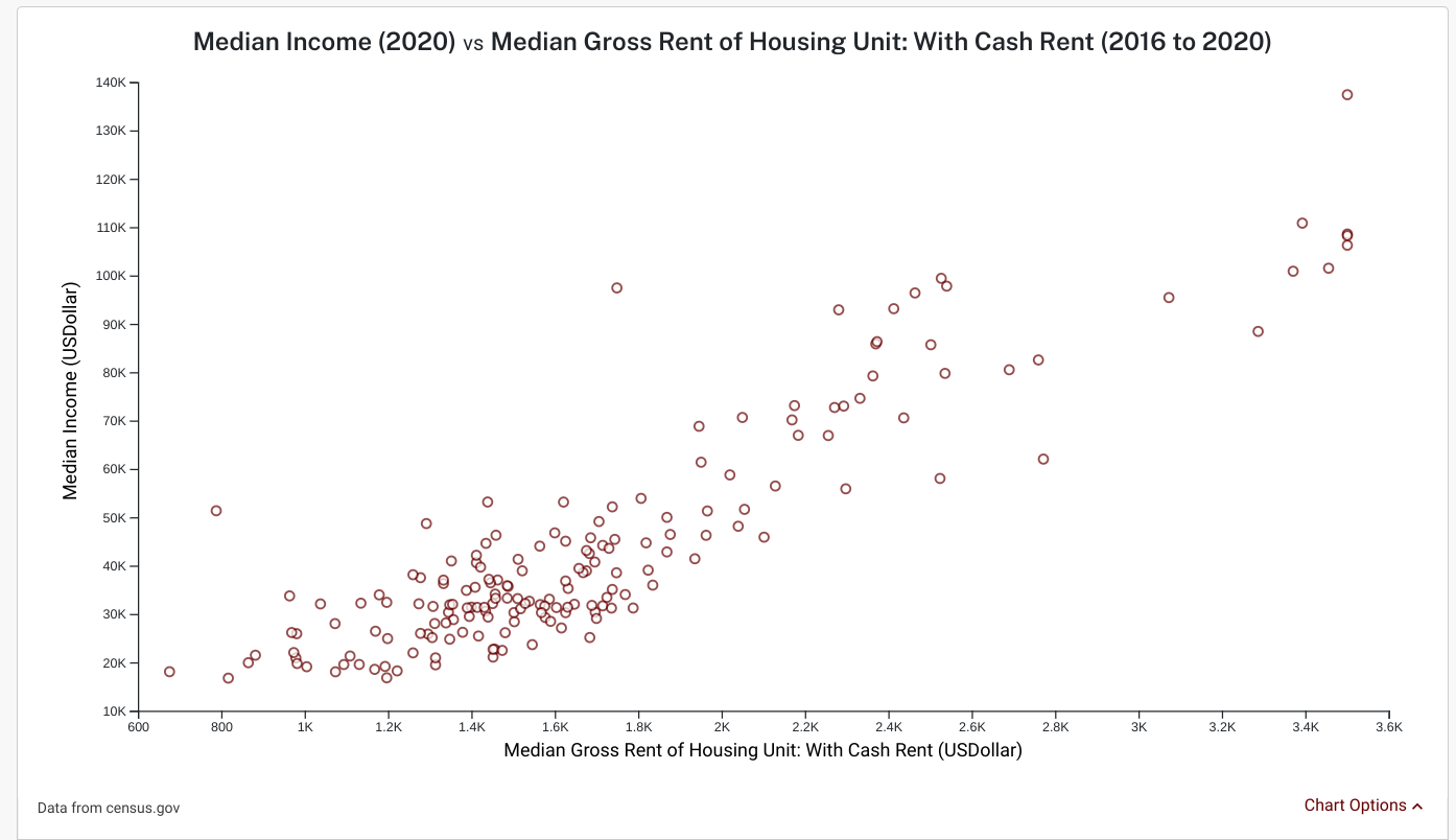
The figure above plots median gross rent (for rental units that have their rent paid in cash) and the median income for each zip code in New York for each year between 2016 and 2020. We can see that median rent and median income have a relationship: when one goes up, the other usually goes up as well.
[Source]
It is important to note that when two variables appear to have a relationship, it is not necessarily a causal relationship. The strongest conclusion we can draw is that when one variable increases, the other also tends to increase or decrease. However, we cannot definitively say that the first variable caused the second to go up or down since it could have been the second variable that caused the first to change or a third variable that caused both to change.
For example, when there is more sunshine, there are more people who are sunburnt. By looking at the data, we can see a relationship between sunshine and sunburns but we cannot determine what caused the changes without more complicated analysis or prior/expert knowledge.
Similarly, when there is more sunshine, there are also more ice cream trucks in the streets. Looking at a scatter plot of ice cream trucks and sunburns would tell us that the two variables are correlated (when one goes up, so does the other). However, we know that ice cream trucks do not cause sunburns and sunburns do not lead to more ice cream trucks. Scatter plots rarely show the whole story and they almost never demonstrate causality.
Later modules will go into this problem in more depth but for now, it is sufficient to remember that scatter plots only show a correlation not a causation (here’s a good video that explains this issue in greater detail).
Additionally, with insufficient data, it is easy to (wrongly!) assume that there is a relationship between two variables that are actually completely unrelated. For example, the bar chart below has just two data points: one for the 80s and one for the 90s. Using just these two data points, it seems as if seat belt use (in automobiles) and astronaut deaths are negatively correlated but if more data were added (e.g. in years when seat belt use and astronaut deaths both decreased), that relationship would disappear.

A bar chart that shows seat belt use in automobiles and number of astronaut deaths for the 80s and 90s.
[Source]
To summarize, scatter plots are useful for spotting a relationship between two variables but it is important to remember that this relationship is not necessarily causal and may not exist when the number of datapoints is small.
Line
A line graph plots the values of two variables on separate axes with lines connecting data points.

The line graph above plots the number of players for each card game on the x-axis on Wednesdays and Sundays. We can see that Spades is the most popular game and poker is the least popular. Drawing lines in this graph tells us that the x-axis is sorted in order of increasing popularity on Wednesdays. It also tells us that on Sundays, Hearts becomes less popular than Cribbage.
[Source]
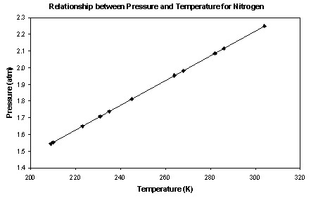
This line graph above plots the pressure of nitrogen at varying temperatures. We can observe a correlation between the two variables.
[Source]
Line graphs are often used to represent trends such as a consistent increase or decrease or oscillation. However, they can also be used to spot more complicated patterns, especially when multiple variables are plotted on the same figure, or to spot abnormalities (i.e. the variable was decreasing but then increased sharply in year X, such as in the figure below).
The most popular use of line graphs involves analyzing data over time by plotting time on the x-axis (see example below). There will be an entire module later that covers analyzing time-series data (i.e. data collected over time) which will use line graphs amongst other tools.
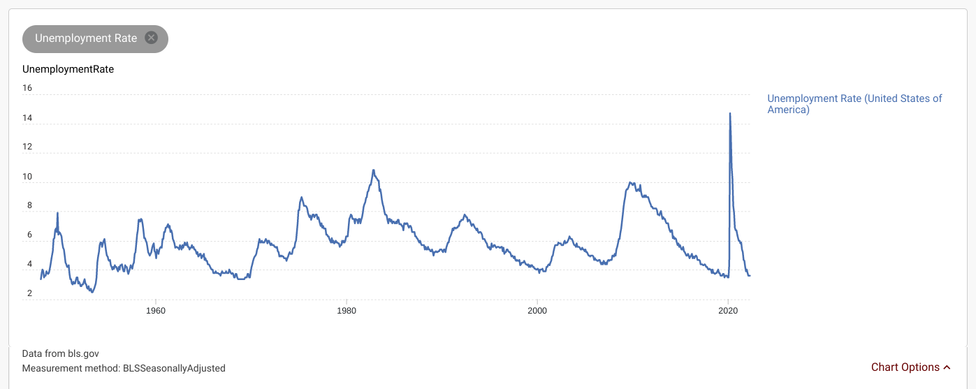
This line graph plots the US unemployment rate for every month between January 1948 and May 2022. We can observe several patterns from this graph: unemployment tends to (1) oscillate and (2) experience large spikes during significant events such as the 2008 recession or the 2020 pandemic. We can see that the 2020 spike was an abnormality and most spikes are not as steep and do not return to the previous value as quickly.
[Source]
Map
Map plots involve labeling a map with data values, usually to demonstrate a spatial trend or pattern or to present the information in a familiar format.

This map plot shows that the number of tornado events between 2005 and 2021 is higher in the American Midwest and gets higher towards the south.
[Source]

This map plot shows the median age in 2020 for each county in Texas.
[Source]

This map plot from the New York Times shows the total number of Covid cases for each country in the world by using dot sizes to represent magnitude (yellow dots indicate missing data).
[Source]
As we’ve seen, there are many options for labeling the map with the data values, such as using a color scale, dot sizes, using the numbers themselves, or some other format. Map plots can even handle non-numerical data, as shown below. Later sections will discuss this in more detail.

The map above shows the most popular Halloween candy in every state.
[Source]
Additionally, since a map may include locations that do not have any data, it is important to recognize when data is missing and indicate the missing data on the map.
Bar
A bar graph is a plot that displays categorical data using bars of different heights. It uses size differences to demonstrate differences in magnitude and is a good tool to compare two or more values for any variable across categories.

The bar graph above plots the poverty rate for six cities near San Francisco, CA. The scale on the left y-axis indicates what values the heights correspond to. We can easily see that Oakland, CA has the highest poverty rate out of the six cities.
[Source]
Generally, bar graphs are good for comparing numerical values across different categories.
Histogram
A histogram is a plot that groups data into continuous numerical ranges and each range is represented by a vertical bar. It looks similar to a bar graph but the key difference is that bar graphs have categories on the x-axis (e.g. cities) while histograms have numerical ranges.
Histograms are useful for grouping continuous data into chunks to spot trends or patterns. A common use case is frequency histograms, where the height of each bar represents the frequency or the count of a variable for all numbers in that range.

The histogram above plots income for New York and the United States using numerical ranges of $10,000 increments.
[Source: DataUSA]
1-D vs. 2-D vs. N-D
So far, we’ve mainly seen how to plot one or two variables at a time. What do you do if you have multiple variables? In that case, the best way to visualize that data depends on the type of analysis you’d like to do.
The first type of analysis, which we will call “side-by-side” comparison, involves the comparison of two or more variables to each other. For this kind of analysis, it is usually sufficient to use a bar chart, histogram, or line graph with multiple bars or lines (see below for examples). It is also possible to plot several variables on a map plot by using a color scale with two axes (see below), but this is significantly more complicated and can often be hard to design well.

A bar graph that has multiple variables plotted side by side.
[Source]

A line graph that has multiple variables plotted side by side.
[Source]
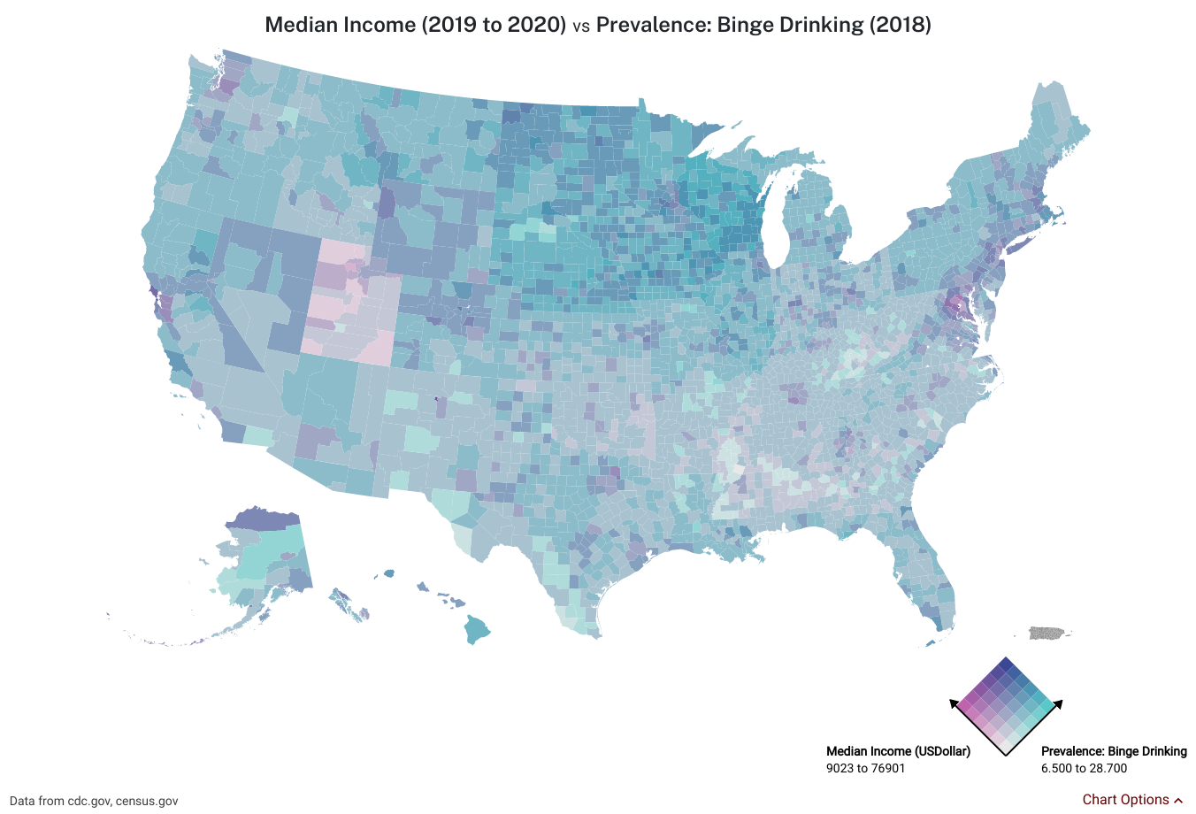
This map plot has a biaxial color scale to plot both median income and the prevalence of binge drinking for each county across the US
[Source]
The second type of analysis, which we will call “joint” comparison, involves observing the relationship between three or more variables. This type of analysis is more complicated and there are several options for how to handle additional variables.
The most natural option is to add a third axis to a scatter plot to be able to equally visualize the relationship between all three variables. However, this option can only be used for analysis of 3 variables at a time, relies on user interaction to rotate the graph, and cannot be used in print media like textbooks or newspapers.

A 3 dimensional graph of 
[Source]
Another option is to use a color scale to color in dots on a scatter plot, where the color is determined by the value of the third variable. However, this is often inaccessible for those who are colorblind so the colors should be carefully chosen with those conditions in mind.
A more accessible option is to scale the size of the dot using the values of the third variable. However, this can be confusing sometimes since it can be hard to properly interpret the relative scale. If the radius is proportional to some variable, doubling the radius will quadruple the area of the dot so it appears to be four times larger instead of just two times larger. Care must be taken to indicate how the scaling works exactly.
An obvious solution to both of these problems (misunderstanding of scaling and inaccessibility) is to just label the dots with the values of the third variable. However, this can make it difficult to spot trends easily.
In general, evaluating relationships for three or more variables at a time can be difficult and while options exist for visualizing them, each option has its own drawback. Combining options is a good way to cover all bases (e.g. using both color and labels for the third variable).
What if we’d like to analyze more than three variables? In that case, we can combine the above options and use one option per variable. This method is still not ideal since each option has their issues but it makes it possible to analyze beyond three dimensions.
Exercise: Exploring Plots and Graphs
In this exercise, we will practice interpreting different types of plots and graphs across several variables.
In a Google search bar, search “number of african american women in cambridge”. A graphic should pop up like shown below:

Click “Explore more →” at the bottom of the graphic. Then, look through the graphs and tables to answer the questions below.
- In what year did the unemployment rate increase the most?
- Which city shown on the page has the greatest difference in median income between genders? What is this difference, approximately?
- Has the poverty rate in Cambridge been (a) steadily increasing, (b) steadily decreasing, or (c) none of the above?
- Which category of highest level of education achieved (i.e. educational attainment) is most common in Somerville, MA?
- During which years did Cambridge experience the greatest decrease in violent crime?
Outliers
Formally, an outlier is a data point that is abnormally far from the other values. However, the definition of “abnormal” depends on the context, as we’ll see later.
Where Do Outliers Come From?
There are a couple of reasons for seeing an outlier in your data. A common reason is that the variable you are measuring could have a wide range of values where the extremes are uncommon (e.g. a height of seven feet would be rare and an outlier in most data sets). Other reasons include an error when measuring or collecting the data or an insufficient amount of data. For example, if you roll a dice 5 times and you get a 1, 2, 1, 1, and a 6, it appears that 6 is an outlier but we know that 6 is as equally likely as any other number on the dice.
How Do We Handle Outliers?
The significance of outliers depends on the context and the type of analysis. For example, if the goal is to measure central tendency, outliers are less important as long as they can be handled properly. However, if the goal is to measure variability or spread (e.g. income inequality), outliers are very relevant to the analysis.
Therefore, when measuring central tendency, it can be helpful to omit outliers or weigh them less during analysis. When measuring spread, it is important to verify that the outlier does not come from a data collection error or an insufficient data issue.
Advanced Topic: Introduction to Distributions
A distribution of a variable is a function, call it f(x), whose inputs are possible values a variable could take on and whose outputs are how often they occur. More specifically, frequency distributions indicate how often values occurred based on collected data while probability distributions indicate how likely a value is to occur based on a theoretical model of the variable.
For example, the probability distribution for a die is  when x is 1, 2, 3, 4, 5, or 6 and
  for all other values of x. If you roll the die 5 times and you get 4, 4, 3, 2, 5 then the frequency distribution is
  ,
,  ,
,  ,
,  , and for all other values of x.
In general, there exists a distribution for any variable but it is impossible to determine a variable’s exact distribution without getting data points for the entire population. However, by sampling data points and plotting the frequency of the values, we can approximate a variable’s probability distribution using the frequency distribution more accurately and precisely as the number of datapoints grows.
Statisticians like working with distributions because they provide a single function that gives you the likelihood of seeing certain values. After estimating the distribution, we can use it to predict the likelihoods of values we’ve seen before (or even values we’ve never seen before!).
When talking about distributions, it can be helpful to visualize the distributions with a graph since all distributions are essentially functions. There are two main types of graphs: (1) frequency/probability graphs and (2) cumulative frequency/probability graphs.
Frequency graphs answer the question “how many data points did we see with a value of x” and probability graphs answer the question “what is the probability of the variable taking on a value of x”. Since this is exactly what the function f(x) represents, frequency/probability graphs are simply a graph of f(x).

A probability graph for the die roll distribution. We can see that when x is 1, 2, 3, 4, 5, or 6 and for all other values of x.
[Source]
Meanwhile, cumulative frequency graphs answer the question “how many data points did we see with value less than or equal to x” and cumulative probability graphs answer the question “what is the probability that the variable takes on a value less than or equal to x”. Let’s call this function F(x). Calculating F(x) involves summing up f(y) for all values of y that are less than or equal to x.
For example, we know from earlier that the probability distribution for a die is when x is 1, 2, 3, 4, 5, or 6 and for all other values of x. Given f(x), we can calculate the cumulative probability function F(x) as shown below:
- When
 ,
,  since
since  for all
This should make sense because the die can never take on values under 1 so the probability that the die takes on a value less than or equal to any number below 1 is 0.  since for all and
- When
 , so
, so 
This should make sense because the dice cannot take on values between 1 and 2 so the probability that it takes on a value less than or equal to a number between 1 and 2 is just ⅙ a.k.a. F(1). - Using the same train of thought, we know that

When , so
, so 

When  , so
, so 

When  , so
, so 

When  , so
, so 

When  , so
, so 
Since we have calculated F(x) for all values of x, we can now graph F(x):
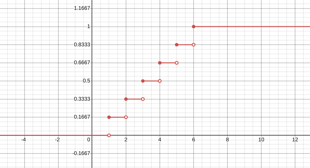
A cumulative probability graph for the die roll distribution, as calculated above.
[Source]
Normal Distribution
Definition
The normal distribution is a function that is determined by the mean and standard deviation, defined below:

where  is the mean and
  is the standard deviation. This distribution is very commonly used to model some real world variables and has convenient properties (discussed later), making it one of the most well-known distributions. When we think that a variable has a normal distribution, we say that it is “normally distributed” or “normal” i.e. the probability that the variable has a value of x is f(x) (defined above).
The standard normal distribution has a mean of 0 and a standard deviation of 1. The figure below is a probability graph of the standard normal distribution.

The standard normal distribution has a mean of 0 and a standard deviation of 1.
[Source]
Although the figure above is the general shape that most people are familiar with for the normal distribution, the graph can look vastly different depending on the values for the mean and standard deviation.
With smaller values of the standard deviation, the central peak becomes skinnier, taller, and steeper. With larger values of the standard deviation, the central peak becomes wider, shorter, and less steep. See figure below for an illustration.
With larger values of the mean, the function moves to the right and with smaller values of the mean, the function moves to the left (but its shape remains the same in both cases).

The functions above are all instances of a normal distribution with a mean of 0. The black line has a standard deviation of 0.4, the green line has a standard deviation of 1, and the purple line has a standard deviation of 4.
[Source]
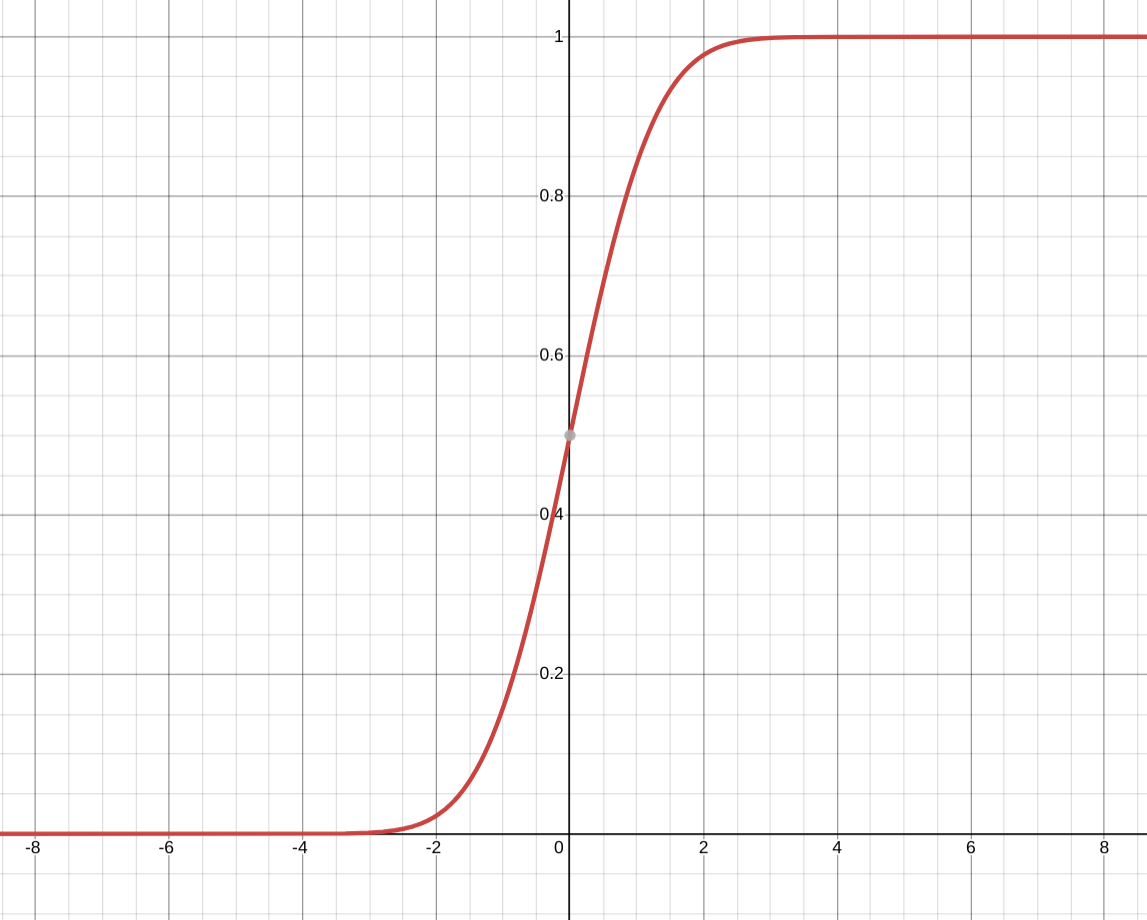
The cumulative probability graph for the normal distribution. Although it is difficult to see in this image, this function never equals 0 or 1 since the normal distribution has no minimum or maximum. You can click on Source to explore this graph further.
[Source]
Properties
Although the graph of the normal distribution can change depending on the values of the mean and the standard deviation, there are some properties of the normal distribution that are always true regardless of the mean and standard deviation.
Symmetry: the normal distribution is symmetric about the mean. This means that, given the mean is ,  , or in simpler terms, values that are an equal distance away from the mean are equally likely to occur. When the mean is 0, this simplifies to
  .
.
Symmetry is helpful because, if we know a variable is normally distributed, we only need to map out the exact probabilities for half of the values since the other half will be symmetrical. Symmetric distributions also have no skew (defined in module 2) and therefore the mean is a useful measure of central tendency for such distributions.
Mean = Median = Mode: since the normal distribution is symmetric, the mean is equal to the median. Additionally, the normal distribution peaks at the mean/median so the most likely value (i.e. the mode) occurs at the mean/median. Therefore, for all normal variables, the mean, median, and mode are the same number. When this occurs, we know that this value is a good measure of central tendency.
Infinite Domain: the normal distribution has a nonzero probability for all values of x, i.e.  for all
  . However as the values of x get farther from the mean ,
  decreases and approaches 0. When a distribution appears to “taper off” like the normal distribution does on both sides, we call that part of the graph the “tail”. The normal distribution has two tails, the “upper tail” and the “lower tail” and there is no set definition for where those tails begin.
Tails are often important in cases where the worst case value, however unlikely, is much more important than the average value. For example, in high frequency trading, latency (the amount of time it takes for the program to complete a task or respond) is a crucial variable and often has long tails where searches or actions could take up to 1000x slower. Even though these events are rare, when they occur they can lead to disastrous losses and therefore latency teams focus on the tails instead of the more probable values.
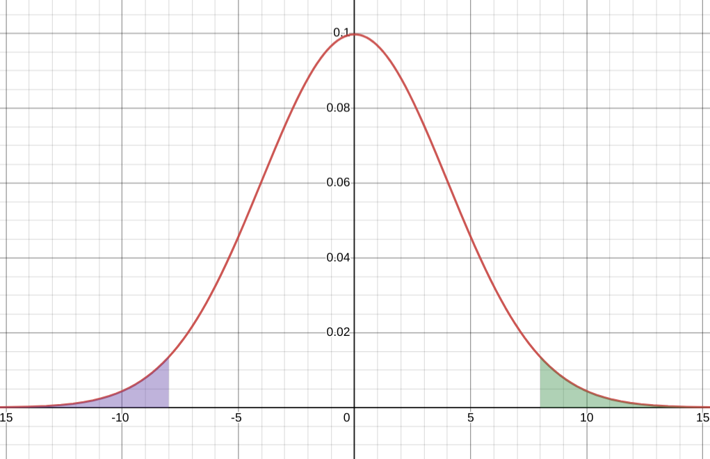
The upper tail (shaded in green) and the lower tail (shaded in purple) for a normal distribution with a mean of 0 and a standard deviation of 4. Here the tails have been set to start 2 standard deviations away from the mean but alternate definitions could be accepted.
[Source]
When is Data Normal?
Earlier we mentioned that a lot of real world variables are normally distributed. For example, height is a popular example of a normal variable (see below for a frequency distribution of height). In fact, a lot of physical attributes that are difficult to change (e.g. birth weight, shoe size, etc.) are normally distributed.
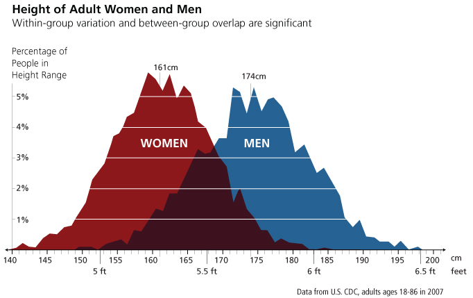
A frequency distribution where the y-axis represents g(x) = the percentage of the population that has a height of x. We can see that, when we separate the data into two categories, men and women, that both categories are roughly normally distributed with a mean of 161 cm for women and 174 cm for men.
[Source]
Another common example is the Galton board, where a board is constructed that has interleaved rows of pegs that eventually lead to a set number of bins at the bottom. Beads or balls are then dropped from the center at the top and either fall left or right as they bump into the pegs. The final distribution of beads/balls resembles the normal distribution (see here for a video demo).

After splitting the data in two categories, men and women, we can see that the data is roughly normal.
[Source]
Modeling a variable as normal simplifies a lot of analysis and gives us a symmetric function that has been extensively analyzed. However, in order for a variable to be normal, it must satisfy the properties above. For example, it must be roughly symmetric with very close values for the mean, median, and mode. Data collected on the variable should have long tails on both ends and be roughly the same shape as the normal (singular peak in the center). Most significantly, it must have an infinite domain.
Exercise: Is It Normal?
It can be hard to determine when something is truly normal. Take the frequency histogram below for an unnamed variable that has a mean of 20 and a standard deviation of 40. We’ve zoomed in a bit so that we only see the frequency counts for the values between 0 and 60 and we are using a bin size of 20.

- Can you conclude that the variable is normal (yes/no/needs more information)? If yes, why yes? If no, why no? And if you need more information, what information do you need?
Now let’s change the bin size from 20 to 5 and zoom in so that we are only looking at the frequency counts for values between 0 and 35.

- Does your answer from question (1) still hold? If your answer changed, why did it change?
Let’s zoom out and look at the graph again.
- Does your answer from question (2) still hold? If your answer changed, why did it change?
Now, let’s consider a few scenarios for what the variable could be
- Say the variable is the daily change in the price of some stock. Could the variable still be normally distributed?
- Say the variable is the number of chicken nuggets ordered at Kurger Bing. Could the variable still be normally distributed? (Hint: is there an upper or lower limit to how many nuggets you can order?)
We can see from the exercise that frequency histograms can be misleading with the improper bin size and picking the right bin size can shed more light on the data. Additionally, some variables cannot be normal because they have minimums and/or maximums, making them finite in their domain.
Exceptions to the Rule
However, we still say that height is normally distributed, even though we cannot have negative heights. Why is that?
In the exercise, the mean was 40 and the standard deviation was 20. If the variable were normal, then it would take on a negative value roughly 2.3% of the time or for roughly every 1 in 43 data points. When the variable is the number of chicken nuggets eaten, we know that a negative value is impossible so it occurs 0% of the time, not 2.3%. Therefore, it cannot be normally distributed.
In contrast, the average adult male height is around 70 inches with a standard deviation of 4 inches. If the variable were normal, then it would take on a negative value roughly  of the time. This is considered so improbable that many statisticians consider it equivalent to impossible and approximate it as 0. Therefore, it is still okay to model it as a normal variable.
The difference between these two examples lies in the magnitude of the standard deviation relative to the distance between the mean and the upper or lower bound. In both examples, the lower bound was 0.
In the exercise, the standard deviation was 20 relative to a distance of 40 - 0 = 40, making it roughly half of the distance and unlikely but still possible for a negative value to be achieved.
Meanwhile, for adult male height, a standard deviation of 4 relative to a distance of 70 - 0 = 70 is fairly small, making a negative number incredibly improbable to the point of virtual impossibility.
Therefore, since the normal distribution extends infinitely on both sides, not all real world data can be normal. However, when the standard deviation is sufficiently small, we can still model it as normal because all of the negative values have an incredibly unlikely probability of occuring.
Exponential
The exponential distribution is a function that decreases exponentially based on a given parameter 

The exponential distribution is another popular distribution that occurs in real life but it is less common than the normal distribution so we will keep our discussion of this function brief.
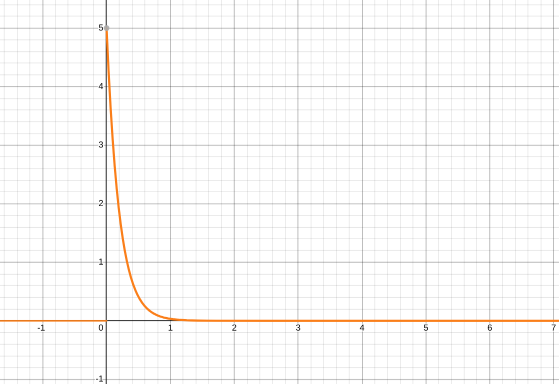
The exponential distribution  where
where 
[Source]

The cumulative probability graph for the exponential distribution seen above ()
[Source]
The main properties of the exponential distribution are as follows:
- Non-negativity: all values less than 0 are impossible
- Positive skew: the exponential distribution has a tail on the right and is thus positively skewed.
- Decreasing: for all
 , is a decreasing function (it decreases as x increases)
 - 0 = Mode < Median < Mean: Since the exponential distribution is positively skewed, we know that the mean will be greater than the median. Additionally, since is decreasing, its mode (its most probable value or the value of x for which is maximized) is
 , making the mode less than the median which is less than the mean.
Some real world examples of the exponentially distributed variables include:
- The amount of time (starting now) until an earthquake occurs
- Length (in minutes) of long distance business telephone calls
- Amount of time (in months) a car battery lasts
- Amount of change kept in one’s pocket or purse
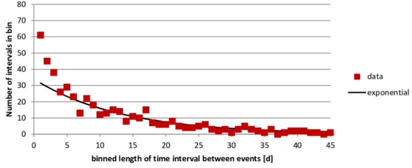
The plot above shows data points for the frequency of each time interval in between earthquakes and graphs an exponential distribution in black to demonstrate the similarity in distribution.
[Source]
The exponential distribution is a useful model because it decreases exponentially and it is an example of distributions that have “longer tails” but are not normal and are also present in the real world.
Other Distributions (Optional)
Bernoulli
The Bernoulli distribution is a simple distribution that models the probability of a Bernoulli trial, or an experiment that has just two outcomes. For example, the results of a coin flip can be modeled with a Bernoulli distribution using the function f(Heads) =0.5, f(Tails) = 0.5. Oftentimes, one outcome is called a “success” and/or assigned a value of 1 and the other outcome is called a “failure” and/or assigned a value of 0.
Binomial
The binomial distribution represents the probability of x successes given n repetitions of a Bernoulli trial where the probability of success for each trial is p
