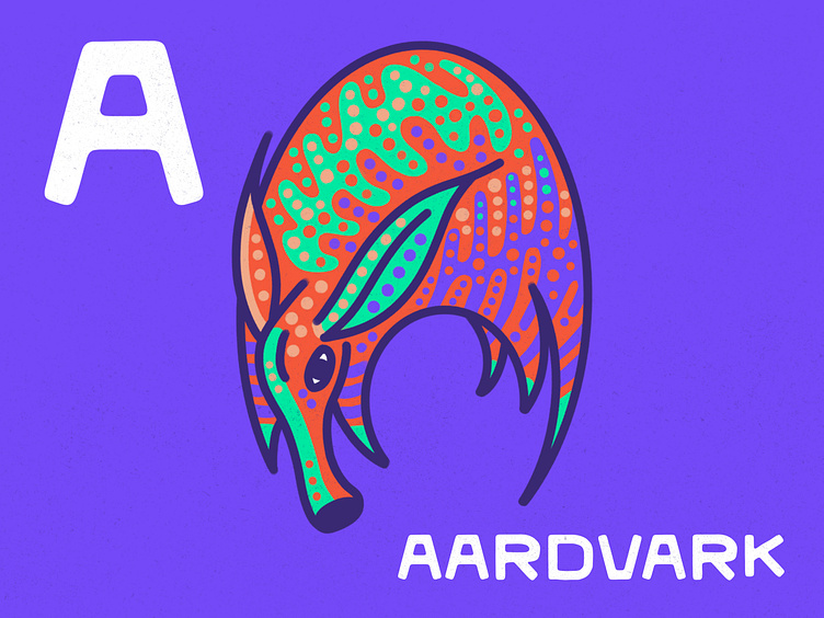
A is for Aardvark

Notes on the design
Digital illustration in Procreate with monoline brushes and paper textures (from RSCO.)
I'm working on some letterform practice and thought it would be interesting to make it pictorial. Since animals are a frequent muse of mine, the tried-and-true 'Animal Alphabet' concept came to mind.
With an exercise like this I usually sketch the line art in pencil, then ink my lines, then go back and add color fills, detailing, and lastly patterns and texture. I debated whether or not to keep the bold stroke lines, deciding in favor as I think they pop the abstract 'A' shape with strong contrast against the light paper.
I'm pushing for a style of illustration that is more organic and minimal, trying to let go of my clinging to realism and have fun with colors, shapes, and patterns found in the elegant designs of Mother Nature's creatures.
One of my favorite illustrators @brettpstenson has really mastered this technique and is a big inspiration!
The story behind the piece
I'm working on a few children's book concepts that are still very abstract and early-stage, so I decided this would be a more straightforward warm-up.
Alphabetically speaking, I don't think there are many other animals that come before Aardvark.