Fraktur
| Latin script (Fraktur hand) | |
|---|---|
 | |
| Script type | |
Time period | 16th–20th centuries |
| Direction | Left-to-right |
| Languages | German[a] and some other European languages |
| Related scripts | |
Parent systems | Blackletter
|
Child systems | Kurrentschrift, including Sütterlin |
Sister systems | See Blackletter |
| ISO 15924 | |
| ISO 15924 | Latf (217), Latin (Fraktur variant) |
| Unicode | |
0020-00FF[b] | |
| |

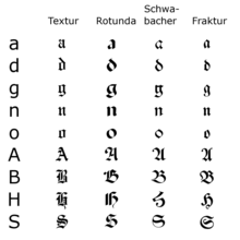
Fraktur (German: [fʁakˈtuːɐ̯] ) is a calligraphic hand of the Latin alphabet and any of several blackletter typefaces derived from this hand. It is designed such that the beginnings and ends of the individual strokes that make up each letter will be clearly visible, and often emphasized; in this way it is often contrasted with the curves of the Antiqua (common) typefaces where the letters are designed to flow and strokes connect together in a continuous fashion. The word "Fraktur" derives from Latin frāctūra ("a break"), built from frāctus, passive participle of frangere ("to break"), which is also the root for the English word "fracture". In non-professional contexts, the term "Fraktur" is sometimes misused to refer to all blackletter typefaces – while Fraktur typefaces do fall under that category, not all blackletter typefaces exhibit the Fraktur characteristics described above.[a]
Fraktur was often characterized as "the German typeface", as it remained popular in Germany and much of Eastern Europe far longer than elsewhere. In Germany, utilizing more modern typefaces would prove controversial until 1941, when the Nazi government rendered any transition involuntary by banning the use of Fraktur typefaces.
Characteristics
Besides the 26 letters of the ISO basic Latin alphabet,[b] Fraktur usually includes the Eszett ⟨ß⟩ in the ⟨ſʒ⟩ form, vowels with umlauts, and the long s ⟨ſ⟩. Some Fraktur typefaces also include a variant form of the letter r known as the r rotunda, and many include a variety of ligatures which are left over from cursive handwriting and have rules for their use. Most older Fraktur typefaces make no distinction between the majuscules ⟨I⟩ and ⟨J⟩ (where the common shape is more suggestive of a ⟨J⟩), even though the minuscules ⟨i⟩ and ⟨j⟩ are differentiated.
One difference between the Fraktur and other blackletter scripts is that in the lower case ⟨o⟩, the left part of the bow is broken, but the right part is not. In Danish texts composed in Fraktur, the letter ⟨ø⟩ was already preferred to the German and Swedish ⟨ö⟩ in the 16th century.[c]
In the Latvian variant of Fraktur, used mainly until the 1920s, there are additional characters used to denote Latvian letters with diacritical marks.[1][2] Stroked letters ⟨Ꞡ ꞡ⟩, ⟨Ꞣ ꞣ⟩, ⟨Ł ł⟩, ⟨Ꞥ ꞥ⟩, ⟨Ꞧ ꞧ⟩ are used for palatalized consonants (⟨Ģ ģ⟩, ⟨Ķ ķ⟩, ⟨Ļ ļ⟩, ⟨Ņ ņ⟩, ⟨Ŗ ŗ⟩) stroked variants of ⟨s⟩ and ⟨ſ⟩ distinguish voiced and unvoiced sibilants or affricates (⟨S ſ⟩ for voiced [z], ⟨Ꞩ ẜ⟩ for unvoiced [s], ⟨ſch⟩ [ž] / ⟨ẜch⟩ [š], ⟨dſch⟩ [dž] / ⟨tẜsch⟩ [č]), while accents (⟨à⟩, ⟨â⟩, ⟨ê⟩, ⟨î⟩, ⟨ô⟩, ⟨û⟩) together with digraphs (⟨ah⟩, ⟨eh⟩ etc.) are used for long vowels (⟨Ā ā⟩, ⟨Ē ē⟩, ⟨Ī ī⟩, ⟨Ō ō⟩, ⟨Ū ū⟩). Stroked variants of ⟨s⟩ are also used in pre-1950 Sorbian orthography.[1]
Origin
The first Fraktur typeface arose in the early 16th century, when Emperor Maximilian I commissioned the design of the Triumphal Arch woodcut by Albrecht Dürer and had a new typeface created specifically for this purpose, designed by Hieronymus Andreae. Fraktur types for printing were established by the Augsburg publisher Johann Schönsperger at the issuance of a series of Maximilian's works such as his Prayer Book (Gebetbuch, 1513) or the illustrated Theuerdank poem (1517).[3]
Fraktur quickly overtook the earlier Schwabacher and Textualis typefaces in popularity, and a wide variety of Fraktur fonts were carved and became common in the German-speaking world and areas under German influence (Scandinavia, Estonia, Latvia, Central Europe). In the 18th century, the German Theuerdank Fraktur was further developed by the Leipzig typographer Johann Gottlob Immanuel Breitkopf to create the typeset Breitkopf Fraktur. While over the succeeding centuries, most Central Europeans switched to Antiqua, German speakers remained a notable holdout.
- uibucduahvasldkcalksdckj;asdm asked mas [obsc['ansac[aosc
aS Mcsnc s 'ssDv s m/nsd v;ks dsvk df;vb as odvo apdpf 'da 'adfnv padfn and adf adf d adf af af asd v as v ad 'ddm adf df
 v


df
;dfa
ad
f ,;la efvjajv benrv er be ]r b eqrnb eqrnb eqkrnb
- ernb
qerbn er;bneqbn; ae
- rbnae
fbnae b;lnqe r;bnlqe r;lbne
Typeface samples
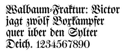
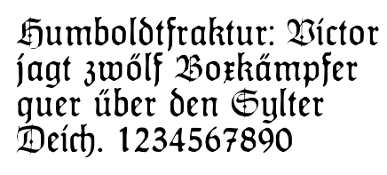
In the figures below, the German sentence that appears after the names of the fonts (Walbaum-Fraktur in Fig. 1 and Humboldtfraktur in Fig. 2 reads, Victor jagt zwölf Boxkämpfer quer über den Sylter Deich. It means "Victor chases twelve boxers across the Sylt dike" and contains all 26 letters of the alphabet plus the umlauted glyphs used in German, making it an example of a pangram.


Unicode
Unicode does not encode Fraktur as a separate script. Instead, Fraktur is considered a "presentation form" of the Latin alphabet.[4][d] Thus, the additional ligatures that are required for Fraktur typefaces will not be encoded in Unicode: support for these ligatures is a font engineering issue left up to font developers.[5]
There are, however, two sets of Fraktur symbols in the Unicode blocks of Mathematical Alphanumeric Symbols, Letterlike Symbols, and Latin Extended-E. The long s, ß, and the umlauted vowels are not encoded, as the characters are meant to be used in mathematics and phonetics, so they are not suitable for typesetting German-language texts.[6]
- 𝔄 𝔅 ℭ 𝔇 𝔈 𝔉 𝔊 ℌ ℑ 𝔍 𝔎 𝔏 𝔐 𝔑 𝔒 𝔓 𝔔 ℜ 𝔖 𝔗 𝔘 𝔙 𝔚 𝔛 𝔜 ℨ
- 𝔞 𝔟 𝔠 𝔡 𝔢 𝔣 𝔤 𝔥 𝔦 𝔧 𝔨 𝔩 𝔪 𝔫 𝔬 𝔭 𝔮 𝔯 𝔰 𝔱 𝔲 𝔳 𝔴 𝔵 𝔶 𝔷
- 𝕬 𝕭 𝕮 𝕯 𝕰 𝕱 𝕲 𝕳 𝕴 𝕵 𝕶 𝕷 𝕸 𝕹 𝕺 𝕻 𝕼 𝕽 𝕾 𝕿 𝖀 𝖁 𝖂 𝖃 𝖄 𝖅
- 𝖆 𝖇 𝖈 𝖉 𝖊 𝖋 𝖌 𝖍 𝖎 𝖏 𝖐 𝖑 𝖒 𝖓 𝖔 𝖕 𝖖 𝖗 𝖘 𝖙 𝖚 𝖛 𝖜 𝖝 𝖞 𝖟
See also
- Antiqua–Fraktur dispute – Typographical dispute in Germany
- Blackletter – Historic European script and typeface
- Breitkopf Fraktur – Blackletter typeface designed 1750
- Fette Fraktur – Typeface designed by Bauer in 1850
- Fraktur (folk art) – Illuminated folk art from Pennsylvania
- Kurrent – Form of German-language handwriting
- Mathematical Alphanumeric Symbols – Unicode block
- Sütterlin – Historical form of German handwriting, used 1915–1970s
Notes
- ^ Similarly, the term "Gothic" is sometimes also incorrectly used to refer to Fraktur typefaces. However, in typography, the term "Gothic" simply means sans-serif.
- ^ ISO basic Latin alphabet is derived from the English alphabet hence its 26 letters.
- ^ Compare, for example, Bibla: Det er den gantske Hellige Scrifft: udsæt paa Danske. 1550. (in Danish) and Biblia: Det er Den gantske Hellige Scrifft paa Danske igien offuerseet oc prentet effter vor allernaadigste herris oc Kongis K. Christian den IV. Befaling. 1633. (in Danish)
- ^ For examples of more obvious "presentation forms", see display typeface.
References
- ^ a b "Proposal to encode 10 Latin letters for pre-1921 Latvian orthography" (PDF). Unicode Consortium. 30 April 2009. Archived (PDF) from the original on 27 November 2023.
- ^ Švehs, Ernsts Aleksandrs (1877). Jauna ābece (in Latvian). Rīga: W. F. Häcker. p. 7. Retrieved 29 July 2023.
- ^ Funke, Fritz (1999). Buchkunde: Ein Überblick über die Geschichte des Buches [Book Customer: An overview of the history of the book] (in German) (6 ed.). Munich: Saur. p. 223. ISBN 3-598-11390-0.
- ^ "Ligatures, Digraphs, Presentation Forms vs. Plain Text | Presentation forms". Unicode Consortium. 7 July 2015. Retrieved 19 September 2022.
- ^ "Ligatures, Digraphs, Presentation Forms vs. Plain Text | Ligatures". Unicode Consortium. 7 July 2015. Retrieved 19 September 2022.
- ^ "Ligatures, Digraphs, Presentation Forms vs. Plain Text | Why does Unicode contain whole alphabets of "italic" or "bold" characters in Plane 1?". Unicode Consortium. 7 July 2015. Retrieved 19 September 2022.
Further reading
- Bain, Peter; Shaw, Paul (1998). Blackletter: Type and National Identity. Princeton Architectural Press. ISBN 1-56898-125-2.
- Fiedl, Frederich; Ott, Nicholas; Stein, Bernard (1998). Typography: An Encyclopedic Survey of Type Design and Techniques Through History. New York: Black Dog & Leventhal. ISBN 1-57912-023-7.
- Hartmann, Silvia (1998). Fraktur oder Antiqua. Der Schriftstreit von 1881 bis 1941 (in German). Frankfurt am Main: Peter Lang. ISBN 3-631-35090-2.
- Macmillan, Neil (2006). An A–Z of Type Designers. Yale University Press. ISBN 0-300-11151-7.
External links
- A complete Fraktur chart (Library of Yale University)
- UniFraktur: Free Fraktur fonts and resources at SourceForge
- Translating newspapers set in Fraktur (familyhistoryfanatics)


