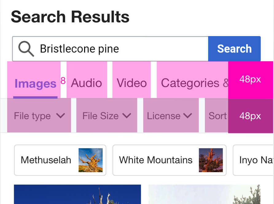
The areas on mobile web that will need adjustment are:
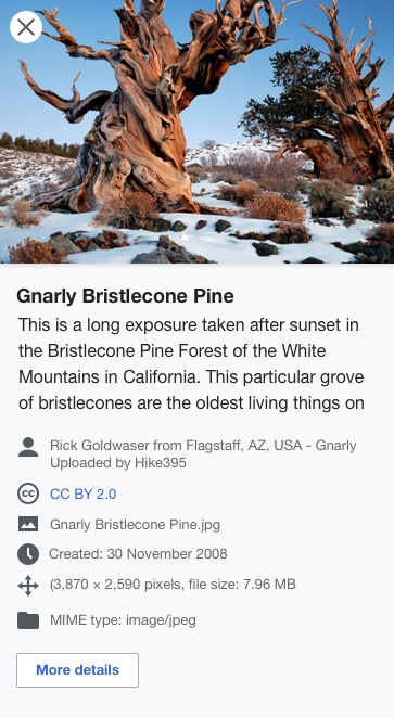
- Quick View. Instead of being an element on the side of the viewport like on desktop, on mobile it can be a full screen modal / takeover.
- File type tabs and filters need a way to fit on the screen. We want to follow the desktop design with the filters below the tabs but with the limited real estate these rows will need to be horizontally scrollable. Since we are supporting a variety of viewport sizes, adding a block that is a fade of transparent to white (Left to right) on top of the text to indicate there is more information to the right could be useful affordance.
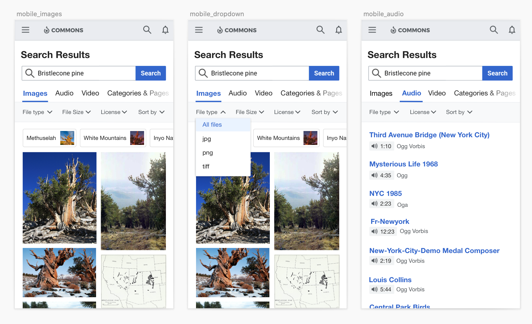
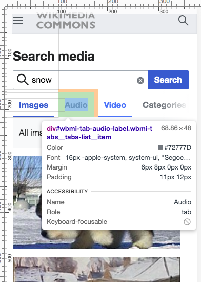
Example of color block
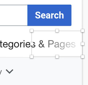
- We also need to pay special attention to the tap target areas for these two rows of controls to make sure they are easy to use. I've added additional height for each row and tap area to help eliminate mis-tapping. The general idea there is making sure the rows are at least 48px tall, with 6px of left and right margin on each element and 8px in between elements