Background
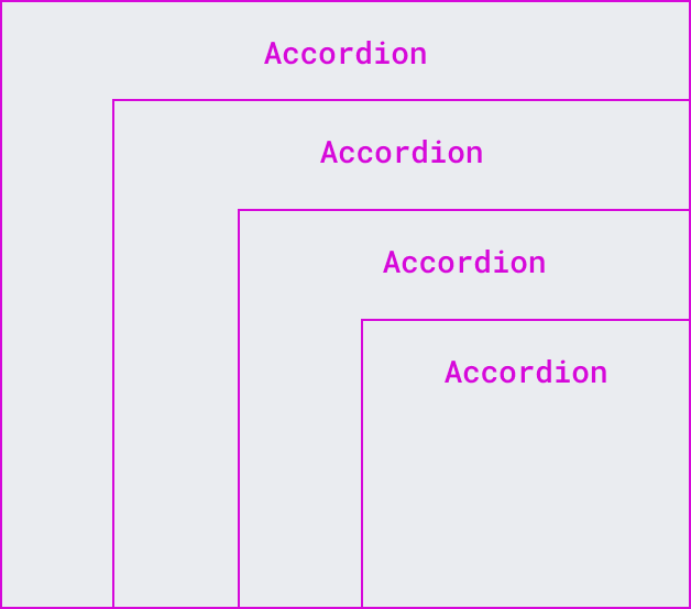
- Description: Accordions present one or more content areas that can be expanded and collapsed.
- History: There's a main task with an inventory of potential accordion instances that should be taken into consideration when tackling the definition of this pattern: T280785: Define and add the expand and collapse (accordion) component to the DSG.
- Considerations: This pattern should be approved by the design team before being introduced in our design system. The DST needs to decide if Accordion should be considered a core system component.
- Known use case(s): The first potential consumer of the Accordion component would be Abstract Wikipedia, in the context of their "Default component". There are several variations of expand/collapse elements in the Wikimedia interfaces, from article sections in Minerva, to tree-like menus in Vector's table of content. We need to decide, as part of the definition of the Accordion, whether these other collapse/expand elements will need any adjustments.
Main use cases:
Minerva content sections collapsed by default 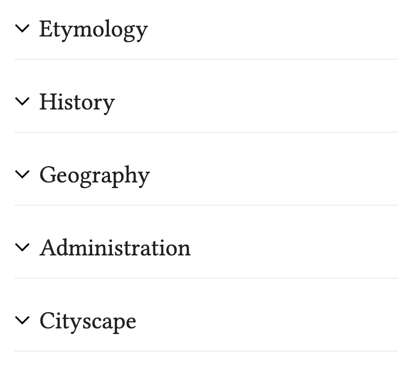 | Expanded 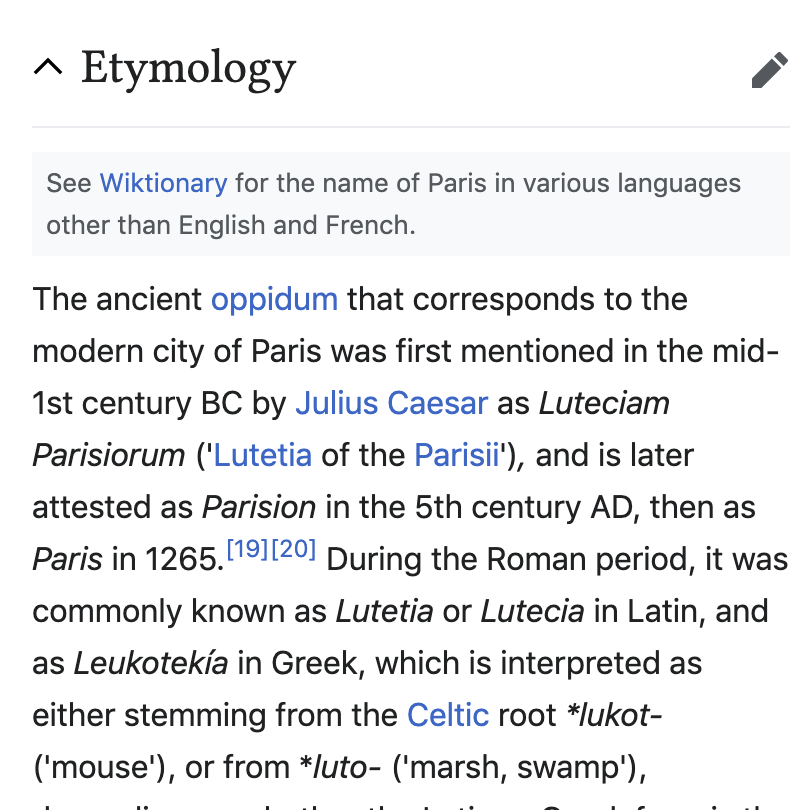 |
Vector Tools panel (Prototype)  | Expanded  |
Wikifunctions T323013 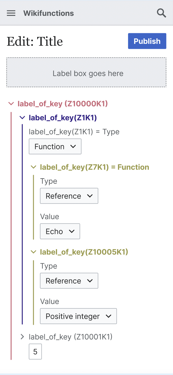 | |
Other expand/collapse use cases:
 |  |  | 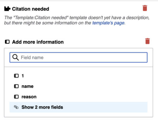 |  |  | 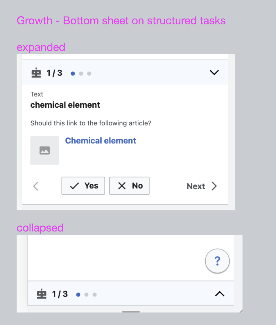 |
| Vector 2022 toc sections (this is a TreeView instead T325351) | VE to display Wikidata entities | VE droplist menu | VE templates selector (doesn’t enable collapse) | Search/filter component on many Special pages | Expand/collapse links in legend/key tables on Watchlist and other Special pages | Growth structured tasks (mobile) - sticky bottom sheet can expand and collapse. |
User stories
- As a designer and developer, I want to be able to reuse an accordion component to group relevant content and present a clean structure to users.
Previous implementations
These artifacts are listed for historical context. The figma spec, linked below, is the source of truth for the new component.
- Design style guide: Pending. See T280785
- OOUI: -
- Vue: -
Codex implementation
Component task owners
- Designer: add the main deigner's name
- Developer: add the main developer's name
Design spec
WIP. A component spec sheet has not been created yet.
| Component spec sheet |
Stage 1: Minimum viable product (MVP)
MVP includes basic layout, default states, and most important functionality.
Acceptance criteria
- Determine what MVP includes for this component and document this in a subtask. Assign task to designer.
- Design MVP. Once complete, assign task to developer.
- Implement MVP
Stage 2: Additional states, features, and variants
Acceptance criteria
- Document design and implementation of additional states and features in individual subtasks
- Complete each additional state/feature subtask
Stage 3: Refinement
Acceptance criteria
- Finalize docs: open and complete a subtask for any additional demos that need to be added or documentation that needs work
- Meet accessibility standards: open and complete a subtask for any necessary accessibility improvements
- Meet internationalization standards: open and complete a subtask to fix any i18n bugs
- Complete testing: open and complete a subtask for any additional unit or functional tests that are needed