
User Details
- User Since
- Feb 9 2021, 9:09 PM (180 w, 3 d)
- Availability
- Available
- LDAP User
- Unknown
- MediaWiki User
- NAyoub (WMF) [ Global Accounts ]
Mon, Jul 8
Thanks for the ping @JScherer-WMF. I agree with everything you said. My main concern with the user icon usage would be that it could cause some confusion on which user's page it is (i.e. in a scenario where person 1 is looking at person 2's talk page, whose page would this link to?). I would lean towards either removing the link altogether or using the username link as you suggested – although having the username link there could also be a bit confusing given that on the non-sticky header (i.e. the step prior) this is approximately the location where we have the active user's username link. So probably removing the link (article icon) would be the best option.
cc @ppelberg
Fri, Jun 28
that makes sense @Jdlrobson, @background-color-success-subtle seems better than yellow for sure – we could even consider @background-color-progressive-subtle if we could consider the success feedback to be too prominent.
(cc @bmartinezcalvo @DTorsani-WMF)
Jun 25 2024
Thanks for the ping, @JScherer-WMF.
Your approach sounds good to me.
Jun 11 2024
May 22 2024
Feb 22 2024
+1, sounds good to me.
Feb 14 2024
Thank you all for your feedback!
Yes, I agree with using a color from Codex for the timestamps. After discussing with Design Systems team members, we should use Gray500 #72777d to keep the distinction with the text.
Feb 10 2024
Thanks @Esanders, the patch looks great!
(@Trizek-WMF I logged-in on patchdemo to try it)
Jan 23 2024
I agree @DLynch, and +1 to the later iteration. What would you recommend for the copy?
Jan 10 2024
Hi @MNeisler, thanks for sharing!
Dec 4 2023
@Esanders thanks for sharing the patchdemo – looks great for initial release!
Oct 21 2023
Thanks for all your responses @Jdlrobson, I agree with you and @Samwalton9-WMF on your points.
Oct 19 2023
Hi @Jdlrobson & @JScherer-WMF (thanks for the ping!), I’d be curious to learn more about the historical context of the Minerva talk page design – assuming the buttons were designed purposefully, whether for increased accessibility (tap targets) or other reasons. Therefore, I’d lean towards keeping them – and eventually, potentially reconsider the design on Vector to map to this as well.
Similar to how the “reply” tool came to exist as a button, it’d be interesting to see how this page UX could be enhanced in the future.
Regarding the definition of the buttons, I’d assume these fit since they perform actions (thanking the editor, undoing the edit) unlike the others which are links (transporting you to the user’s talk page, diff, etc).
Sep 28 2023
Could we re-use the existing messaging from desktop on mobile?
Sep 27 2023
hi @kostajh & @aishwaryavardhana, apologies for missing your comments.
Sep 26 2023
Sep 20 2023
After discussion on Slack and with @ppelberg, we've decided to move forward with the following option including a normal-progressive button:

Sep 19 2023
Here's the updated, latest version of the mock-up design for the Reporting page. [1]
Sep 11 2023
Sep 7 2023
Sep 6 2023
Sep 5 2023
Aug 24 2023
Great point, thank you @Esanders – I agree with the new alignment you're proposing.
Aug 10 2023
@ppelberg the above responses look great to me with the single caveat that "common knowledge" might be a) paradoxically not universal and b) hard to translate into other languages (it would be slightly wordy in French for instance: "de notoriété publique"). In light of that, what do you think of changing that to "widely known" / "commonly accepted" or something else along those lines?
Thanks for your feedback and flagging those @ppelberg.
Jul 20 2023
Jul 14 2023
Jul 12 2023
Jul 10 2023
Jul 8 2023
@Esanders At the moment let's only apply the debounce time for desktop.
Jul 1 2023
Jun 29 2023
Following an offline conversation with @ppelberg, we decided to use the message shared above by @RHo[1] with a small change in the second sentence to emphasize the notification aspect of future edits instead of credit:
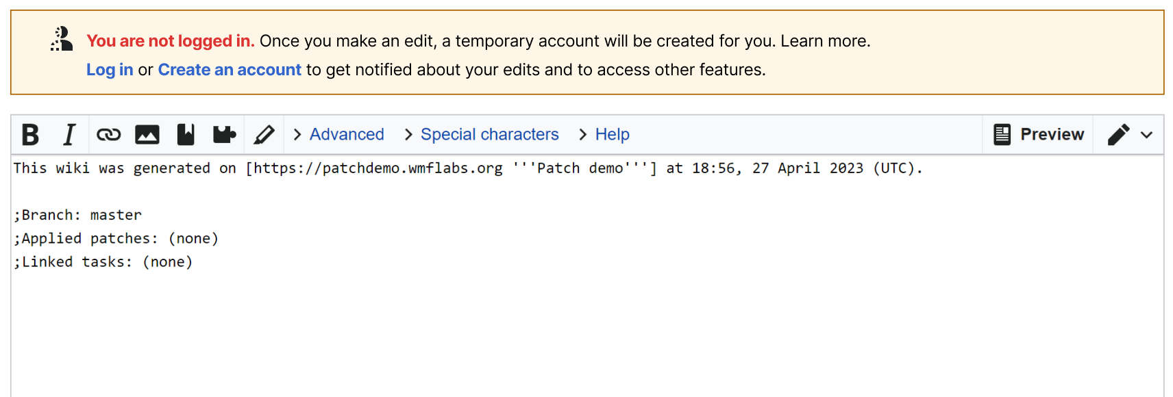
You are not logged in. Once you make an edit, a temporary account will be created for you. Learn more.
Log in or Create an account to get notified about your edits and to access other features.
What about this option?
Thanks a lot for your feedback, @kostajh!
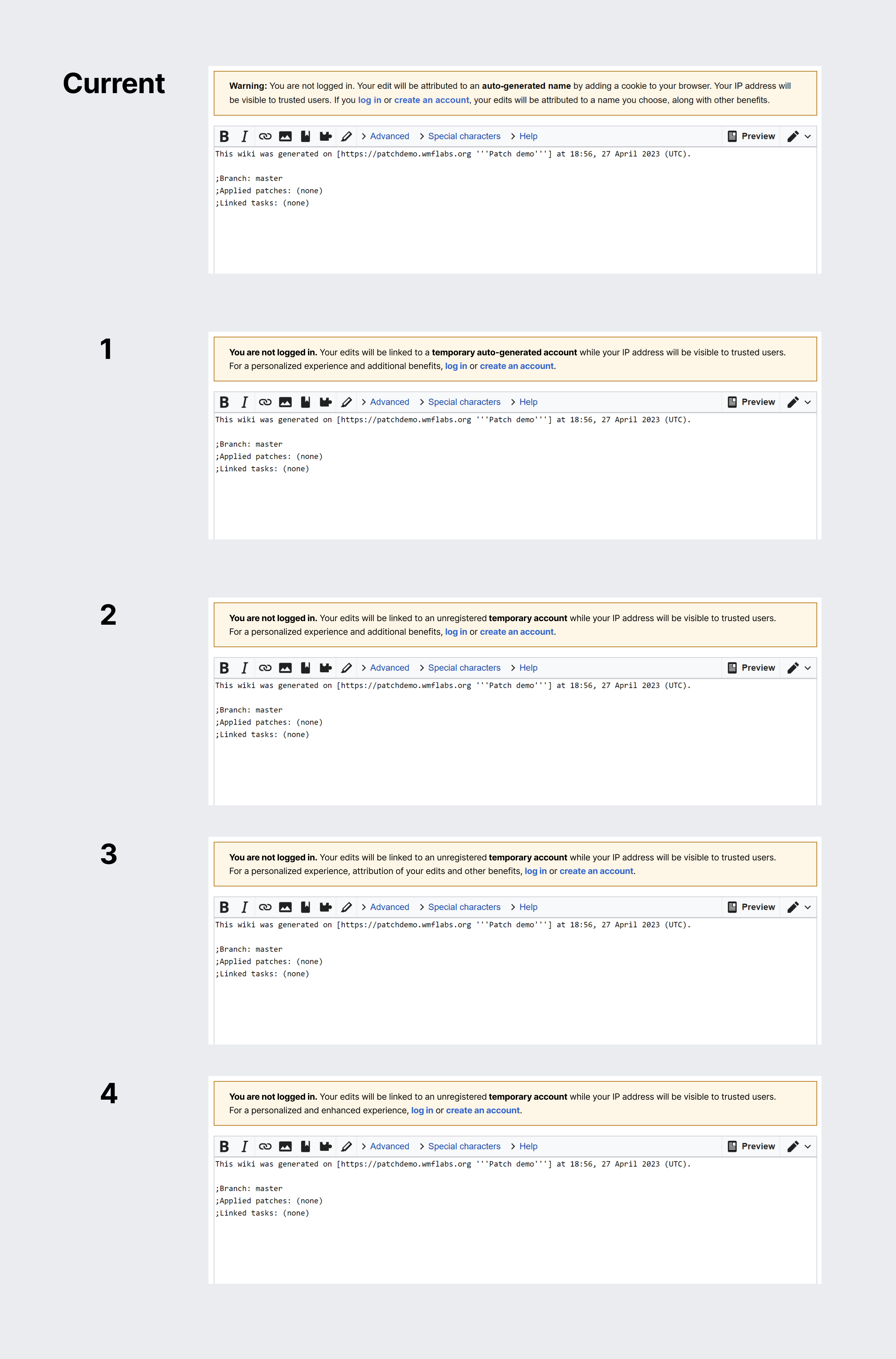
Here are a few options for different UX copies that are being explored – what do you all think?
| Current | Option 1 | Option 2 | Option 3 | Option 4 |
|---|---|---|---|---|
| Warning: You are not logged in. Your edit will be attributed to an auto-generated name by adding a cookie to your browser. Your IP address will be visible to trusted users. If you log in or create an account, your edits will be attributed to a name you choose, along with other benefits. | You are not logged in. Your edits will be linked to a temporary auto-generated account while your IP address will be visible to trusted users. For a personalized experience and additional benefits, log in or create an account. | You are not logged in. Your edits will be linked to an unregistered temporary account while your IP address will be visible to trusted users. For a personalized experience and additional benefits, log in or create an account. | You are not logged in. Your edits will be linked to an unregistered temporary account while your IP address will be visible to trusted users. For a personalized experience, attribution of your edits and other benefits, log in or create an account. | You are not logged in. Your edits will be linked to an unregistered temporary account while your IP address will be visible to trusted users. For a personalized and enhanced experience, log in or create an account. |
Jun 15 2023
@MNeisler I just added the new UX desktop flow to the Miro board for Edit Check Measurement
Jun 12 2023
Jun 8 2023
Jun 7 2023
Mar 15 2023
Feb 25 2023
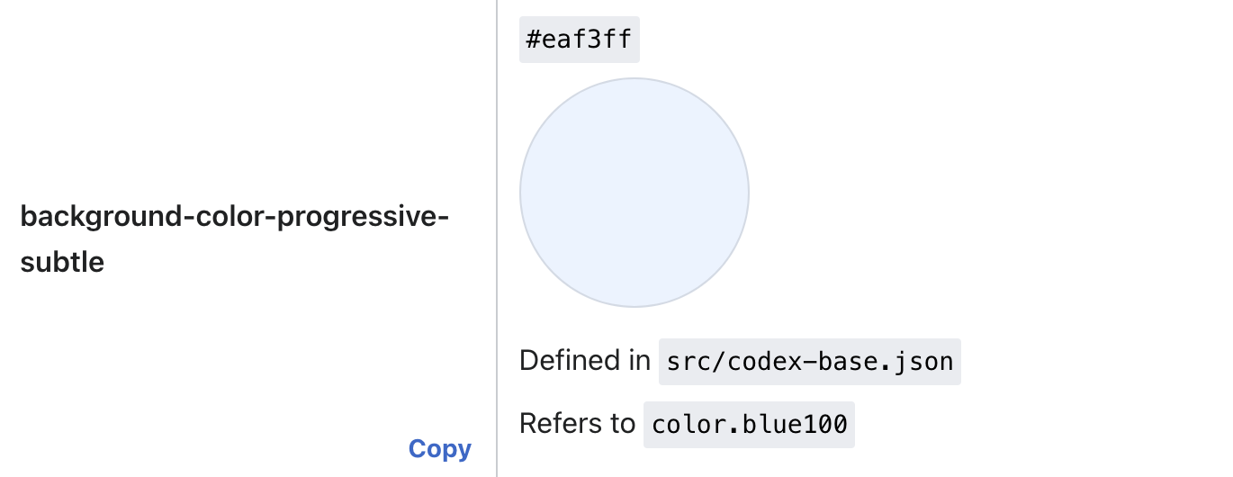
Agreed, the demo looks really nice! Regarding the background color, I believe we should be using #eaf3ff to comply with the design system color tokens – which might already be the case in the patch, the blue looks very similar.
More information can be found in the design system documentation here or below :)
Feb 14 2023
[new exploration] more conversation-like:
Jan 31 2023
Jan 23 2023
Jan 19 2023
Jan 12 2023
The revised scope looks great – I don't imagine the absence of T267444 having an impact on this initial deployment of Page Frame.
Nov 10 2022
Same bug as T320820?
Yes exactly
This looks amazing! 👏
Oct 24 2022
Oct 21 2022
Oct 20 2022
Oct 13 2022
Oct 12 2022
Thanks for the ping @ppelberg and for spotting this @alexhollender_WMF!
I agree with @Esanders: although styled as links, these are buttons so :visited colour doesn't make sense here.
Design QA
Looks great! Two observations:
- The "i" icon looks slightly different than the one on the mock but it's normal – the OOUI icon has been updated since then and the patch demo has the latest one.
- Not directly related to this task but the "add topic" button is missing the talk icon on this patch demo – is it normal since it's Patch Demo or a bug? @Esanders
Sep 13 2022
Great spot @Tacsipacsi thank you for sharing! We won't be working on this right now but it's great to know for the future.
Thanks a lot @bmartinezcalvo for all the context!
Sep 10 2022
Thanks @Esanders Looks great!
Sep 9 2022
Sep 8 2022
The "current spacing" in the original task looks wrong to me: The spacing between the last comment and the next heading is much bigger that it actually is, and as a result your proposed spacing is a large change. I'm not sure we want to make it that large.
Yes exactly that's the discrepancy between Figma and production I was mentioning. I think it'd still be good to have more spacing between the last comment and next heading compared the last patch demo (screenshot below):
@Esanders thanks for the patch demo! I noticed some discrepancies between the original Figma and the patch demo so I adjusted directly on the demo:
Sep 2 2022
Just added the mocks and reviewed the reqs – looks all good. Moving this back to you @ppelberg :)