


How Figma uses Dev Mode to ship high quality features, faster

Learn how the Figma engineering and design teams use Dev Mode
We interviewed Figma’s engineering and design teams to understand how they use variables and Dev Mode to keep design and code in sync, and ultimately ship features faster.
Having a design system available and ensuring adoption allows developers to focus on building product experiences rather than focusing on every UI element, which saves time and allows them to focus on the core product experience for users
Learn how Dev Mode and variables save Figma’s engineering teams time by:
- Automatically keeping design tokens in code and variables in Figma in sync, so that designers and developers are using the most up to date information
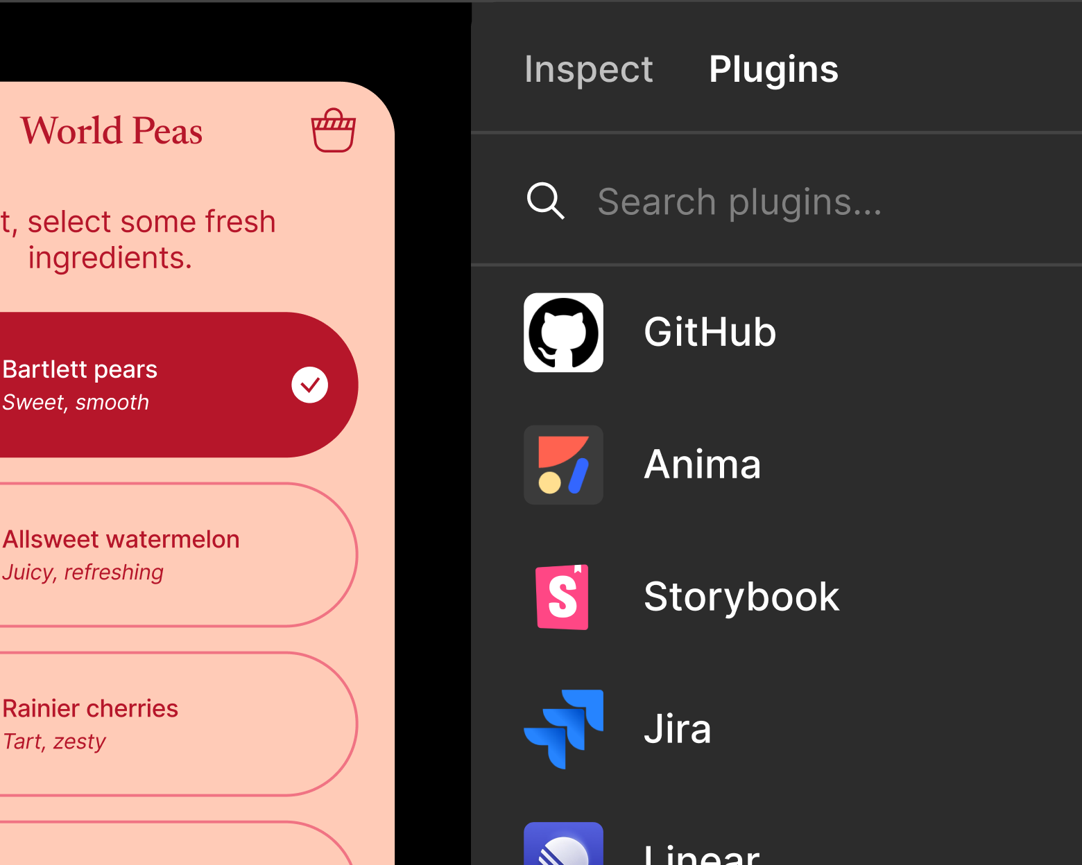
- Surfacing links to Storybook and source code in GitHub, so if there’s a new version of a component in Figma, developers can quickly access documentation for the component and go right to the source code to start editing
- Surfacing variables in the Dev Mode inspect panel, even if a designer forgets to use the correct variables in their design, so that developers don’t accidently hardcode raw values, which is error prone
Who we interviewed:
Josh Ferrell (Engineering), Brian Schlenker (Engineering), Tom Williams (Engineering), Wayne Sun (Designer), Ryhan Hassan (Designer), and Rachel Miller (Manager)
Tell us a little bit about the Figma Design Systems team, and what you do?
Our team builds and maintains the Figma Pattern Library, the internal design system at Figma. Our goal is to make Figma beautiful, accessible, and reliable by crafting high quality UI systems and patterns for Figma’s engineering and design teams.
What are some of the goals of your design system, and why is designer and developer adoption of your design system important?
One of our big efforts with the Figma Pattern Library is to create components that are accessible and compliant with web standards. Something like a tab component needs certain code attributes to tell screen readers what tab has been selected, or that a button is representing a tab. Adoption is critical so that developers are using components that have patterns of accessibility baked into them.
It’s easy in a scaling organization to dismiss building a design system as it’s not directly producing value, but it ends up costing in the long term because there is a cost to developers having to discover which component they need to use, or if they struggle to find it, they may give up and build a new component unnecessarily, even if one already exists.
Having a design system available and ensuring adoption allows developers to focus on building product experiences rather than focusing on every UI element, which saves time and allows them to focus on the core product experience for users.
What are some challenges driving your design systems with developers?
An important aspect of driving design system adoption with developers is ensuring they can easily understand how to implement a design in code using our design system, so being able to give developers quick links to design system documentation, Storybook, or component source code allows them to quickly use the already built components in our design system that have things like performance tests and accessibility tests done against them, which completely match the design, and create a better, more consistent experience for end users.

How are you using Figma variables in your design system, and how do you keep Figma and code in sync?
Our last major project was to convert our color system in our code base to use Figma variables as a source of truth. Previously, all of our colors were in a spreadsheet that designers would have to maintain and then notify a developer that changes were made. A developer would download the sheet as a csv and then run a script against it to generate our tokens CSS file.
Now, we have a GitHub action that automatically gets triggered when a new version of our Figma color library is published.
With that tool, we also ensure that new color variables that are added have code syntax associated with them so developers can get the correct CSS custom property output in Dev Mode.
Want to create a GitHub Action like this for your team? Check out this GitHub repository for a real example of how you can automate syncing tokens and Figma variables.
After we migrated our color system from a spreadsheet, we actually found many instances where colors were out of date. We found over 280 differences, many of which were using the wrong color ramps. So, designers were working on stale information. This can be really frustrating because a developer could feel like, “Well I pulled it from the right spot.” So with us using the Variables API to create our CSS tokens file, we’re able to establish a lot more trust with developers that colors are going to be correct.
Want to automate the process of syncing design tokens and Figma variables? Check out this guide on how to use the Variables API for token syncing.
By linking our code syntax in our variables, we also noticed a reduction in questions that we previously saw of “Which token should I use for this?” Before Dev Mode, a developer may have to do some investigation to figure out what CSS custom property matched a Figma style, which was error prone. Now it’s given to them right in the Dev Mode inspect panel: `var(--color-icon-onbrand)`. No more investigation needed.
What’s been the impact of using Dev Mode with variables?
Currently, we use Dev Mode when working on new components. It automatically associates our Figma variables and CSS custom properties, so we’re able to work much faster by inspecting the component to quickly see, “Oh that’s the border radius token I need to use.”
We’ve also been enjoying the ability to change the units of CSS. A designer may want to work with something like font size in pixels, but on the web, it’s important to use a unit like rem or em in order to allow for users to increase their default browser font sizes and allow the text to scale appropriately. With the ability to set unit scale in Dev Mode, we don’t have to perform that conversion ourselves, and it reduces the amount of times we may have accidentally used pixels for something like height, which is supposed to be in rems in our CSS output.

How do you help devs and designers find design system documentation or other details that might help a developer implement a design in code?
With Dev Mode, we’re able to use dev resources to link components to our Storybook instance, and to the source code in our Github repository. This is useful, not just for developers who may want to see the documentation of a component, but it also gives the design systems development team a quick link to our source code. We haven’t quite seen the full effects of this yet as we’re still linking components as we build them, but I think in the future, it’ll be useful as a historical reference when a new variation of a component is created, because you’d be able to quickly go right to the source code to start editing. It’s especially useful for large codebases where there may be many files called “button.”
What’s been the most valuable aspect of variables in Dev Mode?
Dev Mode and variables really simplified the handoff of design tokens to engineers. Before, there would be a translation of 4px to `var(--spacer-2)` and oftentimes, those spacer tokens wouldn’t get used and 4px would be hard coded. With variable’s code syntax showing in Dev Mode, it’s extremely straightforward for engineers to just grab the correct value.
Easily the most valuable aspect of Dev Mode is the output of CSS values in the inspect panel. Dev Mode is really smart at mapping the correct values, even if a designer forgets to put in the correct variable for something like a spacing token. So, if a designer uses a raw pixel value like 4px for padding , Dev Mode will pick up that there is a corresponding variable for 4px and will show `var(--spacer-2)` in the CSS output in the Inspect Panel. This is really great for new hires because there is little onboarding that needs to happen for them to know not to hard code padding or hex colors. They can grab that value directly from Dev Mode.
To learn more about Dev Mode and variables, check out the Help Center.