


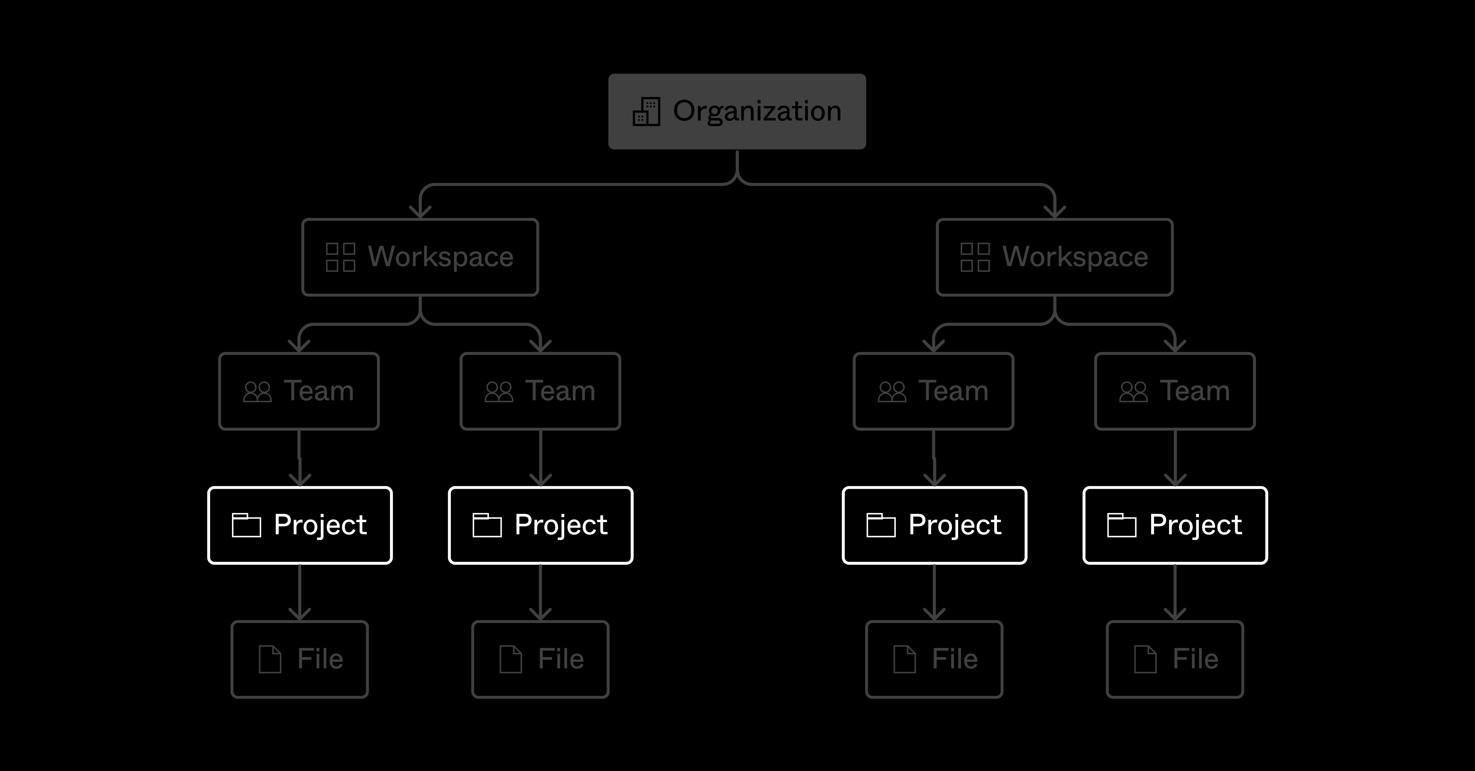
Team, project, and file organization

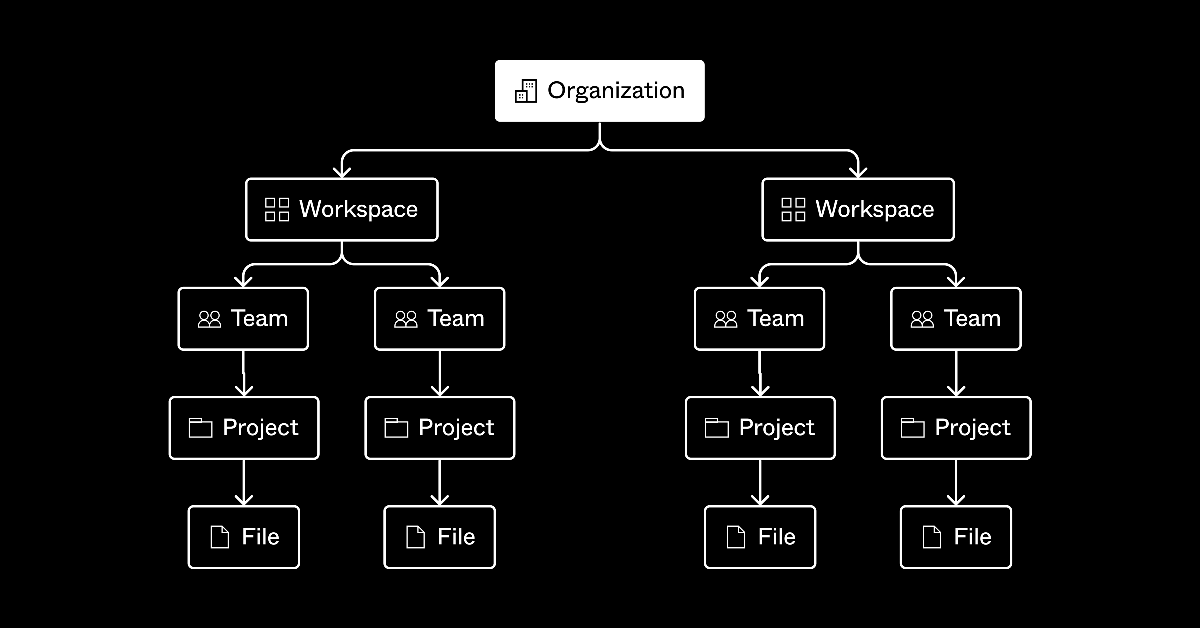
The way you structure and present work can make or break your ability to map towards broader goals, stay on the same page, and even know where to find the latest version of a design.
Registration-flow-v1-final10.jpg, anyone?
It’s also the key to alignment, not only within your team, but also with your cross-functional partners. While we all strive for a well-organized structure to match our pixel-perfect designs, it can be tough to figure out where to start, how to maintain your system, and what works best for your team.
In this guide, you'll find a few different approaches for how to organize your teams, projects, and files within Figma.
Here's what you can expect:
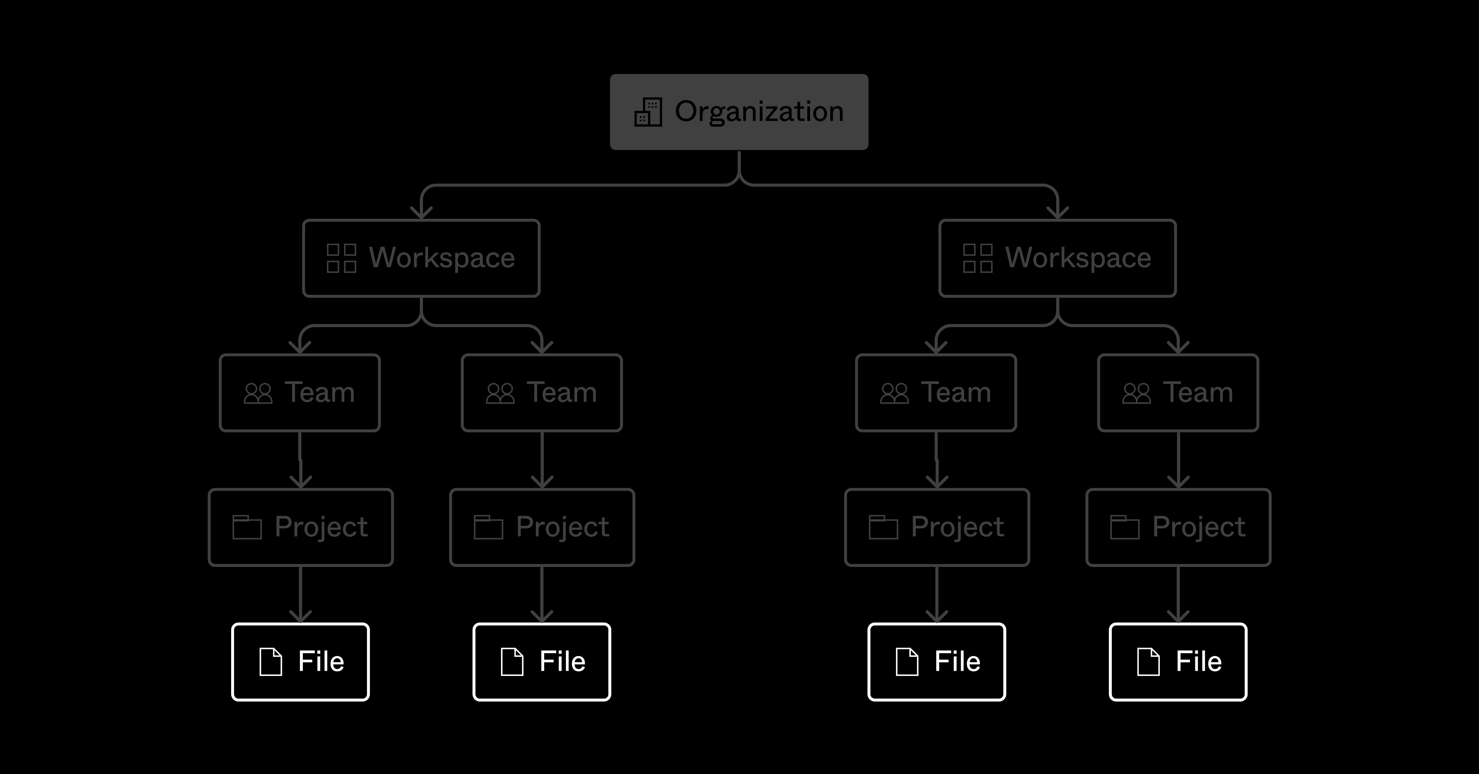
How to structure teams in Figma

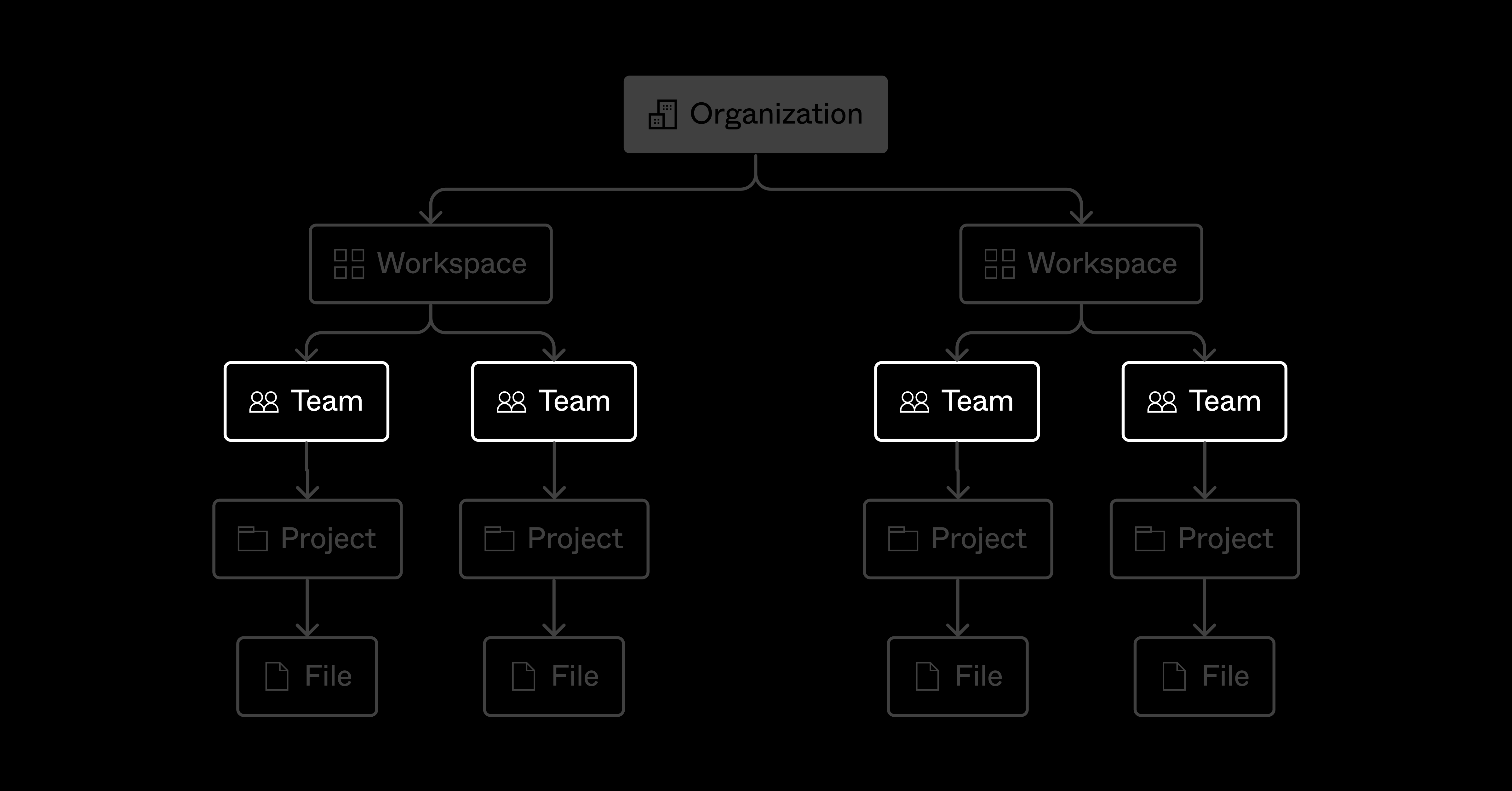
Within Figma, teams can have three types of permissions: open, closed, and secret.
Open is a fully transparent team that anyone in your organization can join at any time. This is best for most situations, and encourages an open design culture.
Closed requires a request from your colleagues before they can join, which is ideal if you want to limit who’s making updates to your designs.
Secret teams are exactly that, as they prevent your entire organization from seeing what you’re working on; only the team creator and editors have access… perfect for that surprise project you’re cooking up.
Despite being called teams, these permission types can be a great way to separate workstreams within your organization. If you don’t know where to start, try setting up teams in Figma by mirroring your product team’s structure. For example, your organization might be split into platforms, like web, iOS, and Android—all guided by an overarching design system. By allowing your different disciplines to work independently within their own Figma space, you can operate as transparently as you need. If, say, the iOS team requires the creation of a secret team while the next version of the product is being released, that can be managed independently from the rest of your Figma teams.
Teams can also be useful for larger groups that look after separate, more complex projects. At Figma, we’ve set up teams for each part of our product, like prototyping, design systems, collaboration, and so on. This encourages a workflow in which our central design system is consumed by different product teams that all share our Figma components and styles library.
Before diving into approaches, it’s helpful to think about what the “day to day” of a designer on your team looks like. Can they achieve most of their responsibilities in one or two teams within Figma? Would a new designer joining the team be able to understand your Figma structure at a glance, or would it require training?
Simplicity is your friend here.
Within your organization, create a separate team for your design system—or set of Figma libraries—with its own unique project, file, and permissions structure. Splitting it out into a separate team can help you frame it as a distinct workstream, handled independently by a subset of the team. If you'd like a simple structure to get started, check out this community file; this one is more in-depth.
A separate team allows you to manage individual edit and view access on the work inside of your design system, whether that’s at the team, project, file, or even branch level. This extra layer of organization gives you the flexibility to use projects for organizing your system, too. Once you create a separate team for your design system, there are four different approaches to choose from.
Note: It’s still possible for different teams to use different design systems. Take a look at our help center article covering library permissions.
By lines of business
Structuring teams by lines of business is best for umbrella companies where designers are responsible for particular products

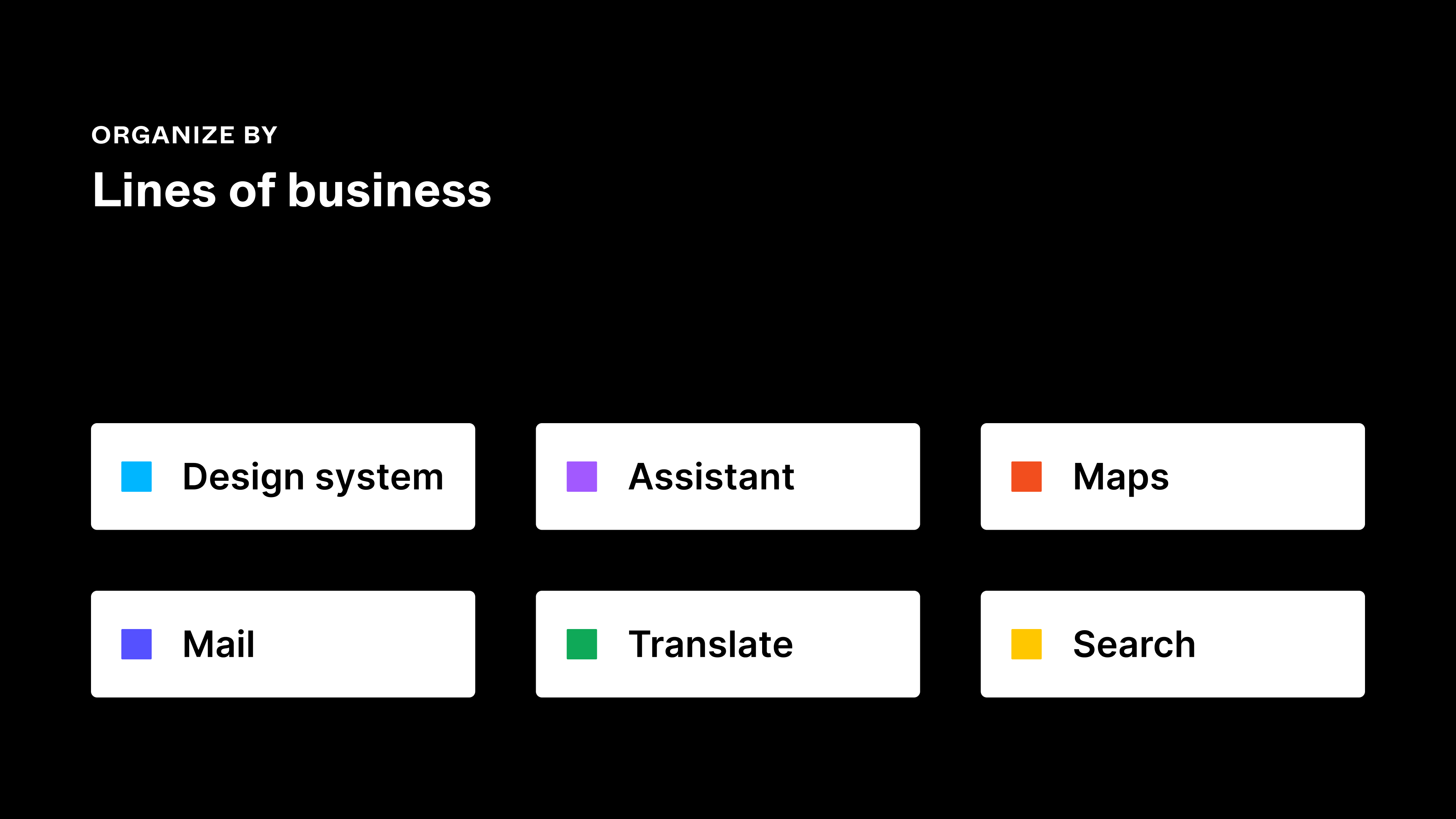
For larger companies with a portfolio of sub-businesses or products, creating teams for each is the way to go. This approach will allow you to manage permissions for specific lines of business, with the flexibility of inviting stakeholders into multiple teams (or projects within teams) as needed.
For example, a company like Alphabet might want to create a different team within Figma for each of their businesses, say, Google Maps, Gmail, and Search. By mapping the structure to each area of their business, designers can be responsible for delivering work specific to their own workstreams, create libraries unique to the style of their team, and invite key stakeholders to the correct areas of Figma.
As you can imagine, at this scale, you may end up needing to split your work down even further to stay on top of all the features you’re designing. This is where prefixes come in handy. For example, by adding iOS to the start of your teams, you can more easily search within Figma and surface all the teams responsible for working specifically on this platform.

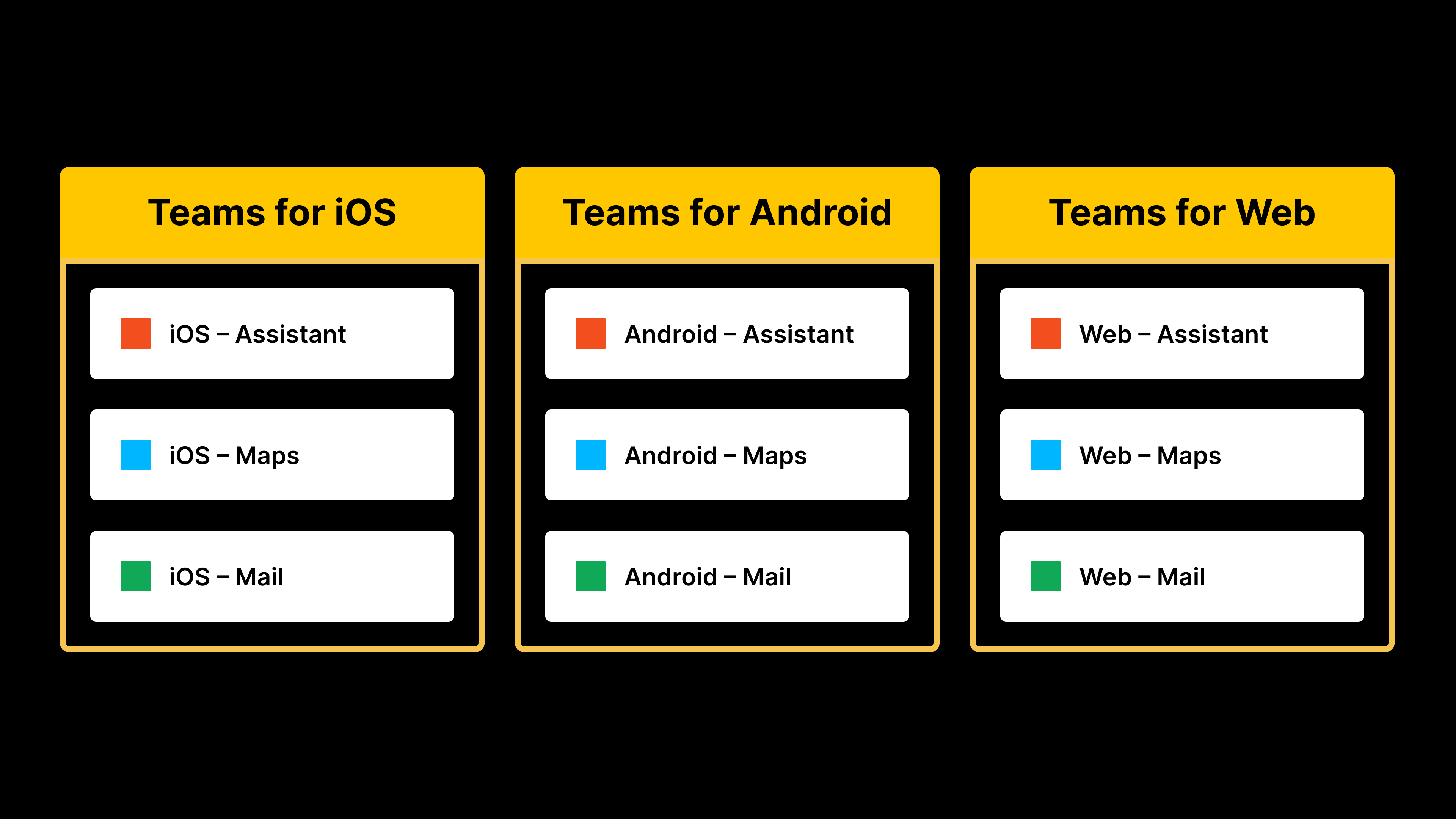
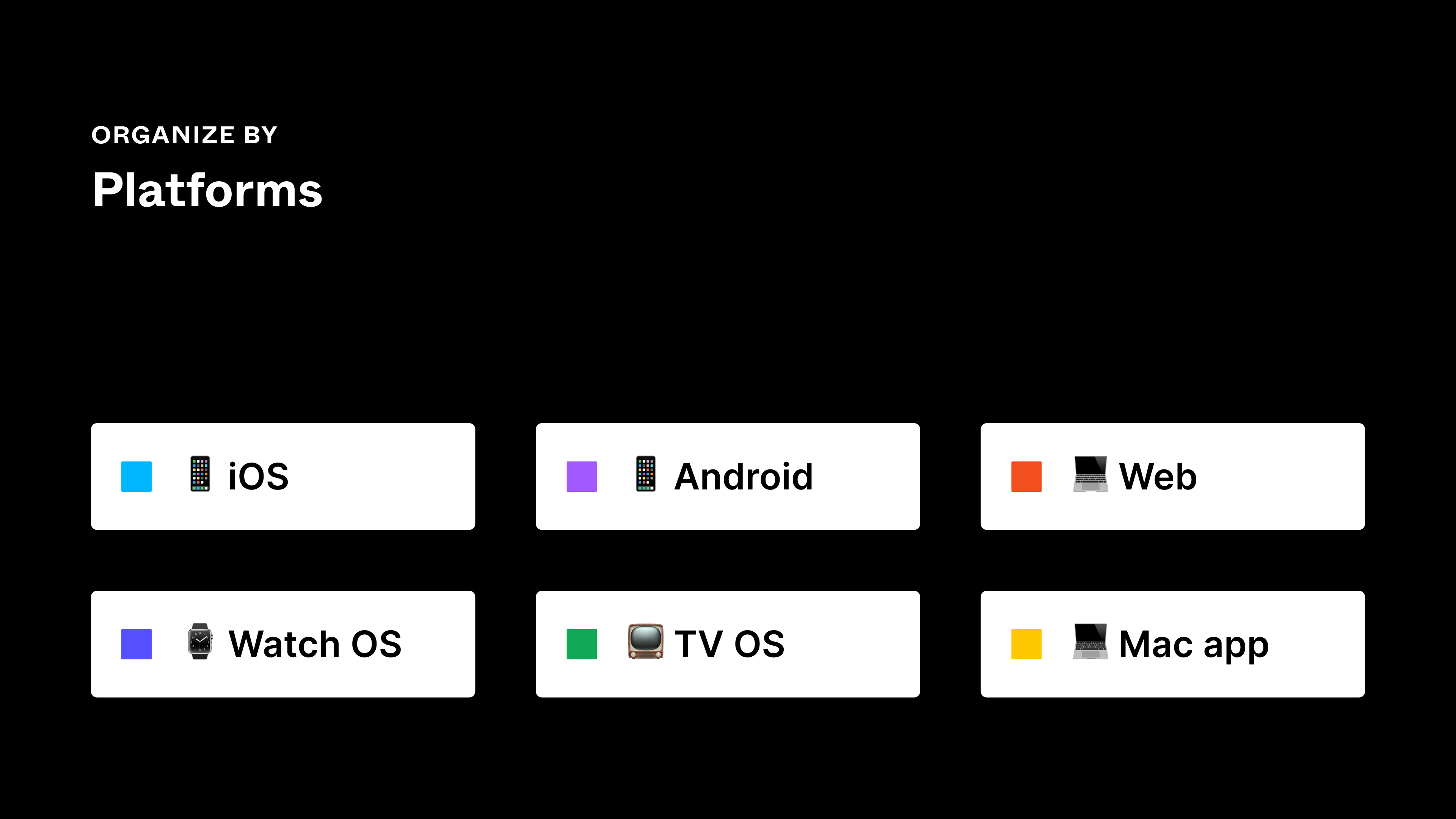
By platforms
Structuring teams by platforms is best for independent teams who work on specific operating systems

This approach is best if you’re a design team that typically focuses on one platform. Or, if your engineering team is split into platform-specific groups, you may organically land here as you map designs to team structure.
Start by creating an individual team for each operating system, like iOS, Android, and web. If you have multiple apps or websites, those should be separate teams as well. This approach allows you to group those systems into very intentional project work and keep everything siloed just enough so that new team members and stakeholders can quickly see how the work maps to product.
Like the previous approach, if you need to create smaller teams within this structure, you can prefix them with a name to aid discoverability. If you work in a large product team where each platform is split into multiple workstreams, products, or features, you might consider creating “sub” teams. In this instance, you’d use a platform prefix on team names, followed by the product feature that your team is working on to make sure that they are easily discoverable via Figma search.


By initiatives
Structuring teams by initiatives is best for product teams grouped by feature

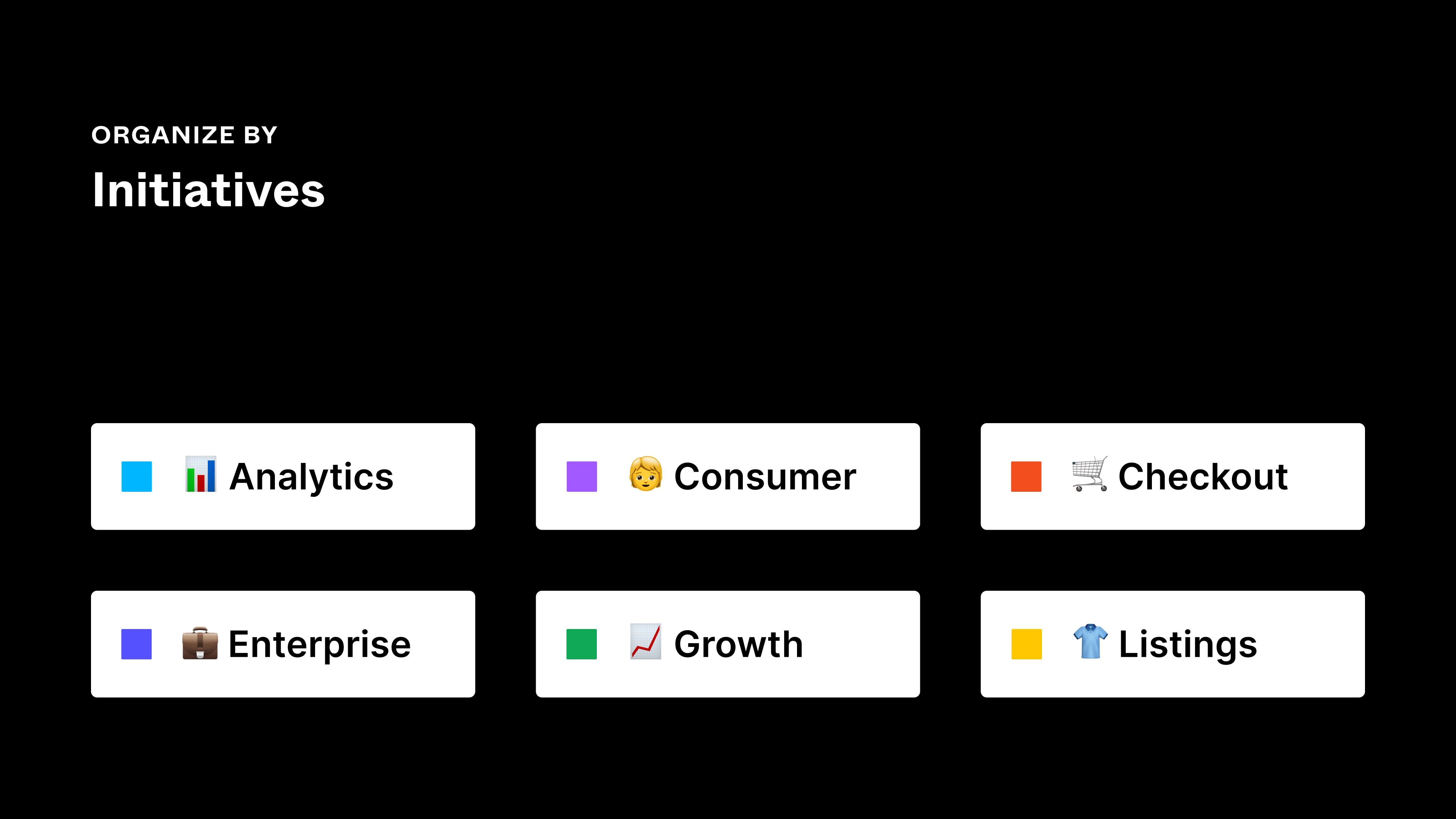
Initiatives are similar to the popular “squad model,” which is based on cross-functional product teams. (The Spotify team created an excellent Figma Community file that takes you through their entire process using this model, and I highly recommend a read.) If you’re working within an agile project, it functions just like a large feature or epic.
For teams that work on long projects—like consultancies, agencies, or annual release software products—you’ll probably be spending time in one Figma space for six to twelve months at a time. This requires an approach that’s semi-permanent, while flexible enough to be situated within a larger product team and organization.
If this is you, map teams to your internal epics or long-term initiatives. Perhaps you’re embarking on a major onboarding feature release that will significantly impact the user flow—this would be a perfect time to create a team. Or, say you’re introducing a notifications feature to your app—this would warrant an approach that’s larger than a team for an individual feature, but smaller than one for a platform or operating system.
As you can imagine, this approach involves creating more teams as your products mature, which will require governance from an admin perspective. If this is the case, align team names to the nomenclature that you use across the business for each area of the product, abbreviating them as needed. For example, in the team name, “Checkout” would be “Checkout,” “Product Landing Page (PLP)” would be “PLP,” and “Growth Marketing” could be consolidated to “Growth,” to make team names as scannable as possible. This is a good opportunity to align across the product and design teams to ensure everyone is aware of the correct naming conventions.
This approach is ideal for globally-distributed teams, with work that can be split down to building block, feature level. On the surface, admins can track the features that designers are actively working on as they transition through the design pipeline, with visibility over each release. Additionally, with this approach you may find it easier to track a designer’s allocation from your Figma admin panel. Is one designer working across multiple teams at the same time? They might be stretched and need help!
By pillars
Structuring teams by pillars is best for companies with distinct features that fall under one product offering

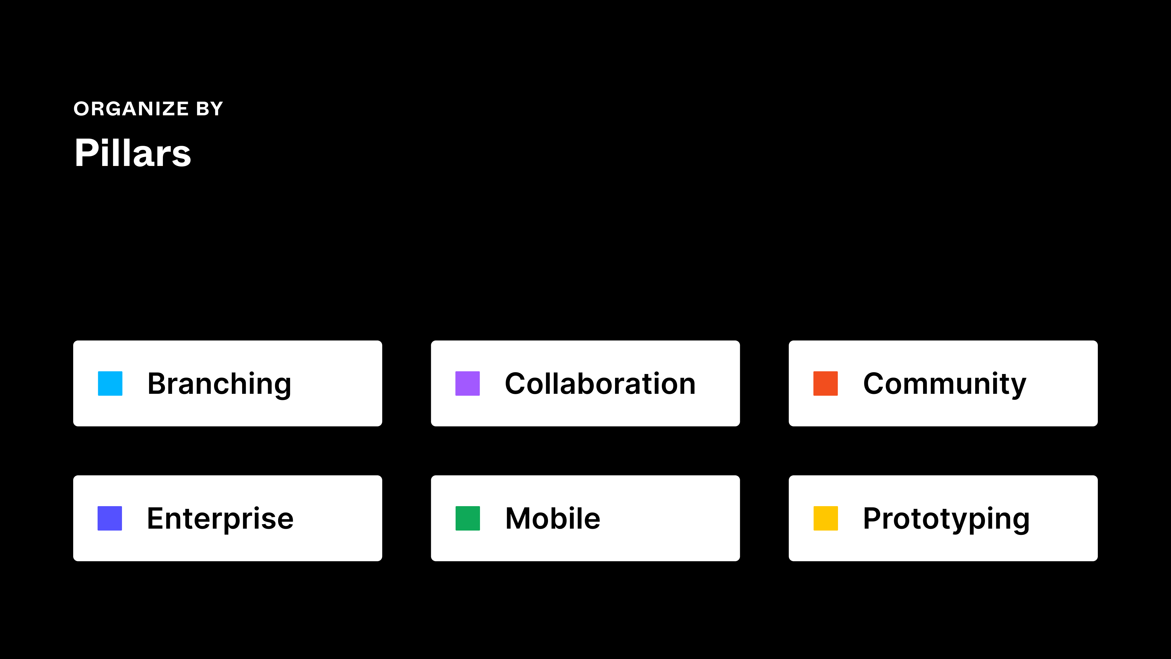
This approach is how we at Figma structure our teams! It’s great for companies that build and hire for specific feature development. For example, a cross-functional working group built branching in Figma, so we have a dedicated team for that pillar. Similarly, our prototyping team has their own space within Figma to work on new feature updates.
This differs from the lines of business approach in that this method isn’t for separate products that are sold independently; it works for teams that still fall under the same product offering. If you’re billing separately for your individual product areas, it may make sense to look at the guidance around adding prefixes.
By scale
How you structure your team should depend on the size and scale of your organization
While there’s nothing stopping you from inviting 100 editors into a team, that could cause issues with keeping your work consistently organized and structured, and flowing through the design process. Creating smaller teams that are responsible for specific areas of the product allows you to be more nimble, while setting a strong foundation as you scale.
How many editors should a team have? Try to think about editors as you would guests around a dinner table. Just as there’s a limit to how many people would comfortably be able to contribute to a dinner party conversation around one table, there are only so many designers who can seamlessly contribute to a piece of design as editors within Figma.
Similarly, it might be useful to follow the Jeff Bezos “two pizza rule” when it comes to team size. Would two pizzas be sufficient to feed the editors on your team? If the answer is no, break the team up into smaller ones.
While you should be thoughtful about the number of editors in your team, be liberal about adding viewers—there's no limit on those, and having them fosters an open and transparent design culture. That might mean inviting all of your designers to your design system team as viewers, so they can take a look at library files when they need to, rather than requesting access each time they view a component. Think about including developers and other design-adjacent colleagues too, the more the merrier when it comes to viewing our design work.
If you’d like to plan your own team structure, we have a FigJam template to get you started.
Tips for organizing projects in Figma

Projects live within teams, and you can create an unlimited amount of them if you’re on the Professional, Organization, or Enterprise plans. This provides an enormous amount of flexibility to scale design operations in a way that works for you. You can then describe the files within each project so that your collaborators have project context and understand what goes where.
Of the many ways that you can organize projects, these are the three approaches that we’ve seen work best:
- Projects for each product surface
- Projects for each feature or production state
- Projects for each stage of your design process
Here’s a high-level breakdown:

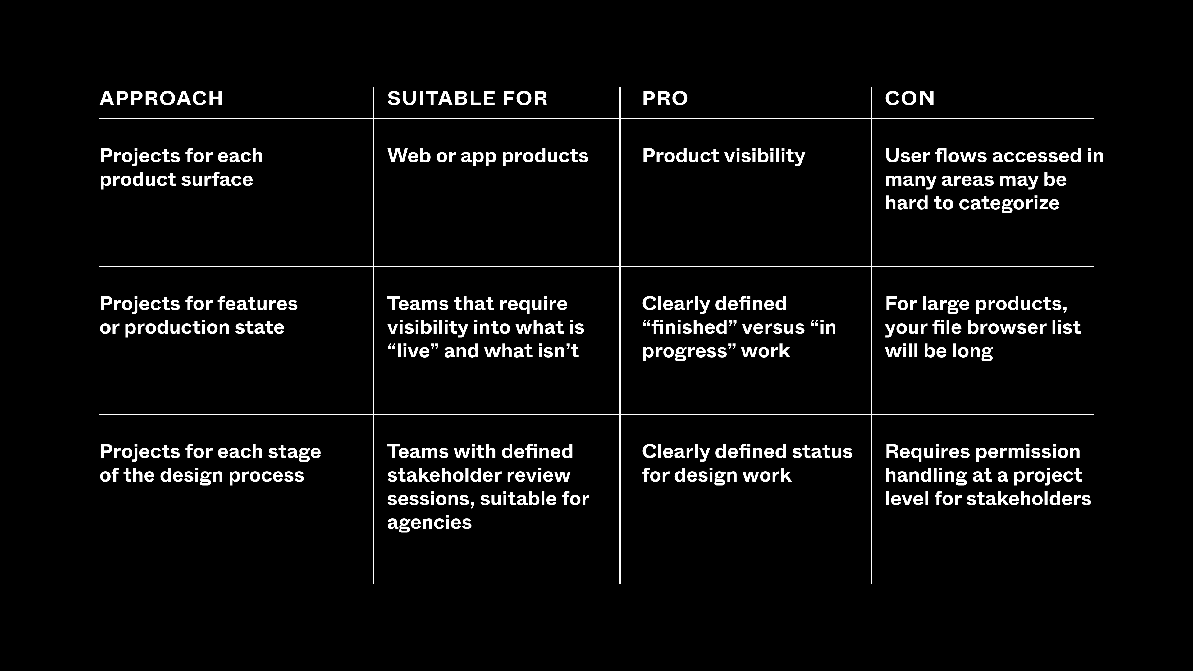
By product surface
Organizing by product surface is best for web apps or products

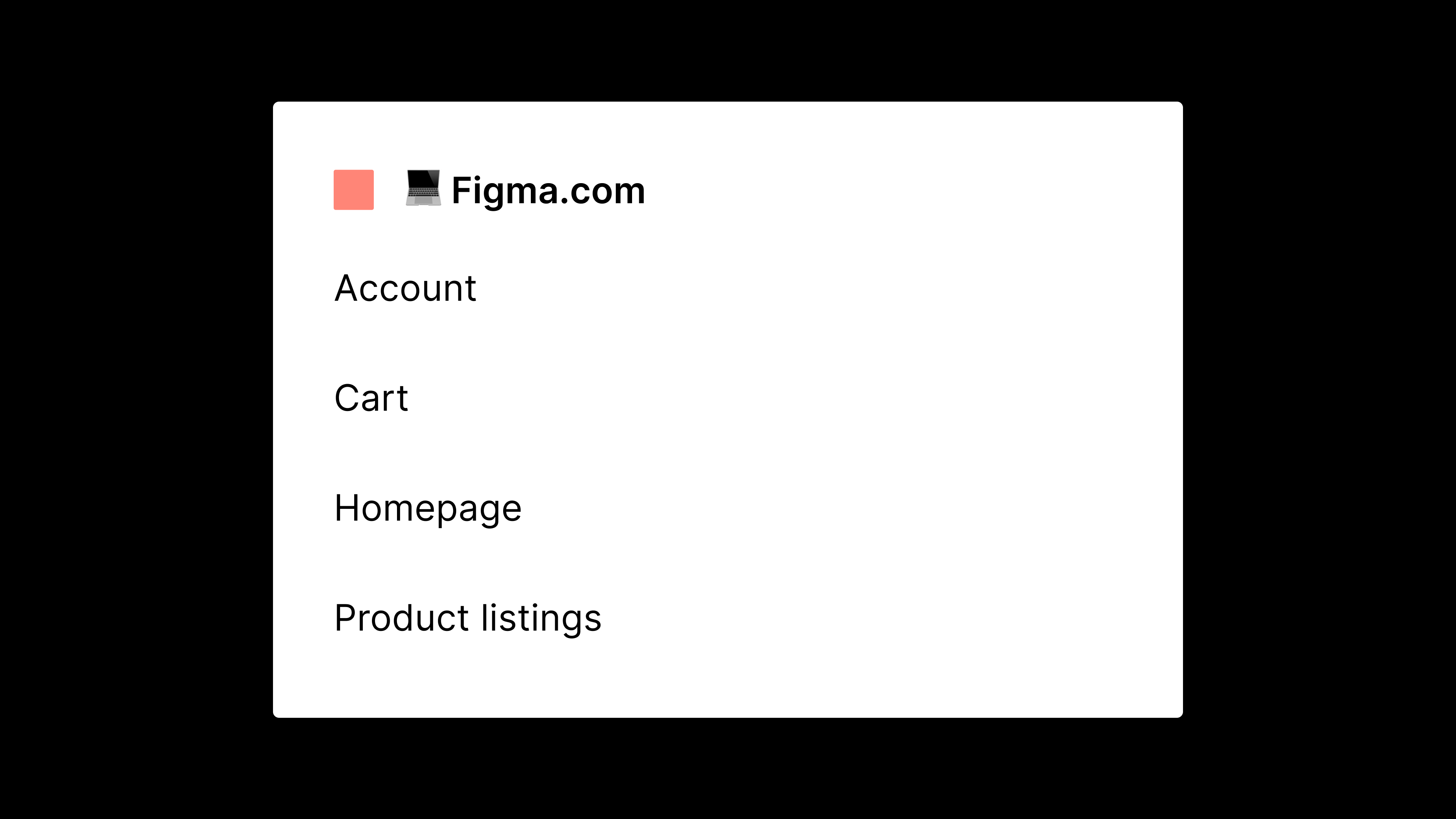
This works best with an example. If you’re building an e-commerce website, you might have the following sections:
- Account
- Cart
- Homepage
- Product listings
From there, you can drill down even more and start projects for each logical user flow or section—like Account, Profile, Products, and Purchase. This allows you to create files that have the perfect amount of context, so that designers can focus on solving the relevant problems without the distractions that come with a larger, more complex file. Designers can also perform user testing on, and contribute to, end-to-end processes within the application without being too concerned with irrelevant user flows.
For cross-functional projects, splitting your work into more manageable chunks also helps localization experts or copywriters focus on individual releases, rather than trying to solve entire user flows in one swoop.
If you just want to move fast and get started, start with this approach—it’s the easiest framework to build on.
Note: This is a perfect time to bring branching into your workflow to manage files. See branching in practice here.
By feature or production state
Organizing by production state is best for teams that require visibility into what's "live" and what isn't

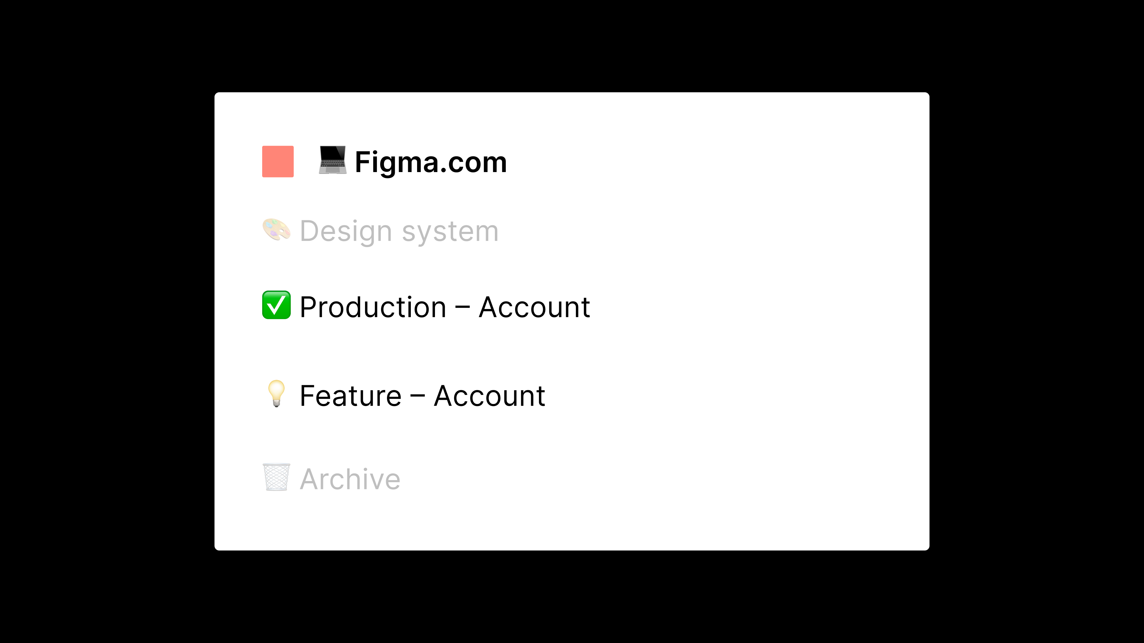
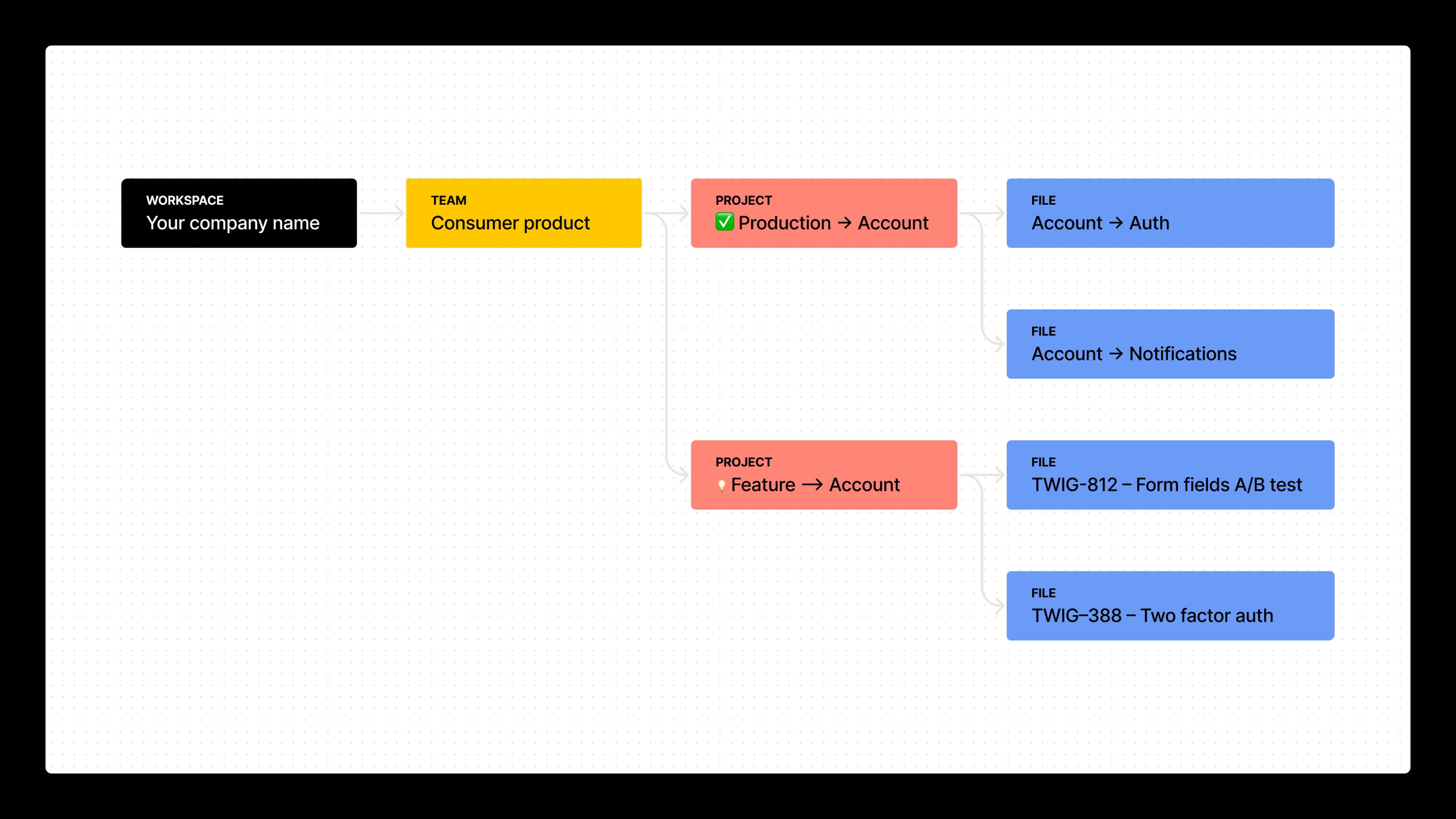
This is useful if you want to create a more transparent approach to sharing the status of a feature. For example, if you manage permission access to files on a project basis, or you aren’t using branches to manage workflows, you can create projects for each product’s user flows. Then, you can split these further into work that is “production” (designed, signed off, and developed) and work that is a “feature” (currently in progress).
So, what does that look like in practice?
Inside “Production“ projects, you might have a complete, approved user flow (or multiple flows, depending on product scope). Anything that is live on the app, website, or product would live here. You might update it on a regular cadence that maps to how you release work, perhaps monthly or quarterly, depending on the complexity of your product.
Inside “Feature” projects, you might house smaller feature files so that each design task has a dedicated file.
There are a few reasons why this is easier than working inside of a main user flow file:
- It prevents confusion about which screens are old and which are new, allowing you to get work through the design pipeline a lot faster.
- It reduces the possibility for file bloat, which can be distracting.
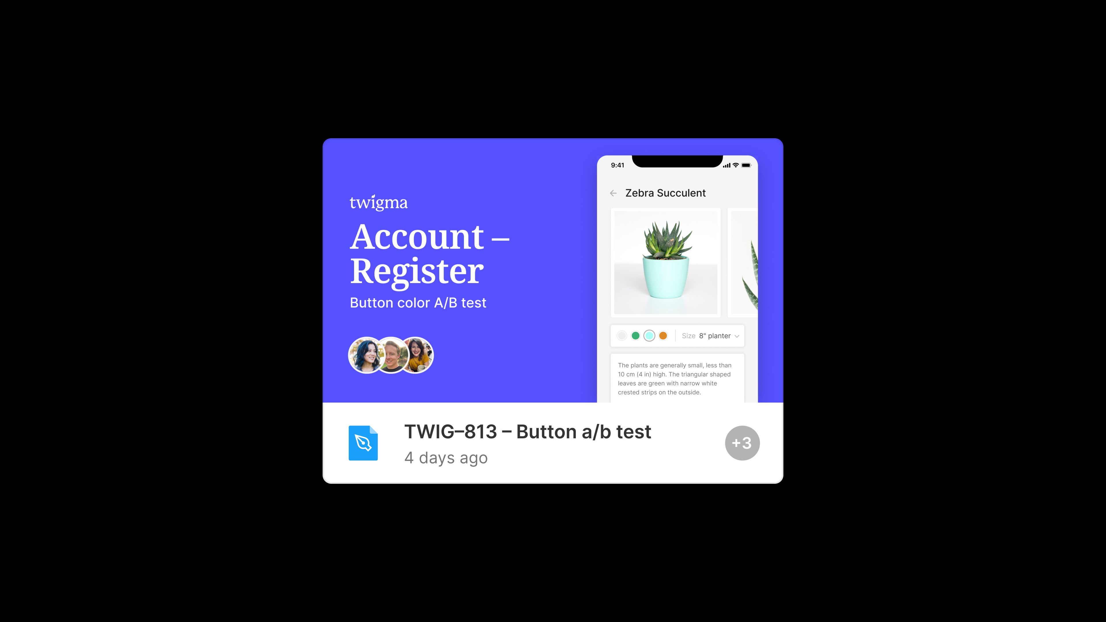
- If you’re using project management software, it’s easier to name files by the ticket you’re working on. For example, if you want to A/B test the display of a button, you’d name a file to match the ticket, like TWIG–813 – Button a/b test.
This community file shows you what the workflow would look like.
Note: You could also use branching instead of creating brand new files for ticket workflows in project management tools.

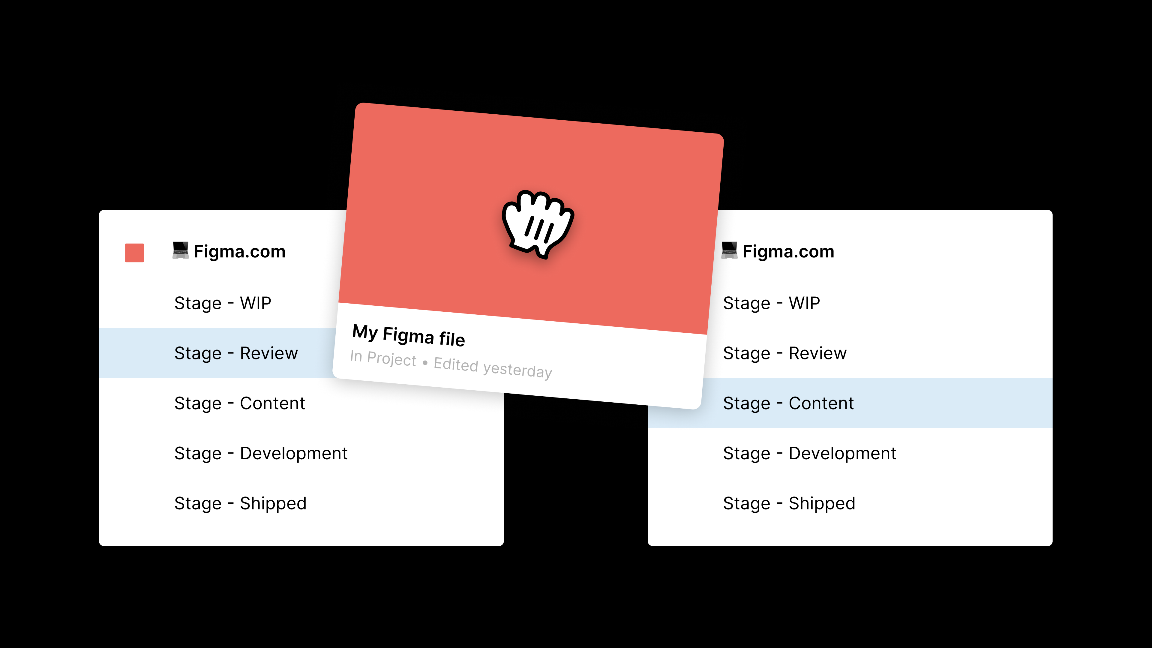
By stage of design process
Organizing by stage of design process is best for teams like agencies, who have defined stakeholder review sessions

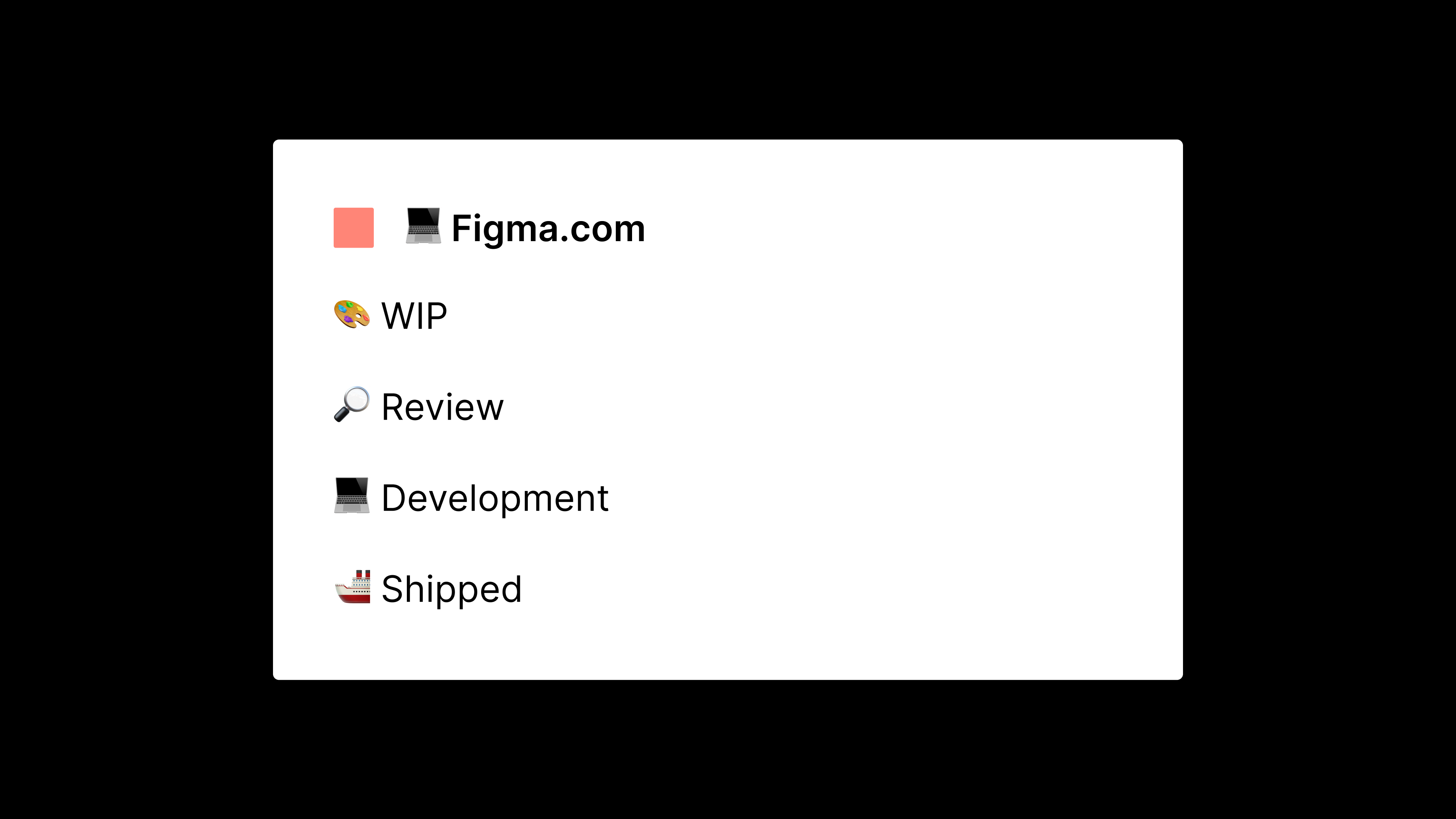
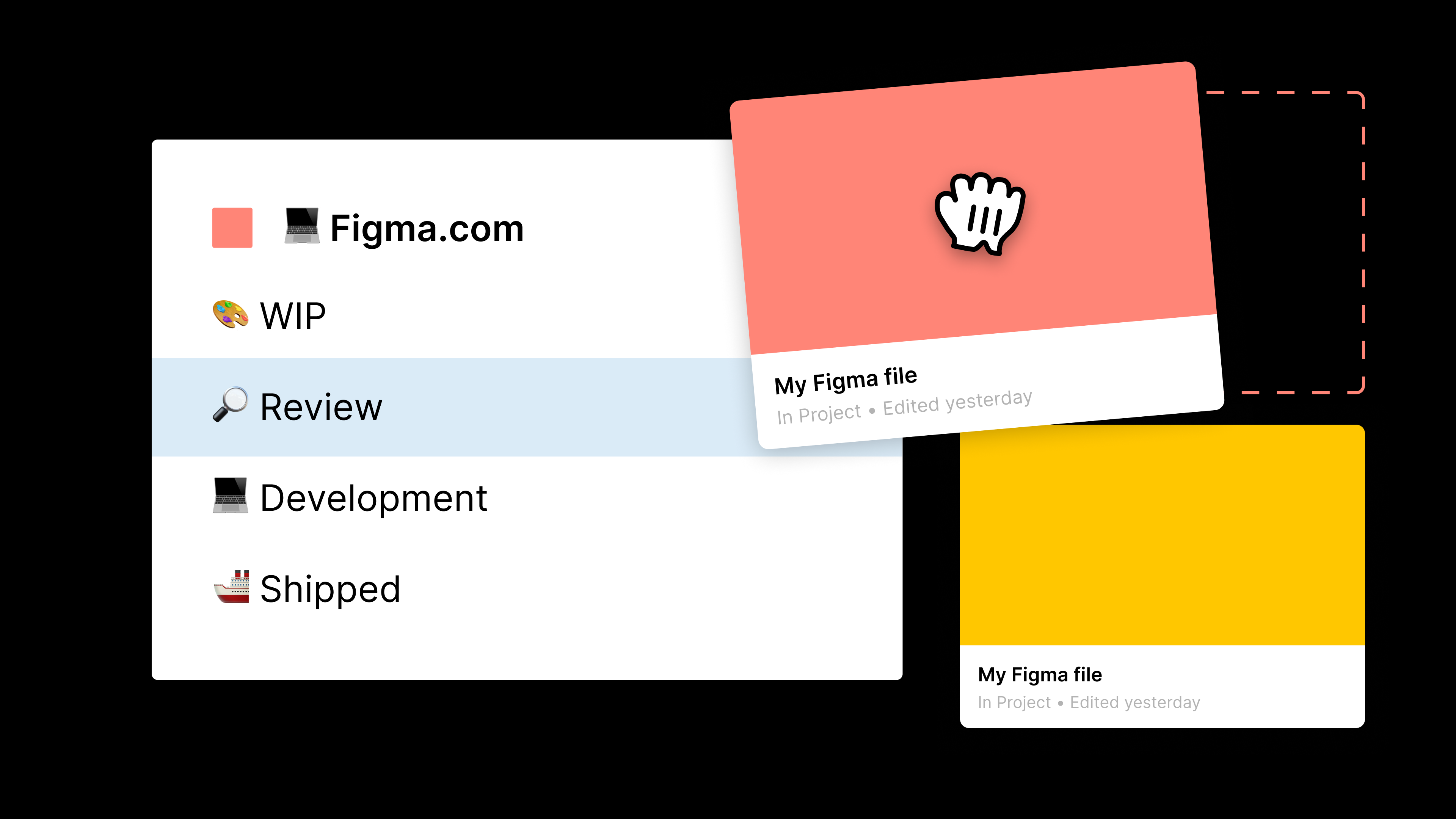
This method requires a different project for each stage of the design process that your internal team aligns to, which is helpful for stakeholder management. The following stages are a good starting point:
- WIP
- Review
- Development
- Shipped
From here, you can split up the design process and build on top of it if needed. For example, you might need a stage for external stakeholder review, or for copywriters to see the work and make copy suggestions.
Note: You can also use FigJam for stakeholder review, which you can learn all about in our FigJam best practice guide.
Within these projects, you can create files as normal and then drag and drop them into other projects in the file browser. It’s a great Easter egg—once you find it, you’ll start to love the power.

There is the additional benefit here of having project-level permissions. You can invite individuals to projects, which creates an extra level of control over what people see in your designs. For example, if you want developers to only see files when they are in the Shipped project, you can do that.
Best practices for any structure
Once you've chosen the right approach for you and your team, there are a few tips that apply to any situation.
Creating a project for your user journey
Create a project that houses your full end-to-end user flow within your product, or at least the section of the product you’re responsible for.
Why? Whether it’s from your VP of Product, developer, sales manager, or CEO, someone will always require an up-to-date flow to demo the product externally. Keeping a current full user flow for each section of your product (or the entire product, if small enough) allows the wider business to quickly glance at the current state of the product. You can update it quarterly, to ensure that all the latest features are included in product demonstrations and client prototypes.
Plus, having one main space (whether that’s a team or project) with your signed off and “live” work means that you can keep everything that’s live in one consistent place, reducing confusion for non-design stakeholders about where all of your perfect pixels live.
Note: For this workflow, it’s best to align on a governance procedure for managing how work transitions from one place to another. This may be a quarterly “quality day,” where team admins from each "source of truth” team move the work you’ve created. Getting on the same page about these norms leads to more consistent and scalable work.
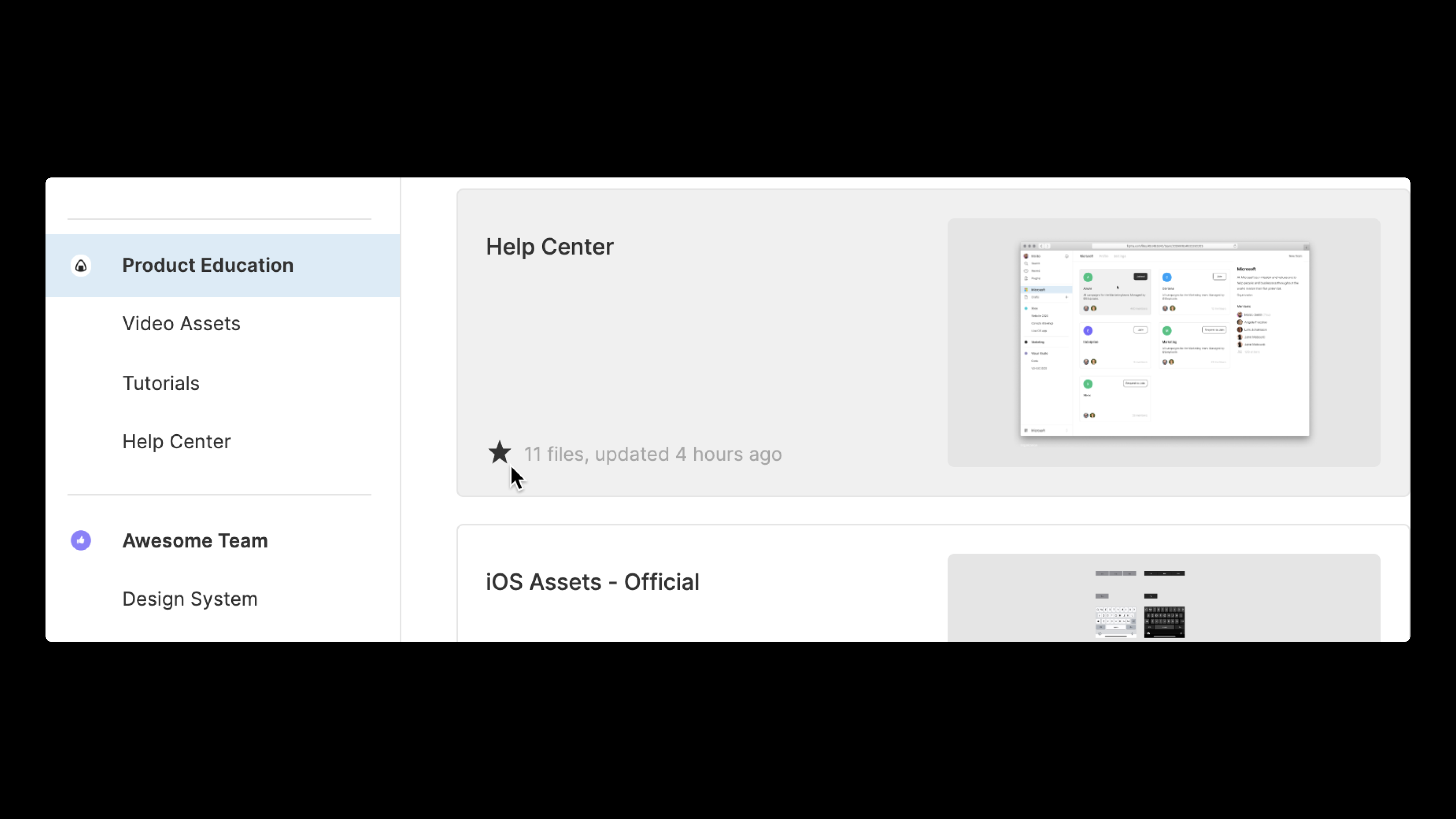
Favoriting projects
To keep projects fixed within our sidebar, you can “favorite” them; you can reverse this at any time, which is perfect for when you want to temporarily keep something sticky while you work.

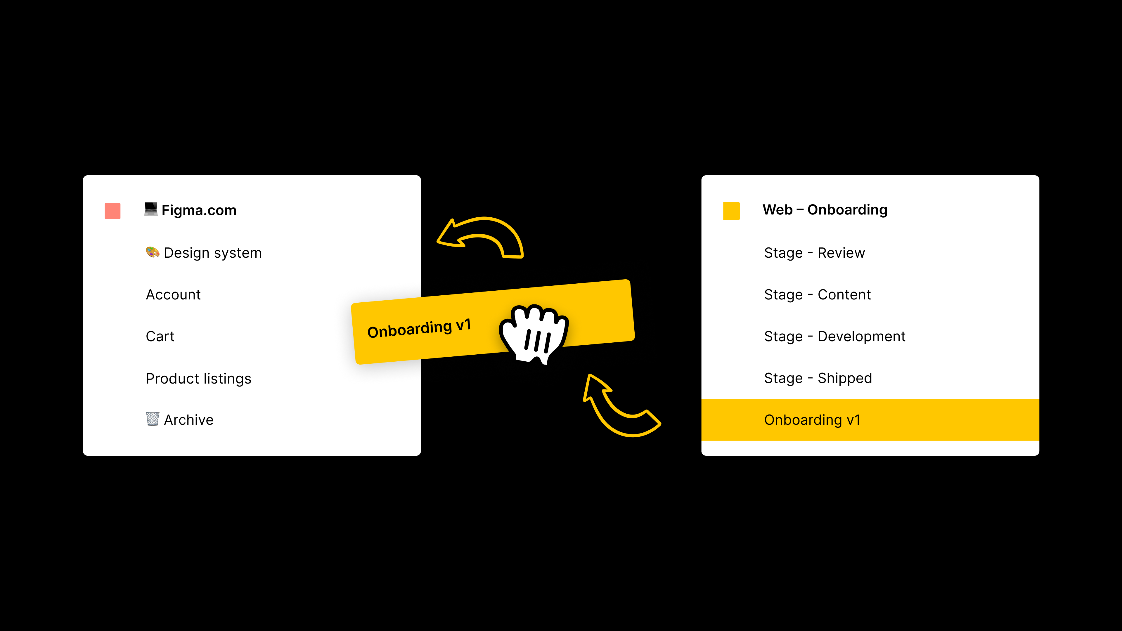
Moving projects
Even though projects live within teams, you can move them to other teams by dragging and dropping. Bear in mind that if you move a project to a new team, file permissions within the project may change.

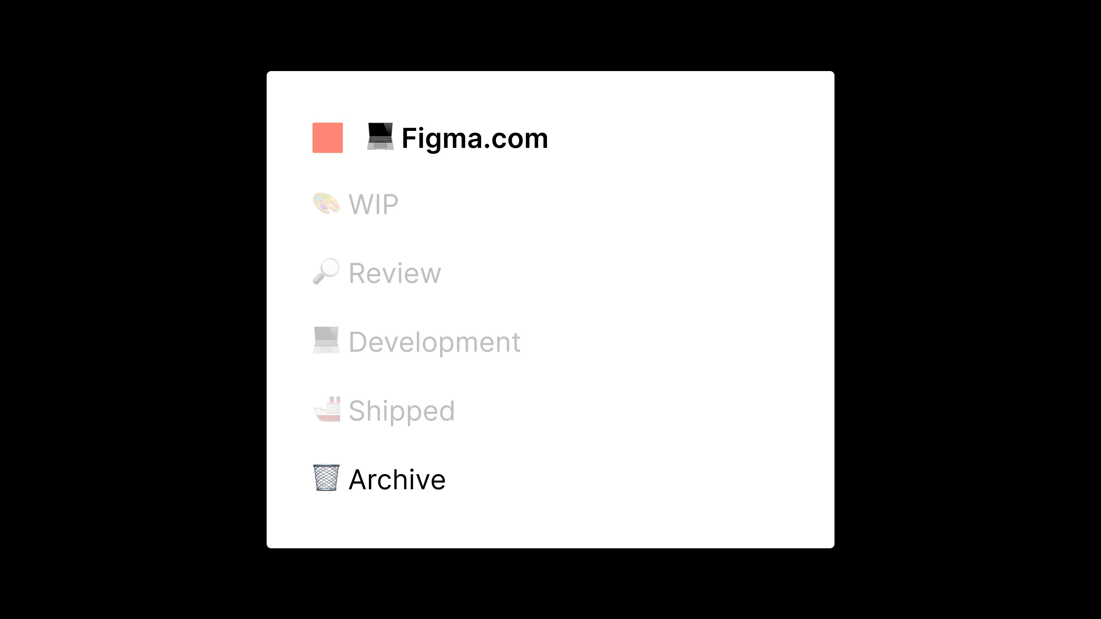
Archiving work
As you create more and more files, organizing and managing their location should be top of mind. The simplest thing to do here is to create a project called Archive (bonus points for adding a trash emoji in the name).
The most effective way to manage the archive is to drag and drop files into the project once they have passed internal review and been either shipped to products, or the work has been copied back into our main user flows.

You could create an entire team called Archive, with projects within that for each area of your product, but that’s probably overkill for most teams.
Testing
With unlimited possibilities comes more responsibility (that’s how the saying goes, right?), and this is where testing comes in handy. Try out one of the approaches here and see how it lands with your team. You may find that you end up with a mixture of all of the ideas, or even something brand new. In which case, I'd love to hear about it!
Best practices for managing file organization in Figma

Once your teams and projects are set up for success, you can create a file structure that’ll make your design process feel as smooth as butter. That’s one step closer to the fun part—actually designing interfaces in Figma.
To recap: Within teams, there are projects, and within projects, there are files. Similar to teams and projects, you have the ability to create an unlimited amount of files within the Professional, Organization, and Enterprise plans, so go wild!
This freedom means a lot of flexibility, which is why a robust file structure that’s consistent across your organization can help you ship products faster. Since files aren’t tied to individual projects, you can drag and drop them into any project, which is useful if you want to match them to a workflow-based project structure.

Size
When teams migrate to Figma, many of them have one file that includes the entire design process, with multiple iterations and versions. While it’s tempting (and often convenient) to include an entire product within one file, try to keep files as small and nimble as possible. There are of course exceptions to the rule, though! If this is your workflow and you have a larger file, make sure to create a new file or branch for every feature update. This way, you can focus on the work at hand, rather than being confused by other, older design work that doesn't require an iterative update.
While you have your main user flow in one file, and iterative updates in others (or a branch), it makes sense to introduce a process whereby this newer work is “merged” back into the main flow. In order to maintain consistency and efficiency, this makes sense as a collective process either once per month, or once per quarter if you have a larger team with lots of moving parts. This larger file (or files) should live in a separate project, and you can then move smaller files into an Archive project to keep file management as clean as possible, as we covered in the projects section.
If you’re looking to archive work within files that have a longer shelf life, check out this workflow.
Naming
Who remembers the days of Account–Auth–v3.01–final2–copy-edits.png? It still gives me nightmares today.
When it comes to naming, there’s nothing wrong with being descriptive—if it’s easier to find, it’s easier to design. A descriptive name, just like a semantically named component, significantly aids the discoverability of our work. It’s just a matter of establishing a clear, repeatable naming convention, so you avoid verbose (and difficult to maintain) file names.
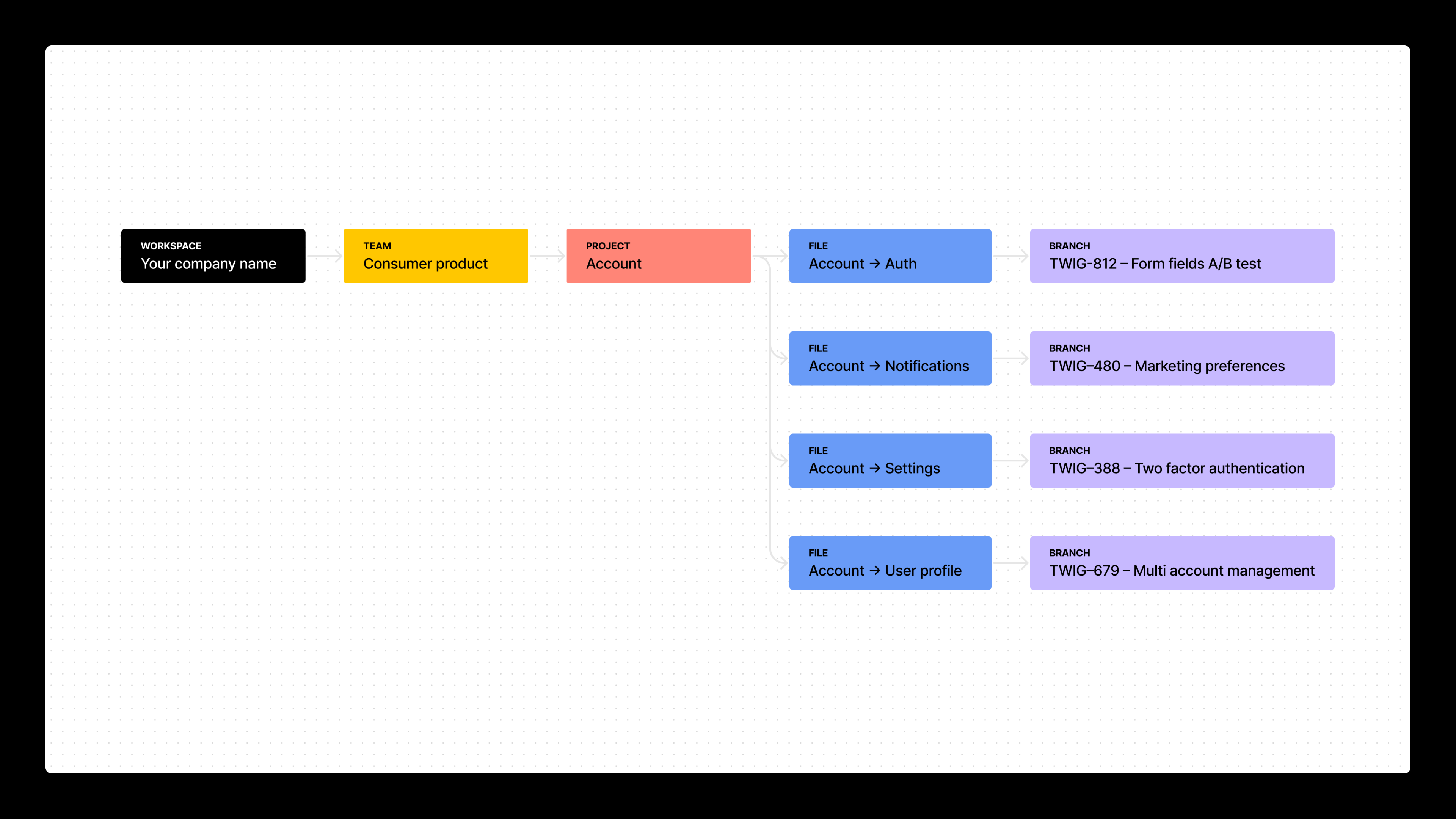
Depending on which project structure you opt for, a strong naming convention could look something like this for a web project:

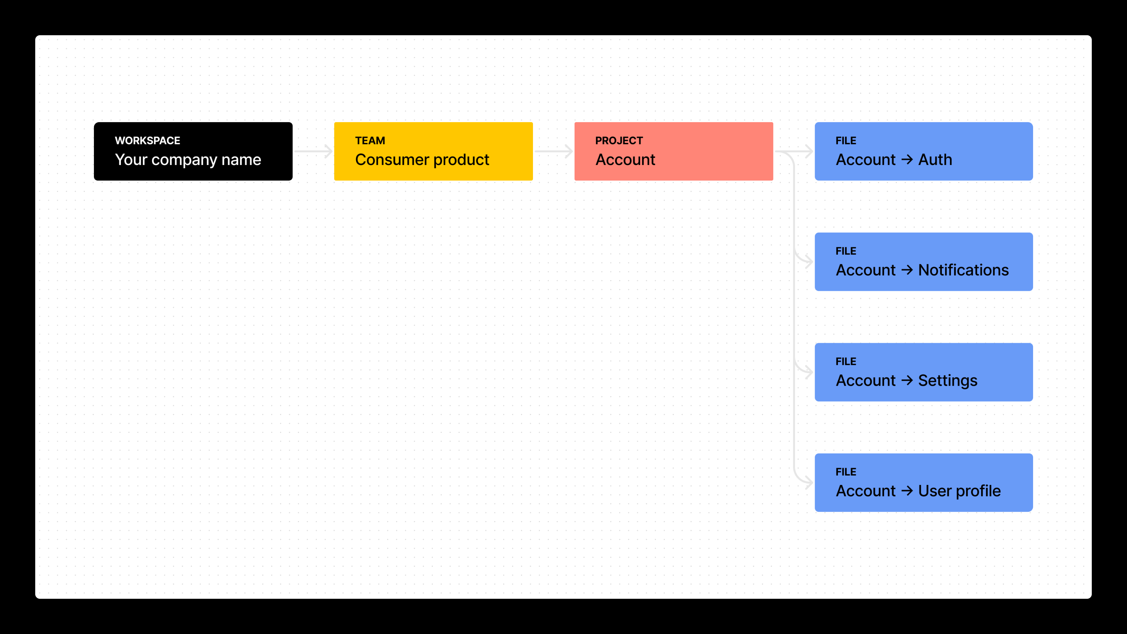
And here’s how that may look for a software product. For example, Figma!

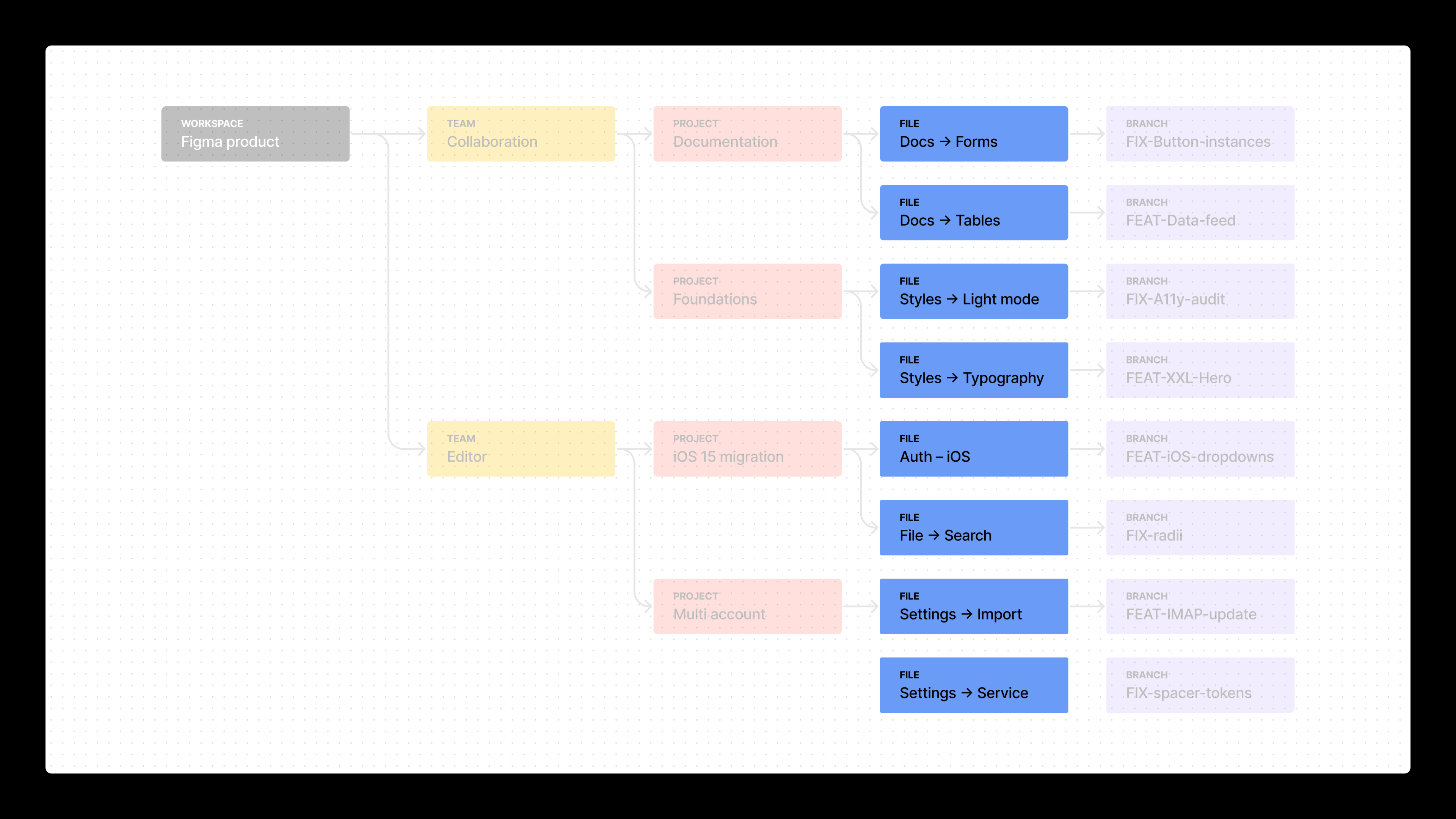
Files pair really nicely with our projects, so you can extend the naming to make them easier to find and understand.
Pro-tip: There’s a very neat feature within file names whereby if you type a hyphen (–) followed by an arrow (>) it automatically turns into an arrow (→). Cool, huh? It even works backwards, in case you need your arrow to point left!
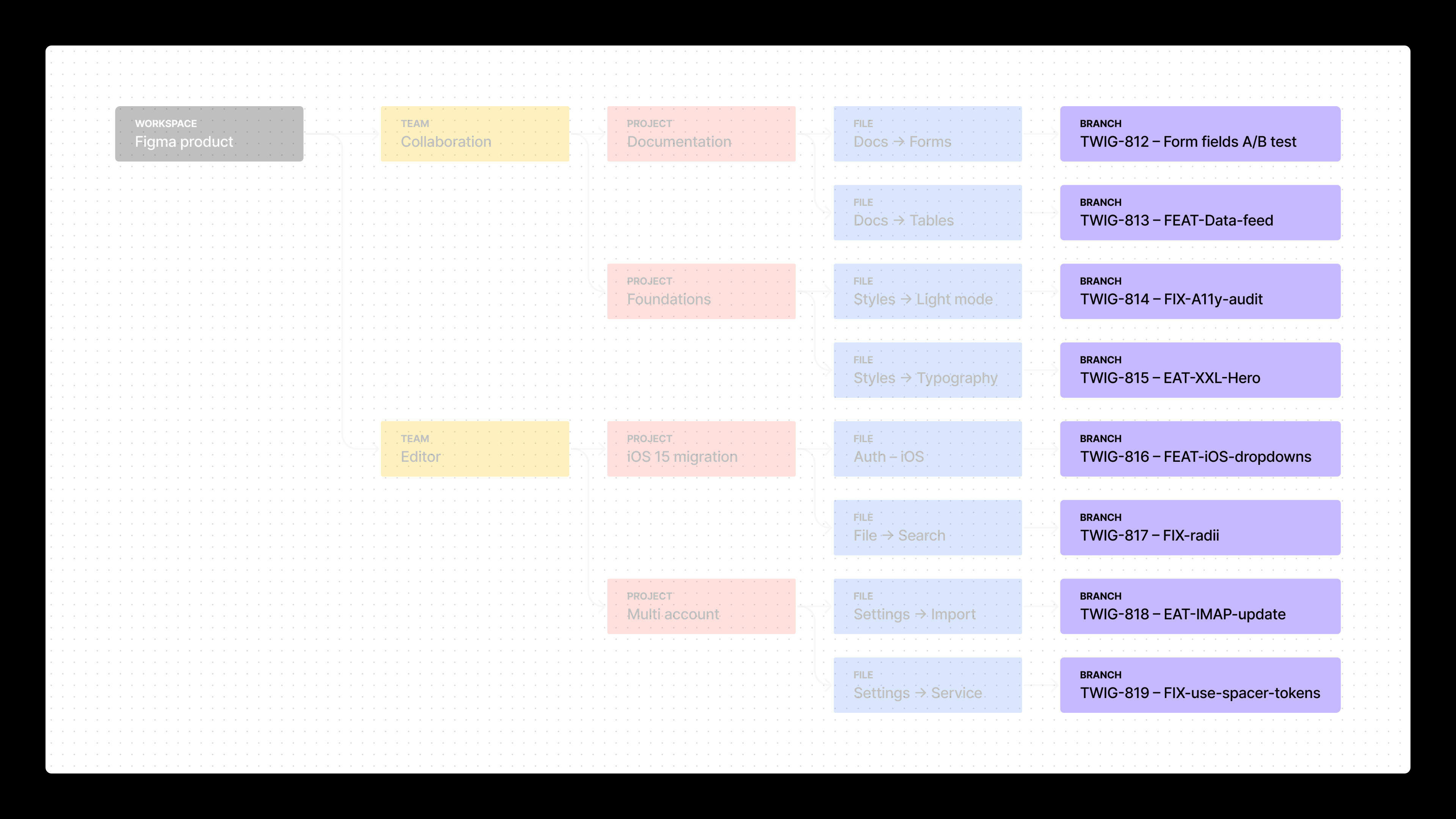
If you manage your designs with project management software, you may want to follow a ticketing system with your Figma files, too. With this in mind, you could compose Figma file names that align as well. For example, a file (or branch!) named TWIG-812 – Form fields A/B test to match the task name.

Or you might work with a combination of the two! Following the feature or production state approach, you could end up with file names that are different depending on whether they are "Production" or "Feature" files, as demonstrated here:

Of course, you can introduce branching to manage versioning. Instead of using different files for new iterative updates, you can create these in a branch instead, which would align to the product surface approach:

Version history
Since Figma is built in the browser, versions are automatically created within the version history of every file. You can supercharge this by making use of “named versions” to indicate any significant changes to the team.

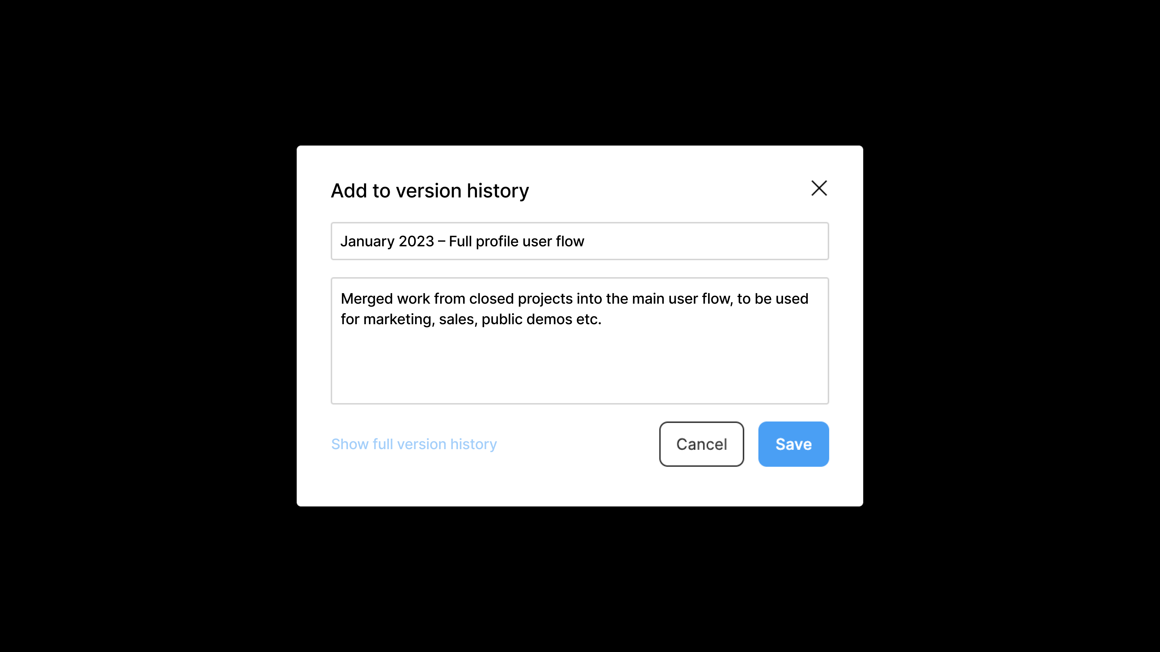
Being able to name major changes makes it easier to articulate the evolution of a design to stakeholders. Plus, you can restore to earlier points in time as needed.
Structure
Generally speaking, you should optimize your design files for speed, comprehension, and collaboration. This means that if you spot an opportunity to split files into smaller, more nimble ones, go ahead!
Here are a couple examples:
- If you usually carry out a lot of image-heavy research, keep this inside a separate file. Use the same naming convention for your main file, but append it with “– Research.” For example, Account → Onboarding as the main file name, and Account → Onboarding – Research as your research file. The performance gains from smaller, more nimble files will be noticeable, and you’ll thank yourself months later when you aren’t forced to navigate a complex file with little context.
- If your discovery work is ordinarily loose and made up of components, shapes and text, keep it all inside one file on a separate page. Name this page Discovery to keep things simple. As you progress through the design process, you might move these components to a page within the file called Components, or (even better) to the main design libraries inside your design systems team.
Let’s get into the page structures. I’ll be working on the assumption here that you’re part of #2 above.
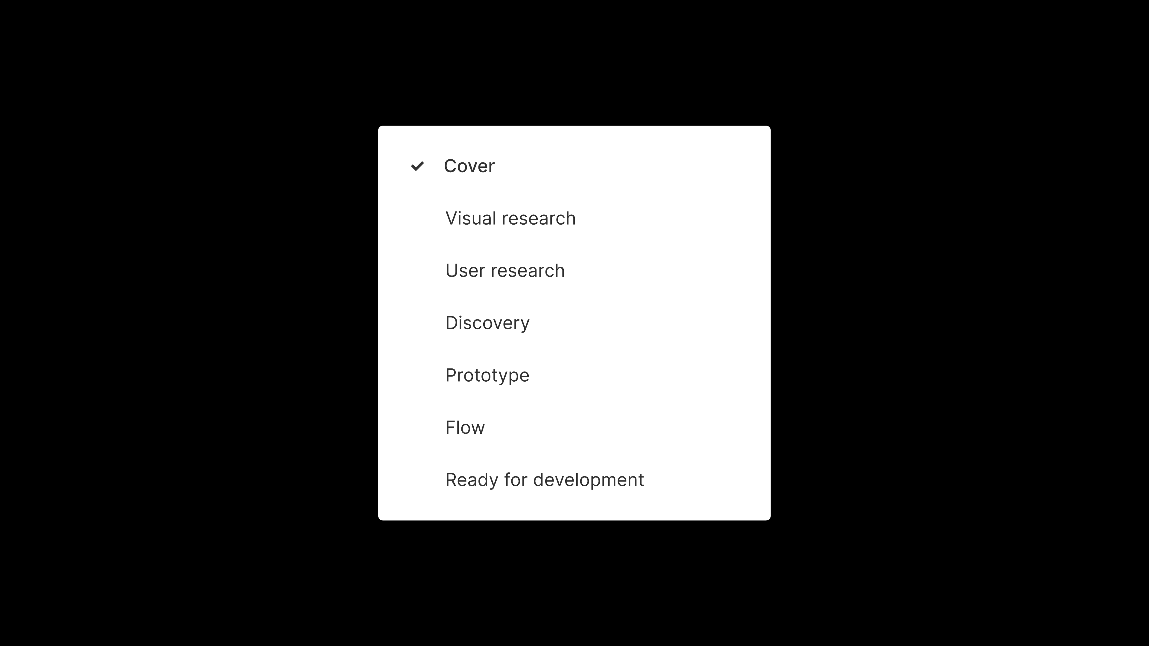
The page structure of dreams consists of:
- Cover: Where you keep the thumbnail of your file so that it’s discoverable in the file browser.
- Visual research: A home for all those wonderful screenshots you use as inspiration.
- User research: An optional space for user testing flows and concepts.
- Discovery: Where you flesh out ideas and store your (amazing!) rejected ideas.
- Flow: How you pull together formalized ideas into a structured user flow for feedback.
- Prototype: An optional page showing micro interactions and click-throughs of work. Why is there a separate page for flow and prototype? Prototypes typically require duplications of screens for animations (a series of screens for your loader, for example) and that could be confusing to stakeholders. Keeping things separate helps you be more intentional with file organization.
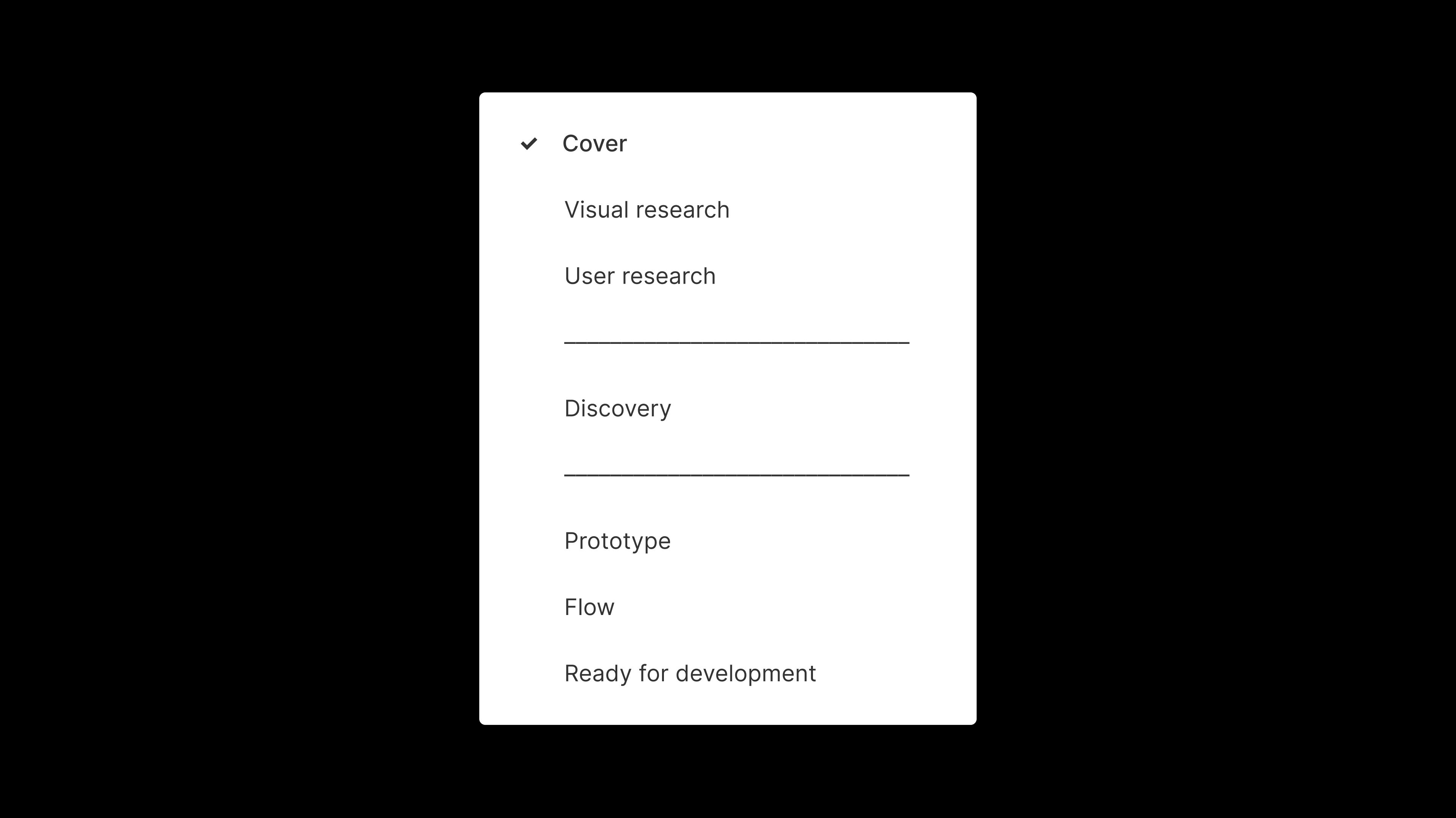
- Local components: A page including components specific to this file (e.g. a carousel that’s only used on this individual screen). Knowing that you should keep components at a more global, design systems level, this page is optional unless you do need components specific to this piece of work.
- Ready for development: Once you’ve gotten sign-off from key stakeholders, organize your work here. It’s good practice to keep everything that has been signed off and shipped in a separate location from work in progress files—you don’t want to use the wrong asset in production!

If you want to uplevel your page structure, you can even include spacer pages in your side panel so that there’s a clearer distinction between phases. These are created using a series of hyphens in the name of the page–simple, but effective!

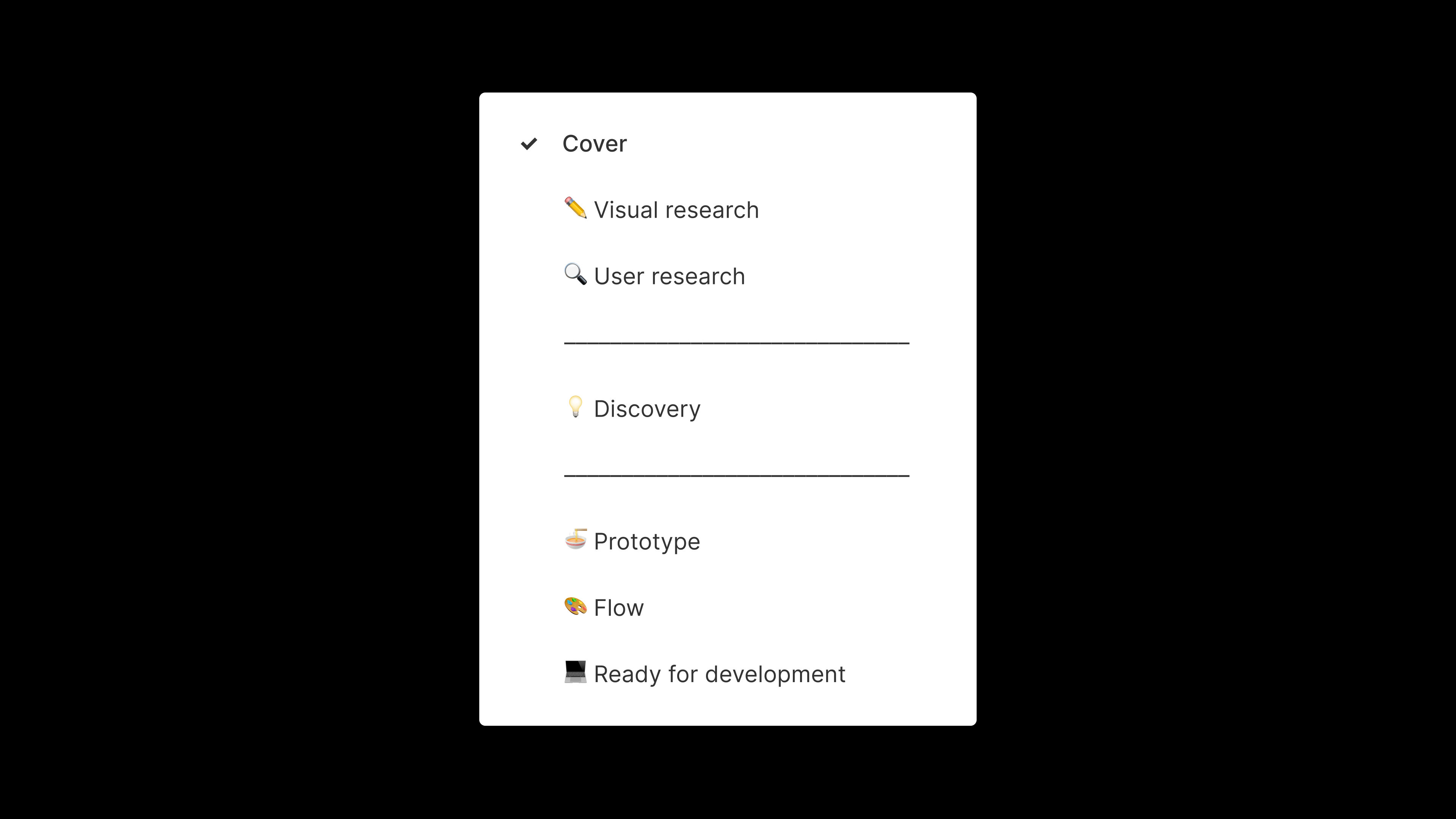
Wait, wait, wait. Where are the emojis? Let’s jazz this thing up.

As this is just a guide, your page skeleton may differ significantly, and that’s totally okay. Every company is different, and you may end up with a smaller or larger base structure for your organization.
Branching
Branching can make file management a lot easier in the long run, and ensure that you’re all working within the correct “main” file at all times.

An example may help here!
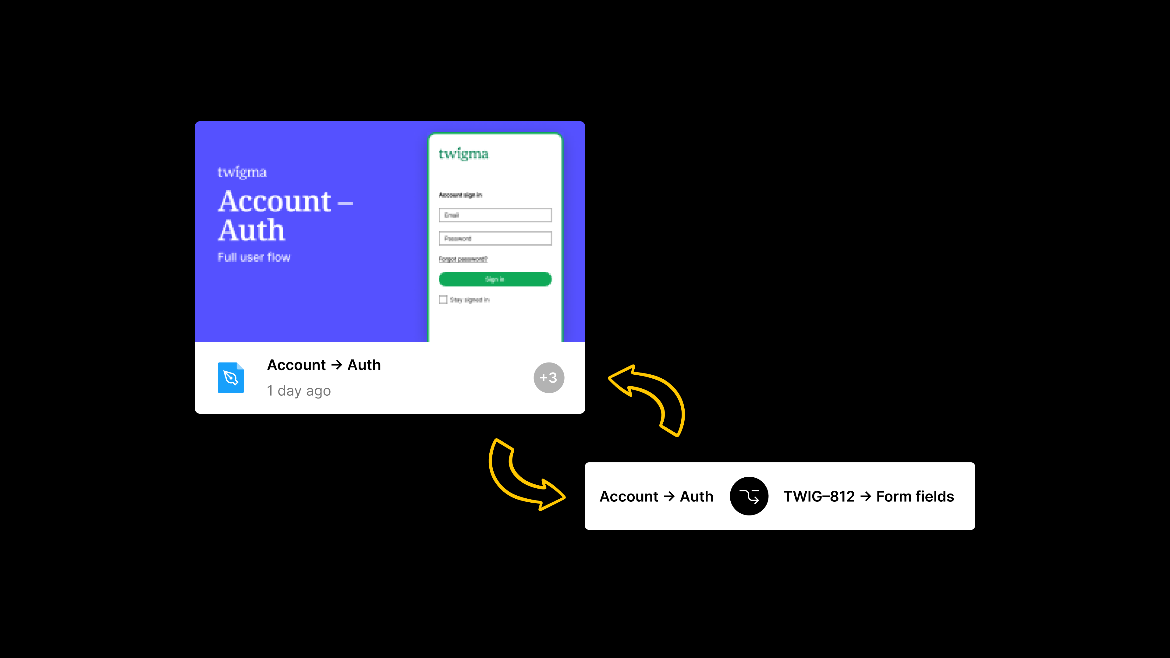
Let’s say you have a team for your consumer app, a project for the Account section of your app, and a file for the Account → Auth designs. If you need to work on a new feature like Add new form fields to the authentication flow, you could use branches to manage the design updates.
If one designer is responsible for each feature, you could create a branch for each distinct update, managed independently. For example, in this instance you’d create a branch named TWIG-812 → Form fields. TWIG-812 refers to the ticket number from your project management software, like Jira, Asana, Notion, Monday.com, Linear, and so on. You can see a full list of Figma integrations here.
Each designer would work within their own branch, testing out their ideas, gathering feedback, creating prototypes, and ultimately pushing it through the development process. You could invite your developers into a branch as viewers, or even embed the branch into your project management software to browse.
Once the work has been signed off and coded up, you’d then merge your work back into the main Account → Auth file, add a named version into the version history with a date and description of the work completed, and move onto the next feature.
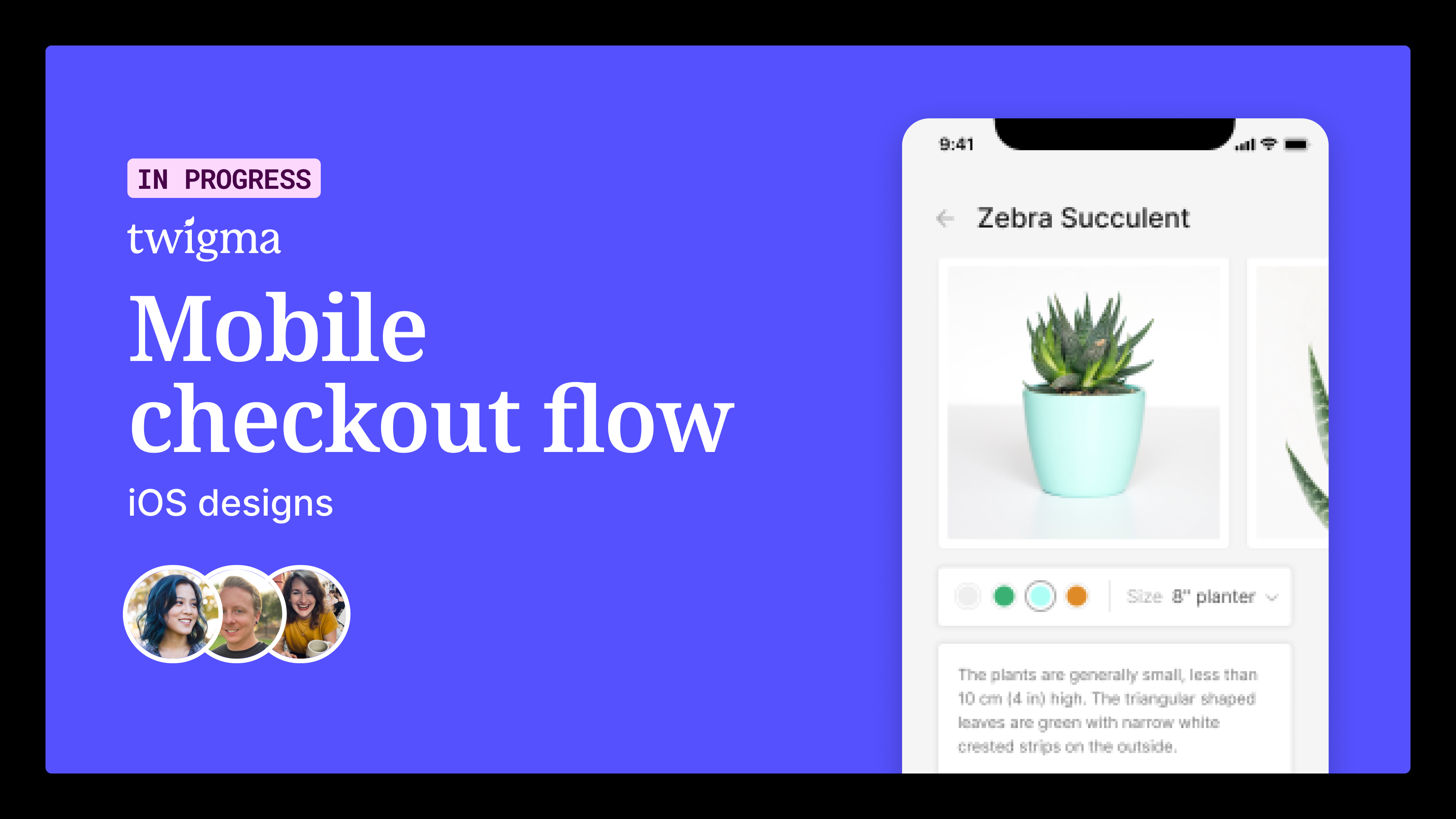
Cover pages
Cover images are great for making files for discoverable. You can design these however you wish, but keeping a consistent structure is key.
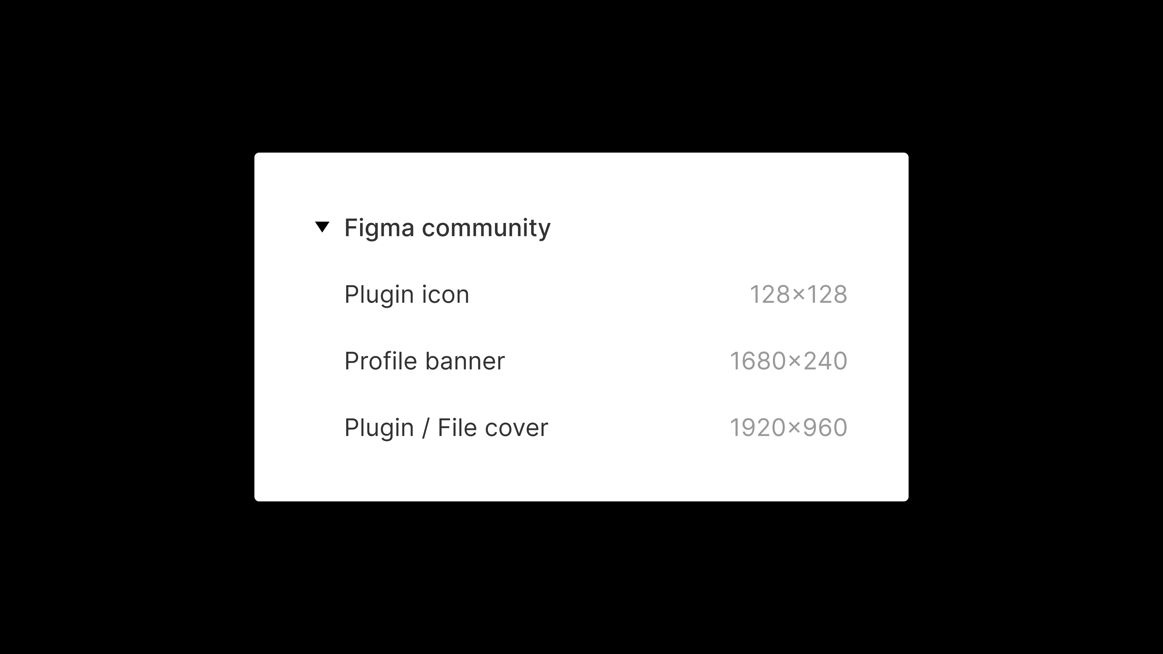
To set up a cover image, create a new Frame on the canvas using the Plugin / file cover preset in our Figma Community section, illustrated below.

Once you’ve added a cover frame, you can design it! At the very least, it makes sense to include details like the file name, and a short description of its contents.


Extending this, you might include a screenshot of the work inside the file. This can help if you have lots of files with similar names.

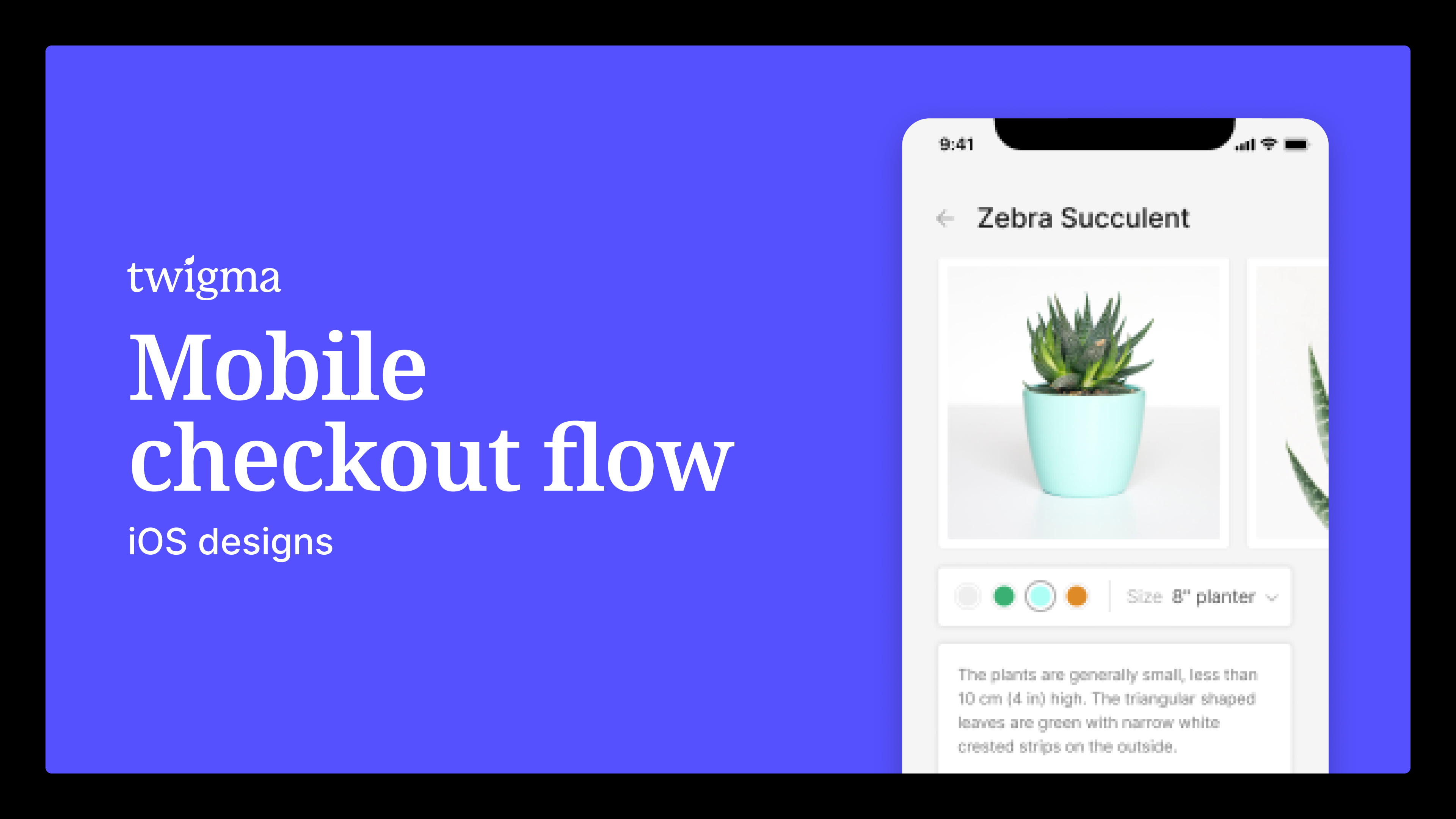
Some teams even indicate the status of their design work and information on the team that’s designing the feature too!

There are endless options here, and you can add as much as you need to keep teammates and stakeholders informed. For inspiration, take a look at the Figma Community.
Frame organization
Good file organization is not only helpful for stakeholders, but for the wonderful developers who will build your ideas. With a few components to help organize your top level distinct user flows—and individual frames within this flow—you can quickly assemble clear, discoverable files. Looking for a jumping off point? Here’s a template to get you started.
This step is best left to the end of your design process, once everyone is on board with the direction and you’re moving towards production. Tackling this earlier might mean that you have to re-organize each time you iterate, which can be messy and frustrating. This would also happen in your Ready for development page.
Flows for different platforms
If you’re a cross functional team who ships designs for iOS, Android, and web, you’re probably wondering how best to manage this within your file. The best approach is to use the Figma canvas to organize frames according to flow. Whether it’s in prototype form, or in your Ready for development page, some simple organization tricks can make this all a lot easier to digest. In this instance, you might end up with something that looks like the following diagram.

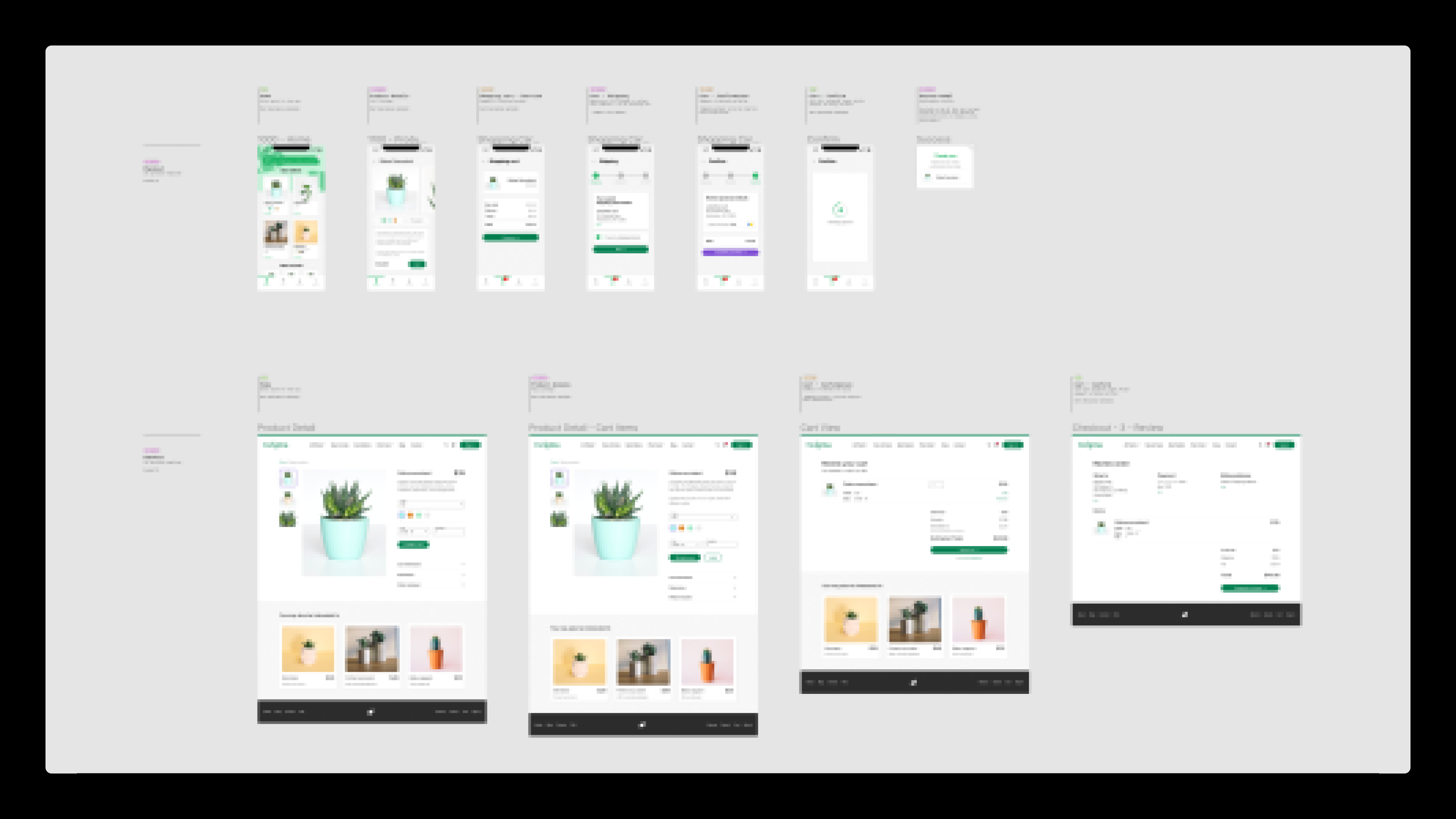
You can see in this screenshot that frames are organized by platform, with mobile at the top and desktop underneath. This works best when you’re explicit with “on canvas” notes paired with consistent frame spacing notations, to make it easier to skim through and digest. You may even want to consider using Figma sections to group the platforms.
This is just an example, and you may have many more frames on the canvas to organize. If you’re entering a world where you have hundreds of frames per platform, consider splitting these into separate pages, or even separate files.
Ultimately, you might decide where platform designs live by thinking about the handoff process. Is the same developer(s) working on both mobile and web here? If yes, it makes sense to be in the same file. If not, split them up.
Layer naming
Ahh, our old enemy—the unnamed layer. Naming layers is not only the butt of many a design joke, it’s something that can divide teams and impact implementation. Seriously!
First, consider how much you need to be describing or communicating with layers in the first place. With this in mind, you’ll want to think about how well and how often you communicate with the development team within your organization.
If you’d prefer to read this layer naming guide as a Figma file, we have a resource that you can duplicate.
No layer names

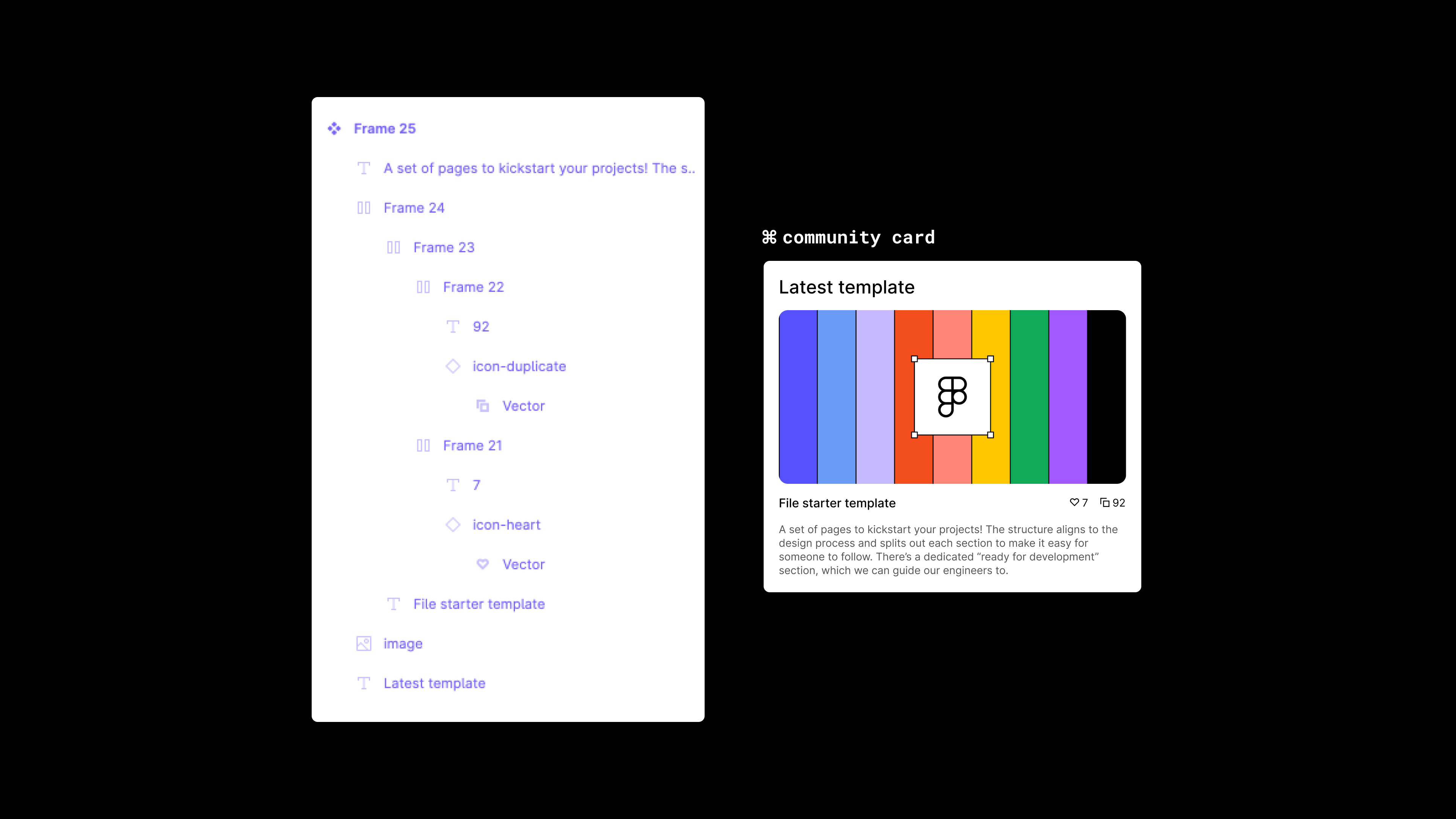
Design stage: Ideating
Owner: File creator
I promise you I’m not cheating here, this is a legitimate approach for teams (or individuals) that don’t need to rely on the layers to communicate their design decisions.
This approach is either something you’d limit to the ideation phase of your design process, or go all in if you communicate your decisions in other ways—perhaps with on-canvas communication, or with other types of documentation.
We’re just having fun at this stage, so you don’t need to pay too much attention to our layer naming or structure. Because this is still very scrappy, we don’t need to be concerned about naming or even using particular elements (maybe a rectangle is fine for a button!).
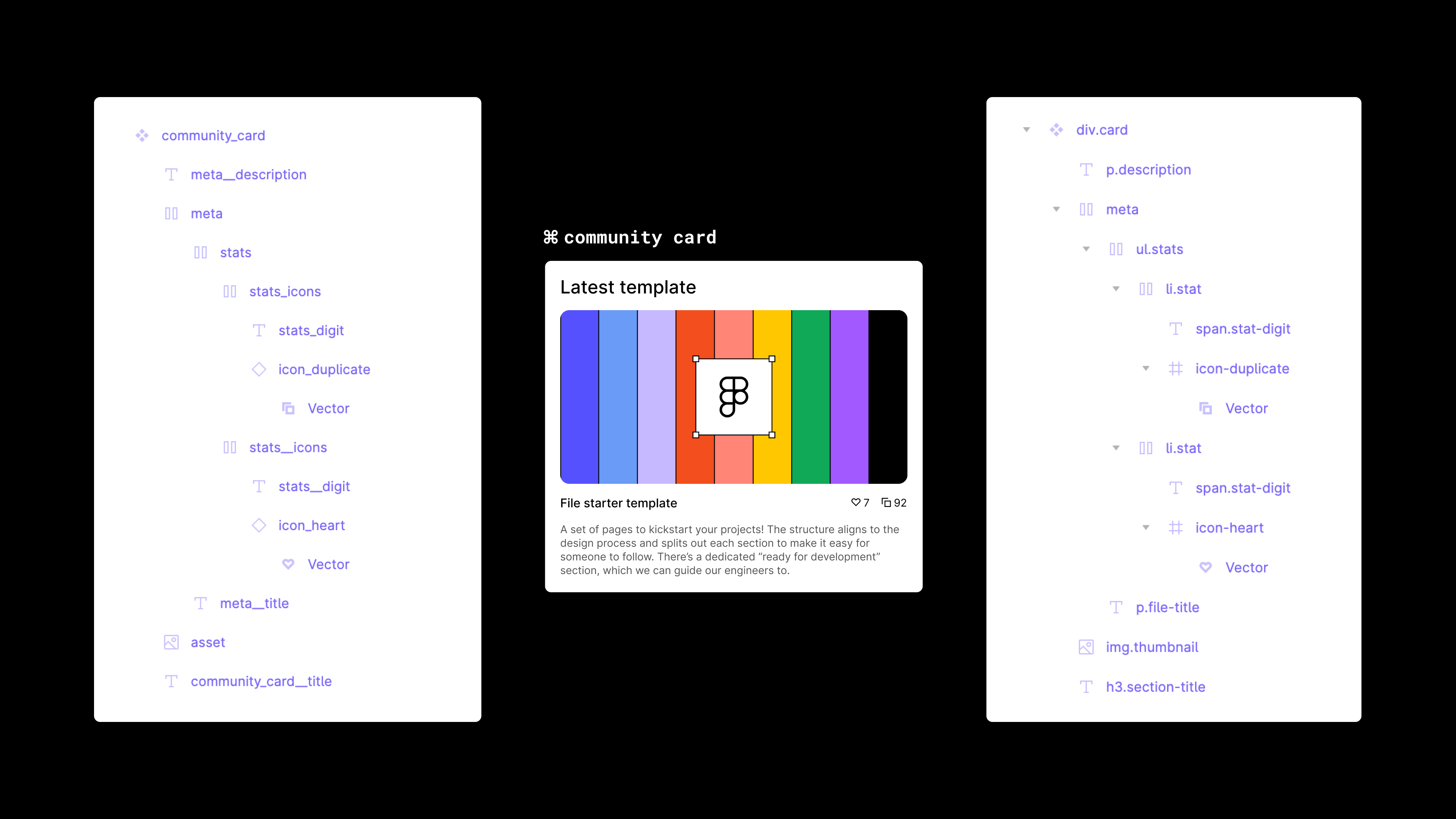
Refinement


Design stage: Refining
Owner: File editors
Are you and your team preparing for sign off from your key stakeholders? This is where you should think about how easy it is for someone to digest your ideas and iterate on them. Clear layer names can really help here; call a card a card, a number a number, and a description a description. While individual designers are still owning their designs at this stage, layer names need to make sense to the rest of the team.
Aligning to code

Design stage: Ready for handoff
Owner: Design systems team
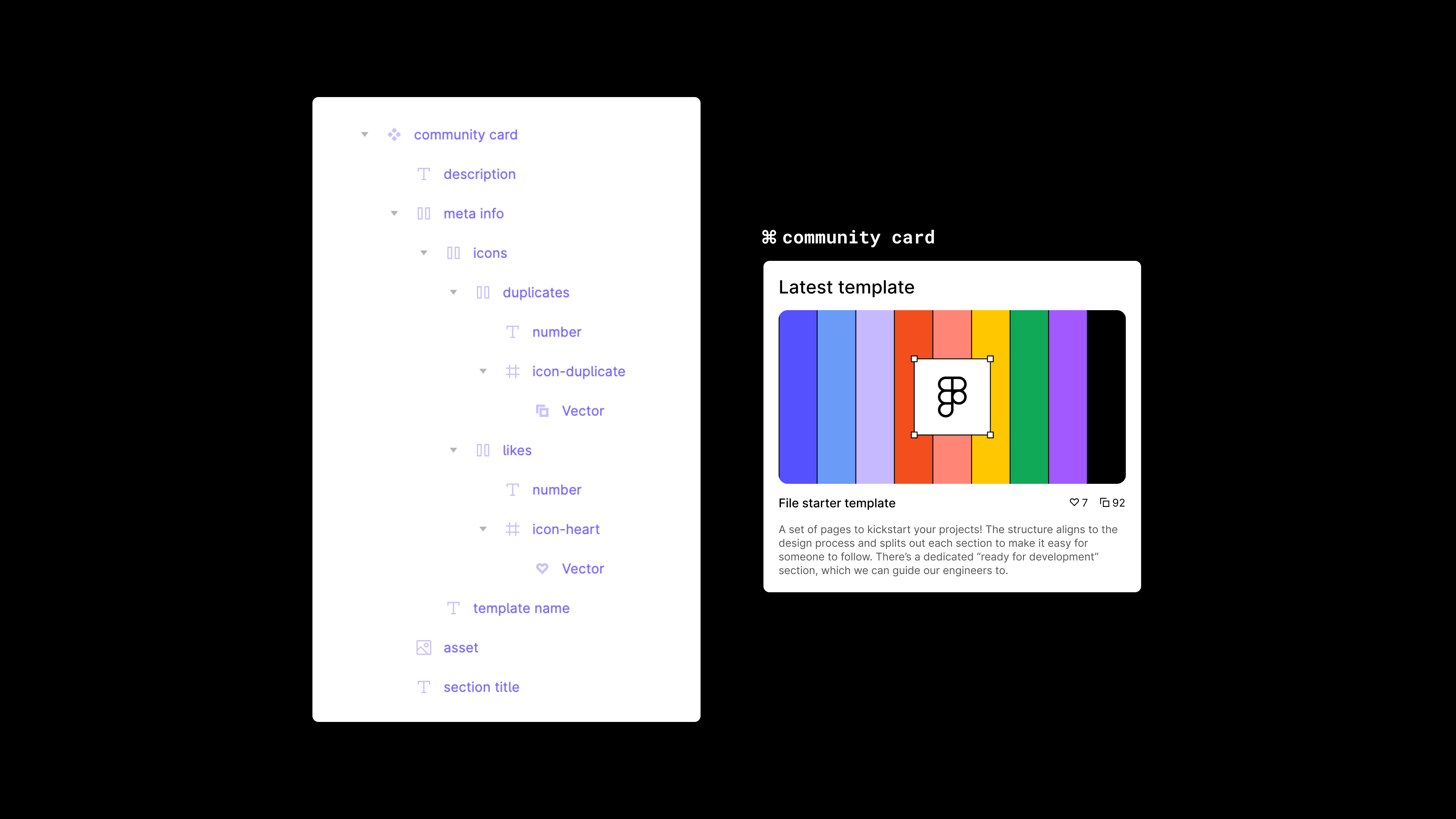
This section will be split in two, with a Block Level Modifier approach and one aligning to HTML markup.
1. Block Level Modifier

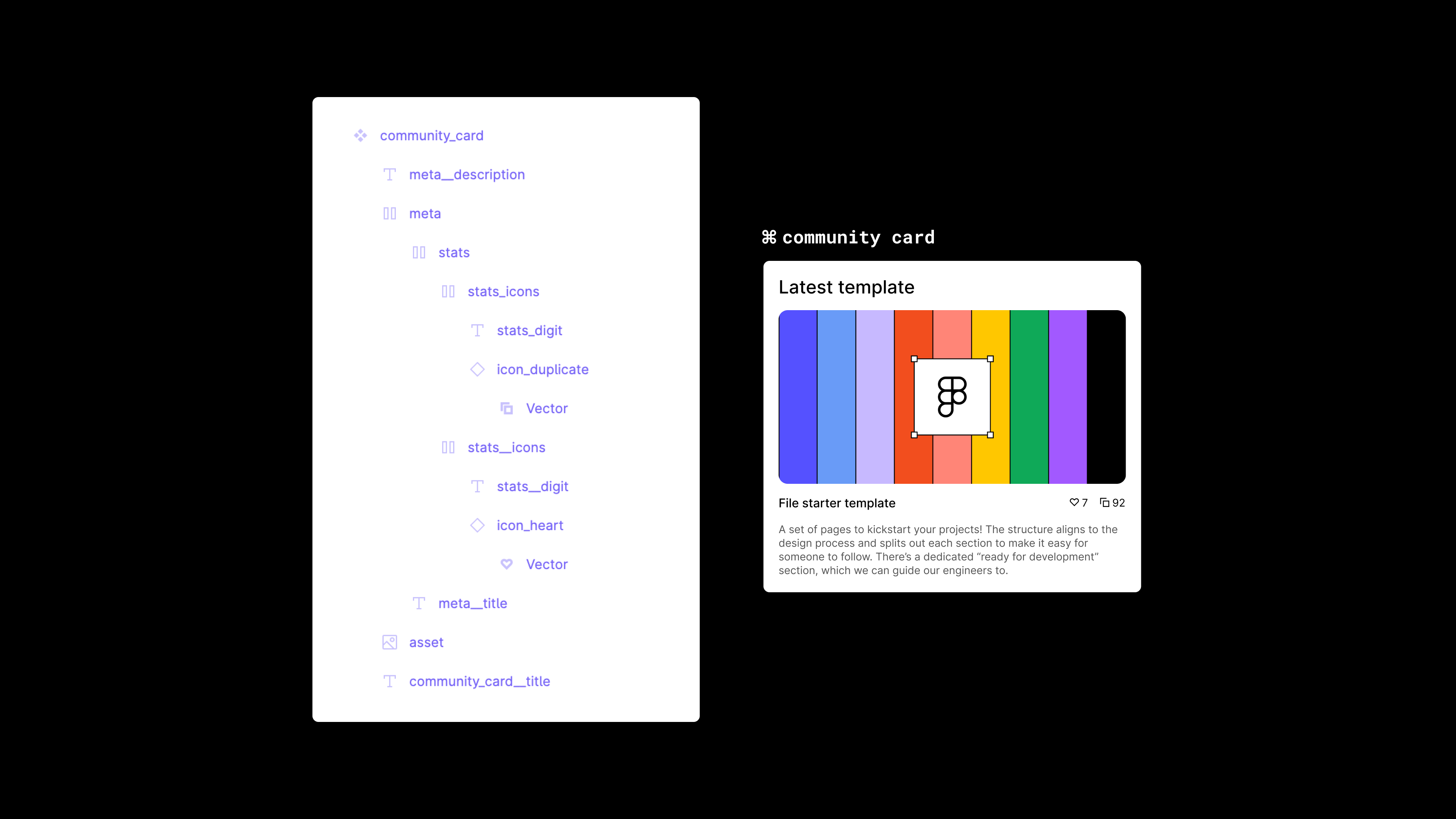
This concept borrows from engineering, and it helps you align layers to code so developers can quickly grasp how to structure their components.
2. Aligning to HTML

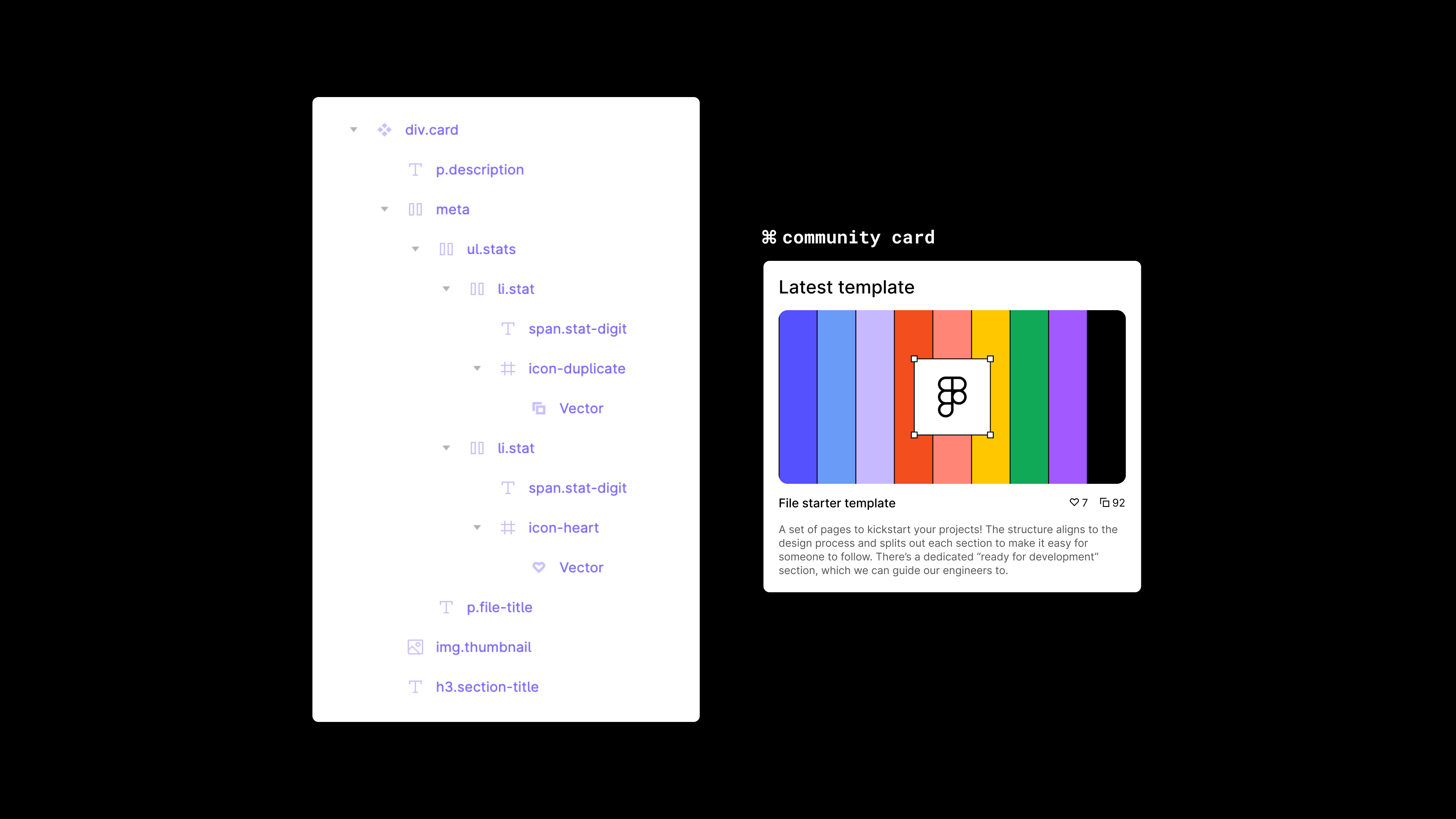
If you’re building a web product, it might be worthwhile to name your Figma layers based on how they’d be presented in the frontend markup that your developers will be writing.
These are technical approaches, and are best handled once your components are in the correct Figma library, in a production-ready state. Any time before, and this would require too many small-scale changes to your layer structure, potentially causing more issues than they solve in the long run.
While designs are really never "finished," follow this structure when you're heading into production. It’s an opportunity to collaborate with your developers, as there’s no better design process than an open and transparent one. Since this method requires knowledge of markup language, it’s best for a technical designer or the design systems team to take it on.
If your team isn’t closely aligned with your engineering counterparts, you might consider a different approach; the naming only really makes sense if both teams use it.
Bonus: Merging a few concepts
Design stage: Ready for handoff
Owner: Design systems team
What if we wanted to borrow something from each of these concepts? Using Figma’s component description field, you can meet these techniques in the middle and satisfy both design and engineering teams.
Like the more technical approaches, this is ideal for when you've already agreed on a component’s design and are moving it into the Figma library file. This way, you only need to set it up once, and publish it out to the wider team for usage.
With your design systems team closest to your engineering team, you can align the naming conventions, status, and any other important information with the correct engineers and then add it to your Figma component description.
Refinement is the easiest approach to scan and read for most teams, so let’s use it as a starting point.

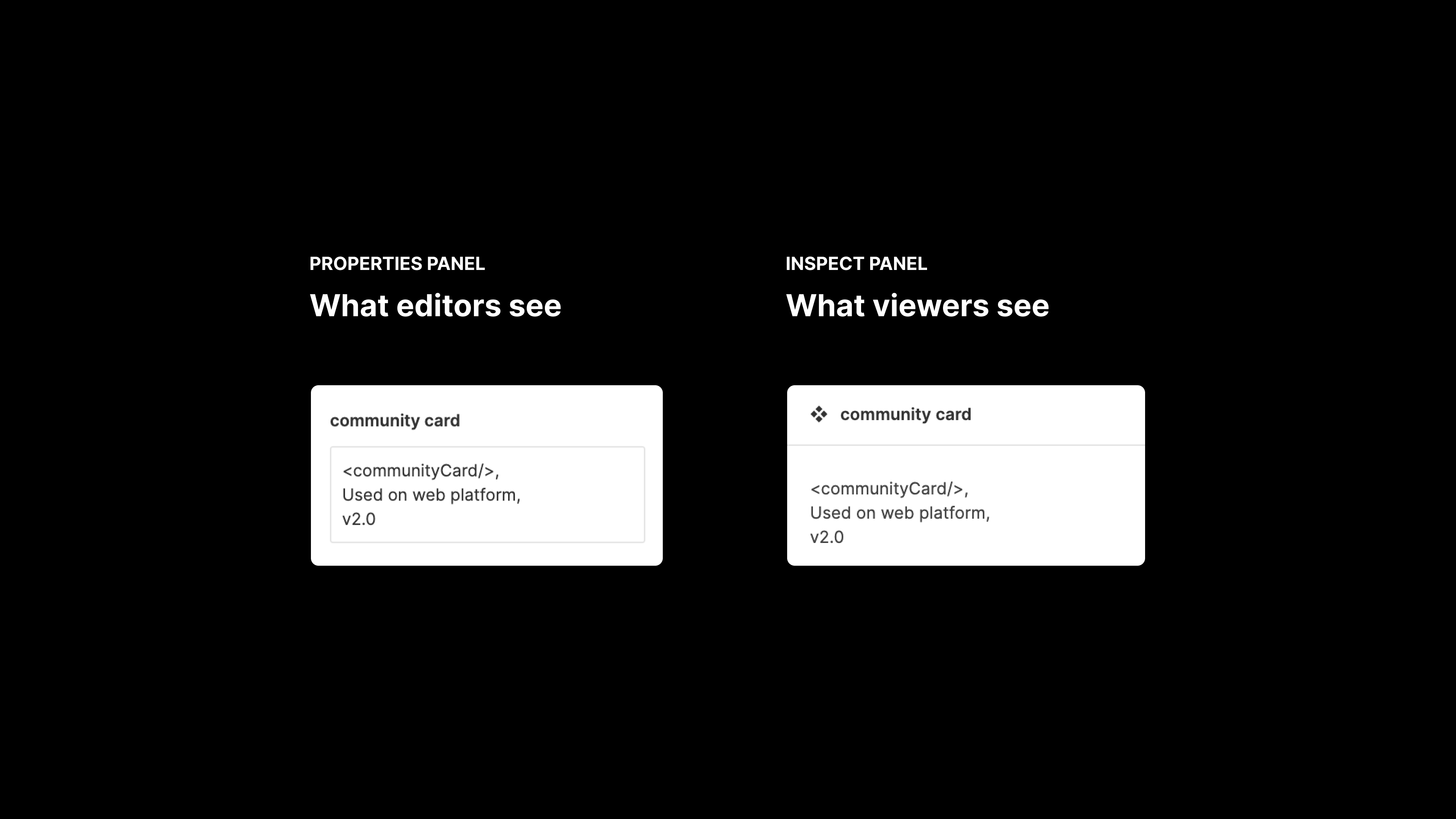
Extending the layer names
You can document your components using the description field to add notes about usage and appropriate naming conventions. This will appear both for designers (in the properties panel) and developers (in the inspect panel).

Adding documentation to your components
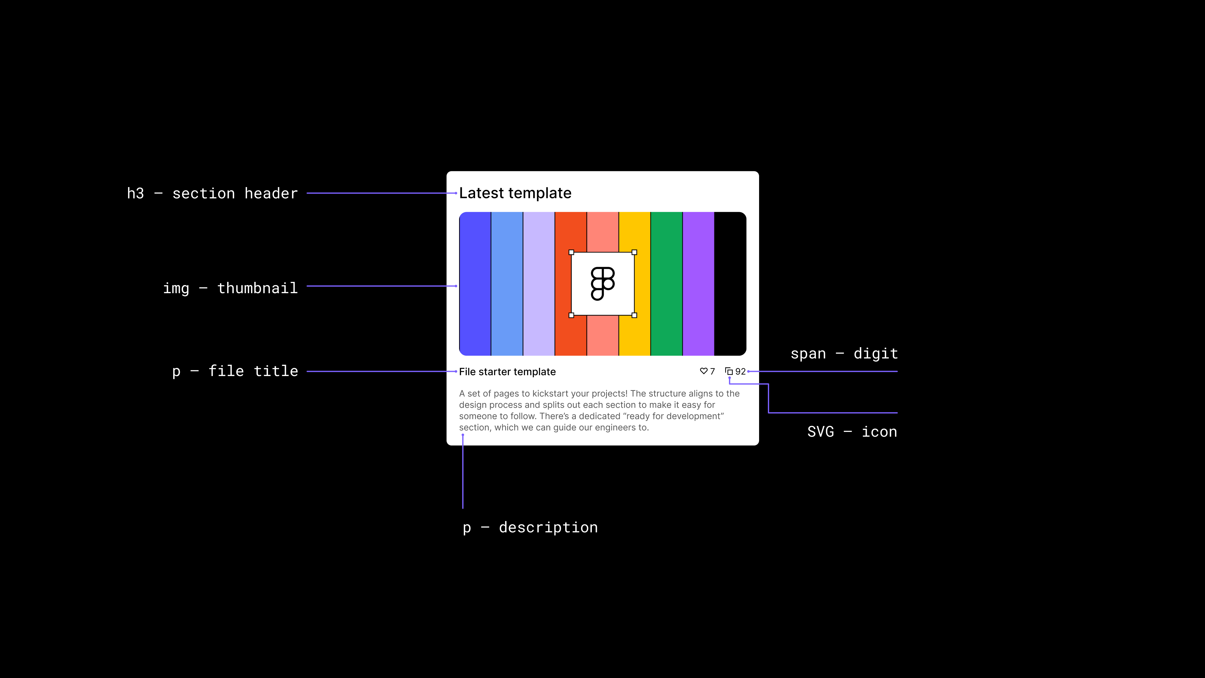
Because there are tons of different ways to implement designs, you can help your engineering team by adding useful annotations onto the canvas.
Note: Manage documentation in a separate file, so that you can maintain documentation and component versions in two separate places. This way, docs are always up to date, even while you tinker on new ideas.
The below is an instance component with manually-added notes that align to HTML.

You’ve been framed
File organization might feel like a chore at first. But when collaboration is at the heart of your design process, the way we communicate to other team members—whether that’s through organization or naming—can help us work more smoothly and efficiently.
Live long and organize!