


Inside the redesigned Figma, where your work takes center stage


UI3 clears space on the canvas for you to bring your creative vision to life. Here’s a behind-the-scenes look at how we landed on a more streamlined and adaptable interface.
Sign up for the beta
Figma AI and UI3 are currently in limited beta and will be rolling out gradually. You can join the beta directly from Figma: Navigate to the bottom of the screen, click on the "?" and select Join UI3 + AI waitlist. Check out our Help Center for more info.
We’ve made so many changes to Figma since we launched nearly a decade ago, but even amidst new functionality, features, and products, the core Figma layout has remained remarkably consistent over the years. This isn’t by accident. With so many of you spending hours a day in Figma, we know how important it is to expand functionality while also preserving and respecting the workflows you’ve perfected to date. But as those updates compound over time, what once felt simple can become unnecessarily complex. To tackle this complexity and lay the foundation for the next decade of Figma, we’re rolling out UI3, the third significant redesign of Figma since we launched in closed beta.

Of course, UI3 isn’t just about the interface and visual design, but the deeper workflows and behaviors that it enables. These changes were rooted in solving four core problems:
- Center your ideas, not Figma’s UI: As we’ve added powerful new capabilities to Figma over the years, from interactive components to AI-assisted design, there’s a risk of these features feeling tacked on and distracting from what matters. We aimed to focus the canvas less on our UI and more on your work.
- Balance the needs of new users and professional designers: When we looked at the Figma interface through fresh eyes, we realized that it was becoming unapproachable to newcomers. We set out to make it more intuitive and friendlier while preserving familiar ergonomics for seasoned Figma users—simplifying Figma, without simplifying what you can do with Figma.
- Adapt to the changing nature of design: Today there are completely new ways to interact with design that didn’t exist a decade ago. For example, more and more people are leveraging reusable components and exploring generative AI. We know that Figma needs to adapt to this world and offer higher levels of abstraction so that designers have building blocks, not just pixels.
- Lay the foundation for Figma’s future: As we bring design and code closer together with Dev Mode and unlock efficiencies with Figma AI, we’re also introducing new products like Figma Slides. We wanted to set the stage for a cohesive family of tools across Figma.
Inside Figma’s redesigned interface
With those inputs in mind, here’s a look at some of the questions we wrestled with, the decisions we made, and what you can expect moving forward.
Clearing the stage for your work
First, we started by reimagining the Figma canvas to maximize precious real estate. This puts the spotlight on your work, clearing away distractions when you want to concentrate, but still keeping your tools well within reach. We started with extreme changes, stripping away features until they were missed. Our goal was to get as much signal as possible, then dial back as needed.
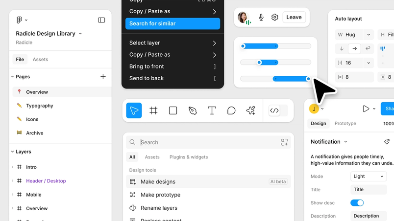
We explored some radical departures, like a super-minimal UI that only revealed itself on hover. No panels, no properties, just you and your work. In other variations, sidebars would appear and disappear. These iterations made the work environment too unstable, but inched us closer to our ultimate solution: resizable panels and a slim new toolbar at the bottom of the canvas. That frees up the top, creating a roomier feel overall. It also forms a standard structure across Figma for easy toggling between products. You can hide the UI completely, with panels only appearing when needed.
Prioritizing features that matter most
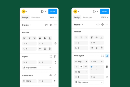
Another key choice was to rethink the properties panel to prioritize critical controls. Take components. As design systems took off and components became central, we realized that component controls like variants and instances deserved top billing above attributes like color and size. It’s a small change that saves time and energy for tasks that take up an increasingly large share of a designer’s day.
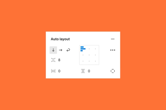
Another big shift: All layout-related options, including width, height, and Auto Layout, are now merged into a single panel. This departs from the typical x, y, w, h panel in most tools, but aligns more neatly with how products are built in code. While we theorized that width and height should take precedence over x and y position, early testing showed this inversion disrupted muscle memory too much. So we adapted—unifying Auto Layout, width, and height, but keeping them below x and y to support longtime users.

We also introduced Figma AI as part of Actions, which provides quick access to powerful features we anticipate will quickly become part of your daily workflow. These features help you breeze through time-intensive tasks—whether searching for a specific component or generating text and images for your designs—without getting in the way of in-progress work.
An interface for usability, not decoration
Historically, our minimalist UI set Figma apart—sharp edges, abstract icons, subtle affordances. This worked for a time, but as we started adding more complex controls, the visual language became harder to parse.
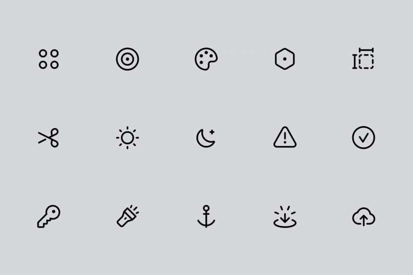
“Maintaining the vast icon system is a balancing act between ensuring visual consistency and conveying extremely complex ideas in an often abstract manner,” says Figma Designer Tim Van Damme.
UI3 introduces backgrounds on inputs, borders around dropdowns, rounded corners, and 200 expressive icons hand-drawn by designer Tim Van Damme. These serve as visual explanations of how to interact with the platform. And they adapt to your needs. Turn on labels to quickly understand what each control does, or turn them off to focus on your work.

Of course, perspectives on what makes an interface user-friendly differ from one person to the next, even—or perhaps especially—on our own design team. Designers have very strong opinions, and Figma designers are no exception.
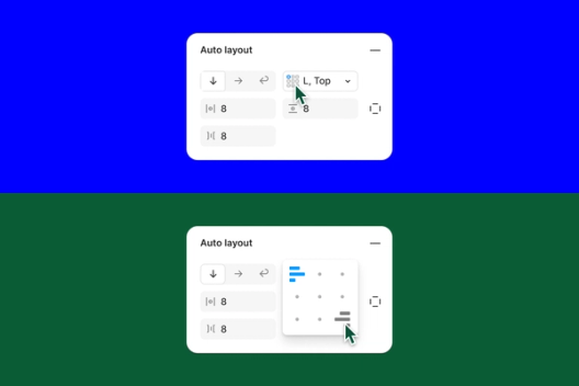
In one iteration, we condensed the alignment grid in Auto Layout to simplify the overall appearance of the panel and make it more accessible. But it didn’t quite land. The grid moved around too much, so we reverted to the original design to preserve muscle memory for power users, but updated the visual styling to feel more approachable.


This push and pull between approachability and power became a recurring theme. How do we make Figma friendlier for newbies, without being too elementary for experienced designers? Very carefully, it turns out. We introduced optional labels to guide new users and aid discoverability, while preserving speed and control for experts.
Supporting a suite of Figma tools
We also saw an opportunity to create more cohesion across the expanding Figma ecosystem. Whether you’re brainstorming in FigJam, refining in Figma Design, or presenting with Figma Slides, we wanted the experience to feel fluid and familiar. Consistent patterns like the slim toolbar and floating collapsible panels create a through line, while still giving each tool the flexibility to shine in its own way. The result is an ecosystem that adapts to your needs, without sacrificing its distinct personality.
Evolving to meet the changing nature of design
Shipping this redesign was a monumental milestone, but in many ways it feels more like a beginning than an end. We’ve laid a new foundation, and the real magic will happen as you put it to work in your creative process. We know it may take some time to fully settle into the new interface, but we’re excited to take this journey with you.
Design and the tools we use are always evolving. Where once we pushed pixels, we’ll work increasingly at higher levels of abstraction. This redesign reflects that shift, streamlining workflows and reducing friction between imagination and reality. As AI and other technologies emerge, they have tremendous potential to transform our workflows. And as design continues to evolve—from solo to collaborative, from static to interactive, from pixels to patterns—we will be right there with you, adapting and evolving in service of your best work. This redesign is a promise: to stay true to our roots, while embracing the future.
The redesigned Figma is slowly rolling out to users today. We can’t wait to see what you create with it.

