How to wireframe


Learn when to create a wireframe, what goes into them, and how they can help you communicate and iterate on ideas with your team.
Wireframes are one of the simplest tools you can use to convey a big idea. But the value of a wireframe goes much further than simply getting your idea down on paper or down in Figma. In this post, we’ll look at what defines a wireframe, what a good wireframe does and does not include, when a wireframe is most helpful, and how you can easily get started wireframing.
What is a wireframe?
A wireframe is a simple visual guide that represents the skeletal framework of a website or digital product. Think of it as the blueprint for your final design. You’re providing enough detail so that everyone knows the shape of the wall, but you’re not getting so deep into it that you’re giving exact details on the type of brick the walls should be made of (that comes later). Though wireframes are most often created by designers, they need to be basic enough so that everyone from other designers, stakeholders, devs, and users can understand the ideas.
Wireframes are not the time to set anything in stone. In fact, the opposite. The power of wireframes is that they provide an opportunity to gather more information through usability research and stakeholder input. Because wireframes are so simple, people can more easily focus on functionality and the user experience rather than getting hung up on colors and other aesthetic elements.
Types of wireframes
In a traditional design process, wireframes come after on-the-fly hand-drawn sketches and right before high-fidelity mockups or prototypes. There are two levels of wireframing, low fidelity and high fidelity — though you can go straight from a low fidelity wireframe to a prototype and skip high fidelity wireframing as a distinct step.
Low fidelity wireframing
Low fidelity is the most basic type of wireframing. It’s so simplistic, that paper and pen will still suffice as a way to represent your ideas, however, creating your wireframes in Figma will allow you to easily share them and make sure your team has access to your latest thinking as you iterate. Low fidelity wireframes are done in grayscale with a focus on layout and high-level interactions. UI elements and content are represented by basic shapes like squares, triangles, circles, and lines.


High fidelity wireframing
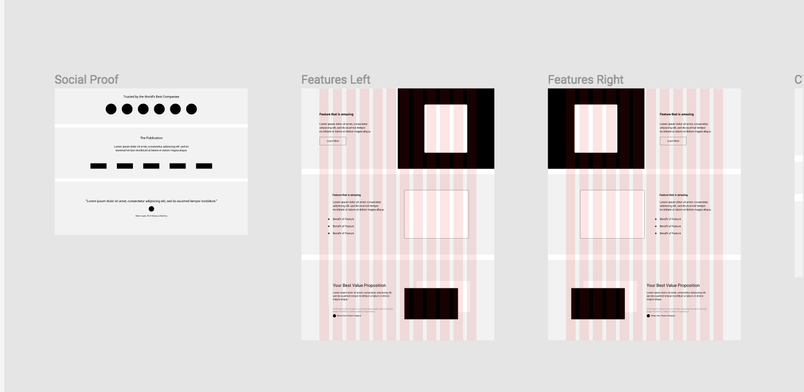
High fidelity wireframing takes what you put together in the low fidelity stage and sprinkles in more of the detailed elements. High fidelity wireframes include visual markers and branding signifiers like colors, graphics, and font style. UI elements look realistic and might even include textures and shadows. At this stage, a designer might also choose to add in images and copy. This wireframing kit will get you started with all the basics you need to create great looking high fidelity wireframes.
To duplicate the above file, click here.
Best practices for creating wireframes
There are no hard and fast rules for what you need to include in your wireframe and what you must leave out, but there are some best practices to help you get the most out of your work.
Keep aesthetic elements simple
Colors should be grayscale: white, black, and the grays in between.
Use two fonts max
At this stage you are using typography to communicate the hierarchy of information. Limit yourself to two fonts to make the hierarchy clear. Change the font size and use bold and italic as needed to differentiate and call attention to different pieces of information in your wireframe.
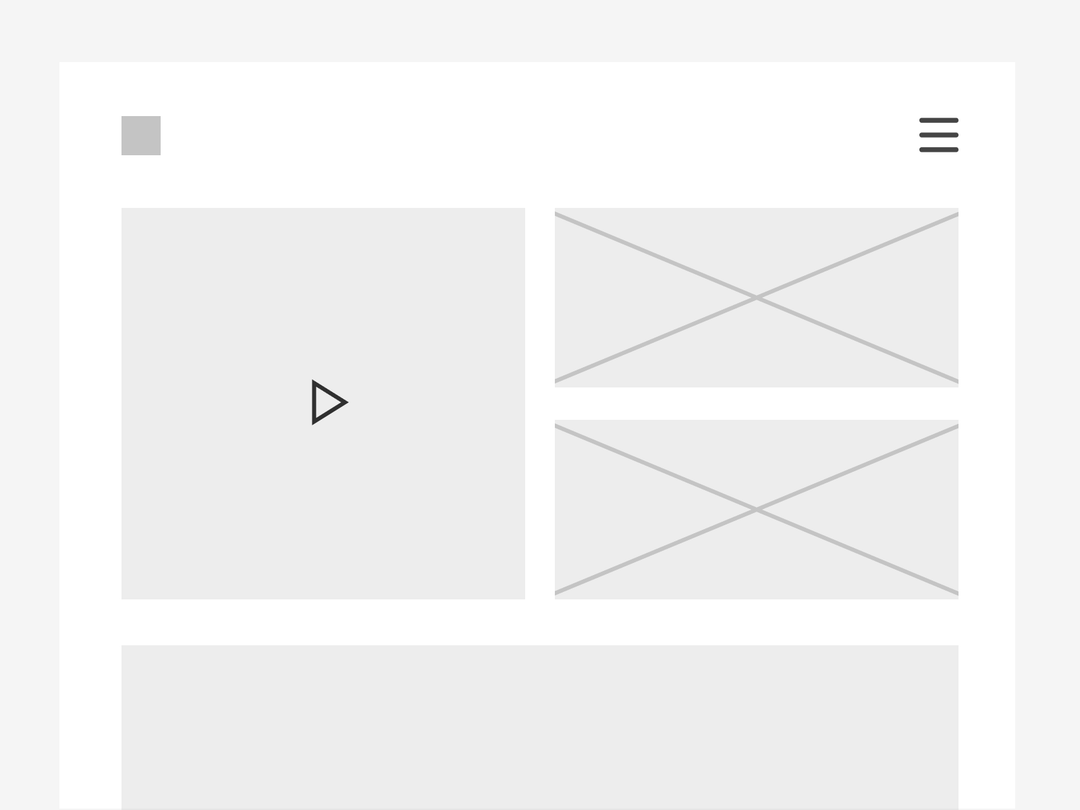
Represent graphics and images with boxes
Keep the focus on the layout by using simple symbols that relay the future placement of graphics and images. Call out video placements with a triangle as a play button on applicable boxes. Image placement can be represented as squares or rectangles with Xs through them.

Consider screen size
Wireframes should be equally creative and technical. Consider the many different places, stages, and ways your design might be used. Three questions that might drastically influence your wireframe or versions of your wireframe include:
Supported devices—Your design adapts to support desktop and mobile. You’ll want to wireframe how the design changes in each instance.
Screen orientation—Depending on if you’re looking at the design in portrait or landscape, some things might need to shift and resize.
Context of use—If a specific feature in your product is more geared to desktop use, consider cutting it from the mobile version upfront. Reducing the design to match how people will actually use it saves a lot of time and money.
When to use a wireframe
There’s almost no wrong time to use a wireframe, but there are some instances when they can be extra helpful. Whether you’re trying to explain your idea to someone, get all the stakeholders on the same page, force a group decision, or validate your plan, a wireframe presents a simple visual representation that everyone can point to.
Get stakeholders to focus—Because the magic of a wireframe lies in the simplicity, your clients, colleagues, and execs won’t get hung up on downstream details like colors and images. Instead, they’ll be forced to zero in on important structural elements.
Catch problems early—Though they don’t present the actual functionality of a page, wireframes allow you to map out how all the elements will look and interact once the design is put into a working prototype. It’s way easier to re-work part of a wireframe than it is to rebuild a prototype or web application.
Cut down on revision time—Related to catching problems early, putting an idea in front of the team or a client in a wireframe gives everyone the opportunity to chime in at a time when it’s relatively easy to adjust and revise. By getting collective feedback early, you’ll cut down on revision time later.
Decide content prioritization—Wireframes naturally reveal space constraints and the hierarchy of elements on the page, without relying on the content itself. Seeing the elements laid out anonymously will help everyone decide if the right weight is given to the most important content.
Test usability with users—When you’re testing out a new idea with someone, they don’t need to see every little detail for you to determine if the idea is going to work. Wireframes give you just enough to work with so that you can validate your approach or pinpoint where adjustments are needed.
Wireframing in Figma
Some designers like to continue sketching wireframes by hand using a blank sheet of computer paper, or dot grid journals. For those that want to jump into designing on-screen, Figma has a wireframe template to get you started. Figma is browser-based, so sharing your wireframes is as easy as sharing a link. Your team can leave comments right on the file so you can easily get feedback and field questions.

Your wireframe is the blueprint for what happens next in the process. Once it’s in a good place, add in the content and copy and keep building from there. Eventually, what started as a line drawing will become a fully functioning product.
Related articles