


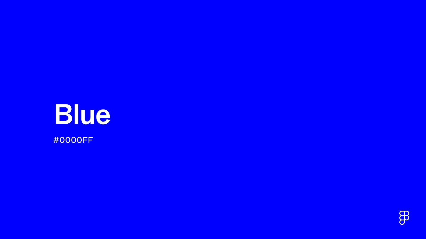
What color is blue?
Blue is one of the three primary colors within the RGB color model and can be created by combining cyan and magenta within the CMYK color model. Blue is associated with feelings of calmness and tranquility, reflecting the appearance of the sky and large bodies of water. Designers can utilize blue’s many hues and cool tones to evoke a wide variety of emotions, from serenity to melancholy.

What does blue look like on digital screens?
Blue is defined by the following color codes and values to ensure consistency across various digital platforms and devices.
- HEX code: #0000FF
- RGB value: 0% red, 0% green, and 100% blue
Accessibility considerations play a crucial role in UX and UI design color choices. Figma offers plugins in the Community to make sure your designs meet Web Content Accessibility Guidelines.
How should I effectively use blue in UI design?
Here are some ways to use blue in your designs:
- Convey a sense of trust. The color blue is commonly associated with stability, confidence, and professionalism. Use it in designs for corporations, banks, and other firms you wish to present as reliable or reassuring.
- Promote a sense of calm. Use blue strategically in your designs to relax users. Tools like Zoom and Smartsheet utilize shades of blue to promote focus and productivity in work settings.
- Establish a visual hierarchy. Use different shades of blue to create a sense of visual hierarchy. Use lighter blue shades to call attention to more prominent items, such as buttons and headers.
Keep in mind that color and its meaning can change from culture to culture—and at any given time. If you are designing for a global audience, research color considerations for your specific regions.
What are similar colors to blue?
For variations within the same relaxing, professional spectrum as blue, consider:
- Slate blue (#5B7C99) is an understated alternative for professional applications with its muted, gray-blue hue.
- Powder blue (#B6D0E2) is an option for designers looking to dive deeper into the calming aspect of blue, providing a more delicate shade.
- Cerulean (#2A52BE) is a slightly more vibrant blue shade, like the sky on a sunny day, yet reserved enough for business use cases.
- Turquoise (#40E0D0) leans more into the world of green but maintains the relaxed, subdued feelings of standard blue.
What colors go with blue?
Utilizing neutral tones, such as white or gray, is a clever choice when you want the full impact of the color blue to stand out in your designs. To make your design pop a bit, implement complementary colors such as orange. You might also consider:
- Beige (#EDE8D0) provides a warm tone that contrasts pleasantly but allows blue to remain the primary focus of attention.
- Navy blue (#000080) is a darker shade that complements standard blue, adding additional depth to your blue color palette.
- Peach (#FFD3AC) pairs well with blue to achieve a warm sense of comfort and calmness.
- Yellow (#FFFF00) will inject life into your blue designs, serving as a cheerful color that contrasts and adds vibrancy.
- Silver (#C4C4C4) is a metallic color with cool undertones that works well as an accent in blue designs, helping to achieve an air of elegance.
Other colors worth considering include lavender, which adds depth and sophistication to your blue color palette. Another option is mustard, which adds a pop of color that isn’t as vibrant and loud as classic yellow.
What colors conflict with blue?
While blue is highly adaptable, it may clash with:
- Red (#FF2C2C) can be overwhelming when combined with blue if the two colors are not carefully balanced.
- Brown (#895129) seems like it may work well, but its warm tones don’t always complement the coolness of blue.
- Lime green (#89F336) and other highly saturated colors may clash with blue, especially in large designs.
- Mint green (#ADEBB3) is another green shade that doesn’t mix well with blue; it can appear too overpowering in many contexts.
- Gold (#EFBF04) can clash with blue if not used sparingly as an accent.
What does blue symbolize?
Within color theory, blue symbolizes harmony and tranquility. People turn to blue to establish a sense of security and reliability in professional settings. However, blue’s meaning varies among cultures. Ancient Greeks saw it as a color symbolizing the gods and heavens. Indigenous people in the United States continue to view it as a symbol of wisdom, spirituality, and healing.
Blue, as associated with the sky and ocean, evokes feelings of calmness and relaxation. These emotions help connect blue to additional feelings of trust and safety. Designers commonly use blue to help relieve stress, such as hospitals and offices.
Designers also integrate blue when they want to relax viewers. Additionally, because it can impart a feeling of trust and stability to the viewer, blue is an excellent option when creating a corporate brand and identity.
What’s the history of blue?
The color blue derives its name from the Old French word “bleu,” which comes from the Proto-Indo-European language. The root “bhel” originally meant “to shine.” During prehistoric times, ancient civilizations created the pigment using minerals like lapis lazuli and azurite.
The ancient Egyptians heavily used the color blue, viewing it as a symbol of the divine. Ancient Egyptian civilization used blue so widely that they invented a hue we continue to reference as Egyptian blue; Egyptians synthesized the color from silica, lime, copper, and alkali. They utilized it in art, jewelry, cosmetics, and to paint the exterior of the pyramids. The ancient Greeks also valued the color blue, working it into art and architecture.
Through the Middle Ages and Renaissance periods, blue became associated with royalty. The pigment was rare and costly, making it more valuable than some precious metals, including gold. By the Industrial Revolution, chemists discovered how to make synthetic blue pigments, making the color more affordable.
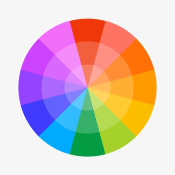
Color variations
Shades
Tints
Tones
Hues
Color harmonies
Complementary
Analogous
Monochromatic
Split
Triadic
Square
Custom palettes
Azure Echo
Starry Night
Dreamweaver
Accessibility
Contrast checker
- Large Text
- Figma
- Normal Text
- How you design, align, and build matters. Do it together with Figma.
8.59:1
WCAG 2.2 Simple ContrastNormal Text
- Pass
- AA
- 4.5:1
- Pass
- AAA
- 7:1
Large Text
- Pass
- AA
- 3:1
- Pass
- AAA
- 4.5:1
- Large Text
- Figma
- Normal Text
- How you design, align, and build matters. Do it together with Figma.
2.44:1
WCAG 2.2 Simple ContrastNormal Text
- Fail
- AA
- 4.5:1
- Fail
- AAA
- 7:1
Large Text
- Fail
- AA
- 3:1
- Fail
- AAA
- 4.5:1
Color simulations
Protanopia
Deuteranopia
Tritanopia
Achromatopsia
Color conversion
The hexadecimal color #0000FF, known as blue, has RGB values of R:0, G:0, B:255 and CMYK values of C:100, M:100, Y:0, K:0.
| VALUE | CSS | |
|---|---|---|
| HEX | #0000FF | #0000FF |
| RGB DECIMAL | 0, 0, 255 | RGB(0, 0, 255) |
| RGB PERCENTAGE | 0, 0, 100 | RGB(0%, 0%, 100%) |
| CMYK | 100, 100, 0, 0 | |
| HSL | 240°, 100, 50 | HSL(240°, 100%, 50%) |
| HSV (OR HSB) | 240°, 100, 100 | |
| WEB SAFE | #0000FF | #0000FF |
| CIE-LAB | 32.299, 79.191, -107.865 | |
| XYZ | 18.046, 7.219, 95.044 | |
| xyY | 0.15, 0.06, 7.219 | |
| CIE-LCH | 32.299, 133.814, 306.285 | |
| CIE-LUV | 32.299, -9.406, -130.352 | |
| HUNTER-LAB | 26.867, 72.878, -190.934 | |
| BINARY | 00000000, 00000000, 11111111 | |
| iOS - SwiftUI | Color(red: 0, green: 0, blue: 1) | |
| iOS - UIKit | UIColor(red: 0, green: 0, blue: 1, alpha: 1) | |
| Android - Compose | Color(0xFF0000FF) |