


Figma for design systems
A design system for everyone
Create shared assets and libraries that the whole team can access. Figma enables design system adoption for more consistency and efficiency.

Trusted by teams at
Design systems that scale
Collaborate together on reusable assets to create a design system that enables consistency and innovation across teams and products.

Create structure for faster innovation
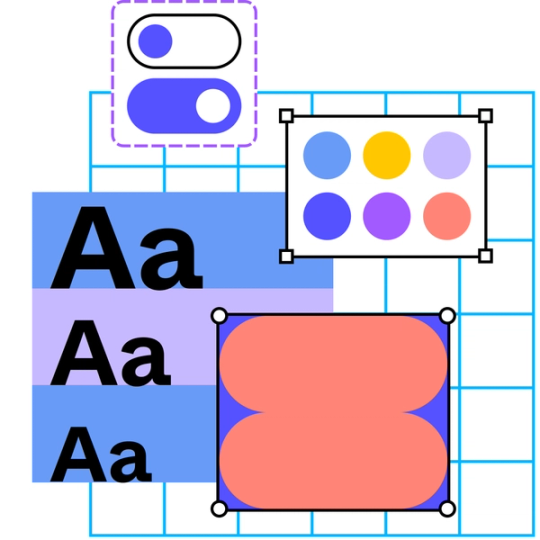
Standardize styles, variables, and components so that everything from color to padding scales seamlessly across your products and brands.
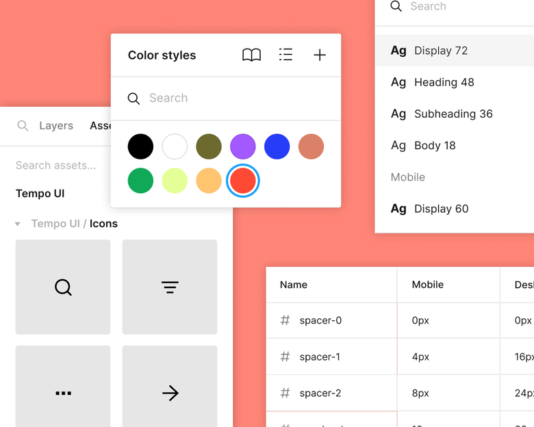
Share libraries for more consistency
Publish assets in team libraries so the latest approved design elements are always a drag and drop away.
Scale your design systems as your product grows
Powerful design systems capabilities, like variable modes, help you scale across use cases, themes, and more.
Explore design system features
Streamline the product development process with a design system that’s aligned across design and code.

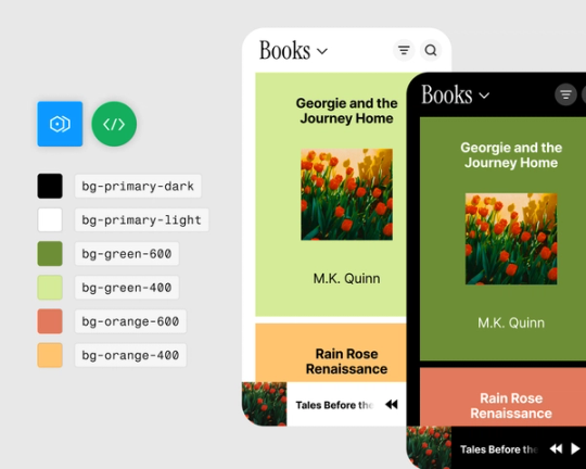
Implement design tokens
Use variables and modes to implement design tokens for you design system. Use color tokens to swap between light and dark modes, or typography tokens to change fonts between brands, and so much more.

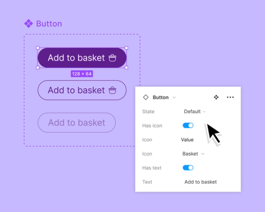
Map components in Figma to code
Use component properties to make components more customizable and map to React properties.

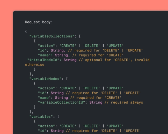
Keep design systems in sync
Use Figma’s variables REST API to create and manage variables in bulk—saving you time while scaling your design system.

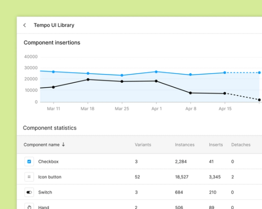
Track usage analytics
Check out the usage of your team's components and variants with design system analytics.
There was a night and day difference after we transitioned to Figma. It acted as a catalyst for building out our design system.
James Davis, Lead Designer at News UK


About Spotify’s cross-platform design system
Read how a need for more cohesion led Spotify’s design systems team to take a cross-platform approach to components.


Explore open design systems from leading brands
Get access to open design systems—from brands like Github, Atlassian, Salesforce, and more.


5 ways to make the most of design system analytics
Design system analytics give teams the context they need to make better decisions and drive adoption.