Page MenuHomePhabricator

[S] Highlight (via a colored border) statement panels on Commons reached via anchor link
Closed, ResolvedPublicFeature

Description

We have this: We've recently implemented linking to specific statements via Property IDs for structured data on Commons, but the target statement UI block isn't highlighted, which is not quite an optimal user experience.

We want this:

ideally, statement blocks reached via anchor tag should be highlighted like they are in Wikidata.

Screenshots (if possible):

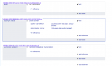
Example from Wikidata:

Screen Shot 2020-04-15 at 5.18.32 PM.png (646×1 px, 100 KB)

Acceptance Criteria:

  • When file page URLs have anchor tags to a specific statement/property, highlight that statement block in the UI with a blue border of appropriate weight (doing it exactly like Wikidata is probably the best bet)

During development, please test the following:

  • Test this feature while logged in AND logged out
  • Test this feature on at least one mobile browser

COVID-19 Deployment Criteria

  • Can you roll back this change without lasting impact?
    1. A recovery plan is required as this will help identify our capacity for recovering from the failure
    2. THIS IS A KEY QUESTION, if you can’t answer it, you shouldn’t deploy
  • Is specialized knowledge required to support this change in production? If so, are there multiple people with this knowledge?
  • Is there a way to increase confidence about the correctness of this change?
    1. Reviews (Design, Code, etc)
    2. Testing coverage (unit tests, integration tests)
    3. Manual testing (e.g. Beta, vagrant, docker)
Event Timeline

CBogen renamed this task from Highlight (via a colored border) statement panels on Commons reached via anchor link to [S] Highlight (via a colored border) statement panels on Commons reached via anchor link.Apr 29 2020, 4:25 PM

Hey @mwilliams, do you think the border around the linked-to statement panel should persist the entire time the user is on the page, or disappear after a certain time or event? I'm thinking of a couple of scenarios:

  1. User follows a link to a specific statement panel. Once the page loads, the browser scrolls to the panel and there's a border highlighting it. Once they click somewhere on the page besides that statement panel, the border is removed.
  2. User follows a link to a specific statement panel. Once the page loads, the browser scrolls to the panel and there's a border highlighting it. The border fades away after ~5 seconds.

We could also just leave the border there, which is what happens on Wikidata.

What do you think is the best experience?

@AnneT Option 1 sounds super reasonable to me. It lets someone get oriented and when they start to take a new action it can disappear.

+1 for option #1. This is how GitHub works when I get to an issue page from a notification email, and it’s quite intuitive for me.

Highlighting a panel that the user has been directly linked to is simple: you can use the :target selector to apply a special style rule as long as the URL contains a hash that matches the ID of the panel.

But target is different from focus – the target would only change if the URL hash was updated (like by clicking on an anchor link to another section of the page). Personally, I would find it kind of surprising/unexpected if a focus-changing action (like selecting an input field) started changing the URL hash in order to clear the target (maybe the user wants to keep the hash in the URL so they can share it, etc).

However, if the goal is to make the targeted element noticeable when the page first loads, and then to remove the extra styling so that it doesn't linger on the page and become a distraction, maybe a CSS animation is a good approach. From the user's perspective, the #P123 panel that matched their URL would get the colored border for a few seconds when the page loads, and then it would fade away and look identical to any other statement panels on the File page. The URL hash would remain unchanged.

Here's an example of how that could look:

One advantage of this approach is that no JS is required.

If we really want to ensure the highlighting remains until the user does something that changes focus, I think the best approach would be to do something like this:

  • When the page JS first runs, check if any element whose ID matches the URL hash is a statement panel (as opposed to something else) and apply a highlight class to it
  • Add a global event listener for focusin events (these bubble, unlike the regular focus event) which removes the highlight class from any statement panels that have it. document.addEventListener( 'focusIn', function () { ... } )
  • URL hash would be left alone

Change 599141 had a related patch set uploaded (by Eric Gardner; owner: Eric Gardner):
[mediawiki/extensions/WikibaseMediaInfo@master] Style statement panels with IDs matching URL hash

https://gerrit.wikimedia.org/r/599141

Hey @egardner, thanks for the thorough explanation. I think the main issue with fading the border out after x seconds is that we don't know how long it'll take for the panel to load for a given user. On my (slow) local site, the border fades well before the statement panel has fully loaded. We could bump up the time to something like 10 seconds, but that still might not cover all users. I'd recommend we either do that and assume it'll cover most users, or go for a JS solution to mimic github's UX.

Edit: After chatting in Slack, the best simple solution would be to just let the border persist (which is how it works on Wikidata)

I'm in agreement about just letting the border stick around as long as the panel ID is in the URL. This is fairly common behavior on lots of websites. Will update my patch to remove the animation. A non-JS solution is a win here in my opinion.

Change 599141 merged by jenkins-bot:
[mediawiki/extensions/WikibaseMediaInfo@master] Style statement panels with IDs matching URL hash

https://gerrit.wikimedia.org/r/599141