Page MenuHomePhabricator

Variant C/D: clicking content of task preview doesn't open suggested edits
Closed, ResolvedPublic

Description

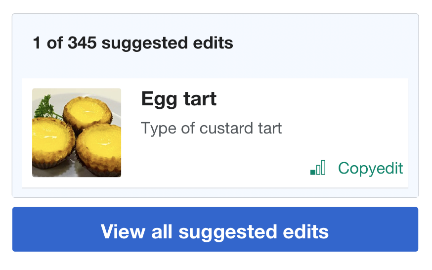
On variant C/D on mobile, the user sees a small task card:

image.png (239×397 px, 31 KB)

Tapping on the image, the title, or anywhere in the white box does not advance to the suggested edits screen. Tapping on the "See all suggestions" button or the blue background does.

We should fix it such that tapping anywhere within the module container advances to suggested edits.

Event Timeline

@RHo I assume want want this done before launch, if so can you place this in ready for development?

@RHo I assume want want this done before launch, if so can you place this in ready for development?

Done, thanks! Question though for you and @MMiller_WMF - if it is possible to open up the first article directly if the user taps on the article card instead of the button, can we do that instead and have only the button open SE?

Yes technically we could do that; that seems like more of a product question though, so let me know what you and @MMiller_WMF decide on that.

@RHo @kostajh -- I remember talking about this when we designed the feature, and we chose to have all the taps go to the module instead of the article.
The reason we preferred this is because if a user goes to their homepage and taps the card, bringing them to the article, then they don't see the suggested edits module and may not know how to find it, and consequently, would not discover the topic or difficulty settings.

So we opted to keep it simple, especially because it would help the user learn more about the features.

But maybe you're right. Now that I'm looking at it, I suppose I would expect tapping on the article card to take me to the article, especially because the progressive button says "See all suggestions" (emphasis mine).

So yes, let's change it. Sorry for the change, @kostajh.

MMiller_WMF renamed this task from Clicking image or text content of small task card doesn't open suggested edits to Variant C/D: clicking content of task preview doesn't open suggested edits.Sep 30 2020, 12:39 AM
MMiller_WMF added subscribers: Tgr, Catrope.

Making the whole block link to the SE module should be simple, just prevent the card from wrapping itself in an <a> (in theory the taskUrl: null parameter it gets should do that but apparently it fails in some mysterious way).

Making it link elsewhere not so much, as <a> tags cannot be nested. We'd have to use a Javascript click handler instead (which means a different behavior during the skeleton phase), right click breaks etc.

Change 631136 had a related patch set uploaded (by Gergő Tisza; owner: Gergő Tisza):
[mediawiki/extensions/GrowthExperiments@master] Unbreak links containing small task cards

https://gerrit.wikimedia.org/r/631136

In any case, SmallTaskCard not working properly as a part of a link when it is configured to be part of a link is a bug that needs to be fixed, whether or not we want to configure it that way in the mobile preview.

But maybe you're right. Now that I'm looking at it, I suppose I would expect tapping on the article card to take me to the article, especially because the progressive button says "See all suggestions" (emphasis mine).

My two cents is that, if we split the surface area of the suggested edits module into two different link targets (the article itself vs suggested edits overlay), there will probably be quite a few people who end up arbitrarily going to one or the other because it's not immediately obvious if those are two different link actions, or because the overall size is small and people have large thumbs, etc.

In any case, SmallTaskCard not working properly as a part of a link when it is configured to be part of a link is a bug that needs to be fixed, whether or not we want to configure it that way in the mobile preview.

I've merged the patch, placing back into Ready for Development to work on the specification change.

Change 631136 merged by jenkins-bot:
[mediawiki/extensions/GrowthExperiments@master] Unbreak links containing small task cards

https://gerrit.wikimedia.org/r/631136

Now that I'm looking at it, I suppose I would expect tapping on the article card to take me to the article, especially because the progressive button says "See all suggestions" (emphasis mine).

I think there are two conflicting user expectations here, one is that the summary boxes generally take you to the corresponding module (there is an arrow on the top, and the design suggests the arrow is not separate from the whole box) and that task cards on other pages link to the task.

Exacerbating that is that that having a link nested inside another link is very uncommon. It is also not technically valid (ie. <a> <a> </a> </a> is invalid HTML), so we'd have two options:

  • Do not make the task card a real link, instead use a Javascript click handler to send the user to the task page. This is trivial to do but a crappy UX - for example, hovering would show the wrong URL (it's not that uncommon to use the mobile view on desktop so hovering does happen there), and opening the task in a new tab via the long-tap context menu would open the module, not the task (you can hijack clicks / normal taps in Javascript, but not the context menu).
  • Put the task card below the module, and use CSS hackery to position it in top of the module as if it were a part of it (so in the HTML sense it is not nested). That's a nontrivial change and probably a bit fragile.

So IMO this would do more harm than good.

Okay, thanks for thinking and writing about this @kostajh and @Tgr. Given that we were ambivalent about this in the first place, and that nesting the targets adds fragility, we can skip it. Let's make the whole module, and everything in it, just one big target that opens up the full module. I'm sorry we've gone back and forth, but I think that's what healthy discussion does. We want to do this before launching Variants C and D.

Okay, thanks for thinking and writing about this @kostajh and @Tgr. Given that we were ambivalent about this in the first place, and that nesting the targets adds fragility, we can skip it. Let's make the whole module, and everything in it, just one big target that opens up the full module. I'm sorry we've gone back and forth, but I think that's what healthy discussion does. We want to do this before launching Variants C and D.

Fair enough. But maybe something to consider for a leftovers task? Esp. if we amended to create a more bisected module design like the following:

image.png (546×874 px, 143 KB)

(If there are no suggested edits it then reverts to the variant A one.)

@RHo -- okay, please do create a leftovers task.

Yes, I noticed that the card did not allow the clicking and thought that it's done to guide a user to click on only on "See all suggested edits". The issue is fixed now.

The good thing - if a card is shown on the SE Homepage, the same one will be also shown in SE module. So, users won't be confused. Changing filters/selecting a new topic(s) and then navigating back to the Homepage will make SE card view to display the last card that was presented to a user.
However, if a user clicks next/previous arrows and moves between cards in SE module and then returns to the Homepage - the card displayed there won't match the last card that a user saw in SE module.

On desktop - variant A (and others) - SE module doesn't preserved a last card that a user sees before navigates away and then returns, so not preserving the specific card on variant D mobile seems consistent with users experience on desktop.

On the other hand, desktop users cannot return to the initial Homepage screen with the SE card view but the mobile users will always see the Homepage screen with the SE card. So the Homepage and SE module might be viewed as much more connected. Navigating back from SE module to the Homepage might be felt as not a "real" navigation. The users expectation might be that a card in the SE card view should match a card that users saw when they left SE module.