Through the course of implementing var C/D, it is observed that the Suggested edits module layout required some further visual design refinements not well-specified/translated from mocks to the original task description of T258704 written by me (@RHo).
Issue A. Article card and image display
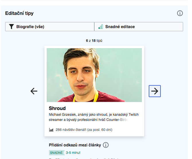
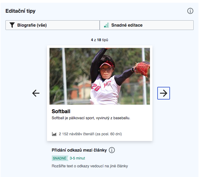
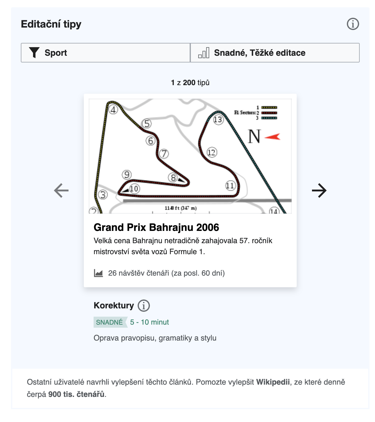
The panoramic aspect ratio is not ideal for the article image, often leading to top-and-bottom cropped images or repeated-y images.
This is illustrated in the following comparison table.
| Version | Image dimensions (Width x Height)/Aspect | Ratio (W/H) | Example 1 | Example 2 |
|---|---|---|---|---|
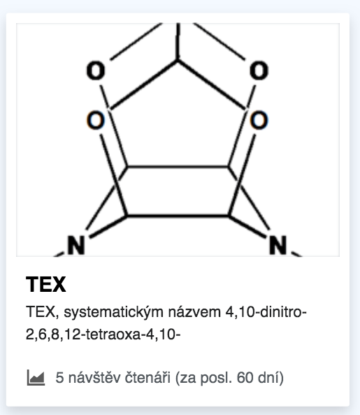
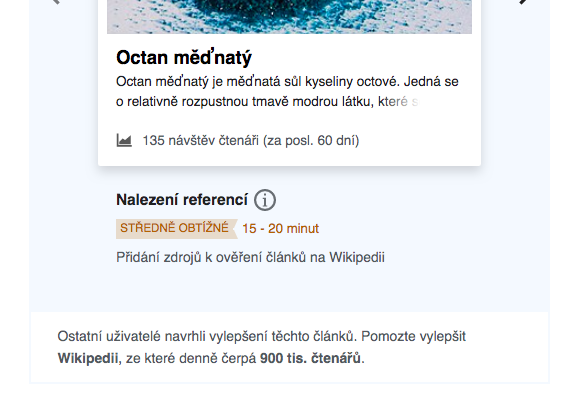
| Var C/D implemented from T258704 (according to inaccurate css on the task description at odds with the Zeplin mock.) | 368x160px | 2.3 |  |  |
| Var C/D mockups | 332x160px | 2.075 | 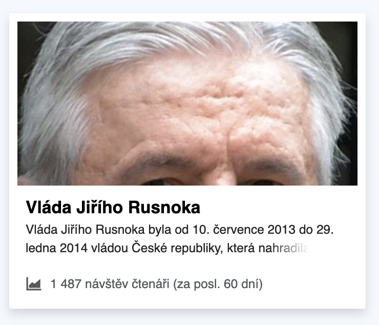 | 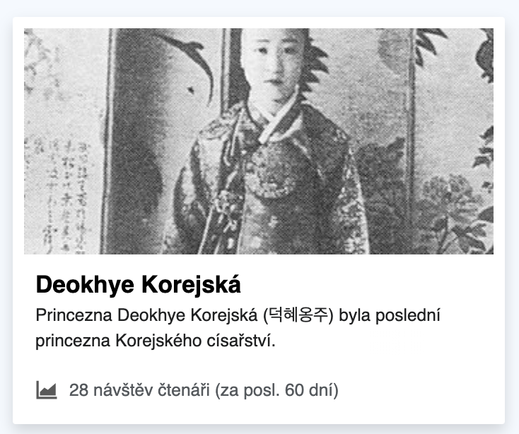 |
| Var A/B card | 260x160px | 1.625 |  |  |
| HD aspect ratio | 16 : 9 | ~1.78 |  |  |
Proposed solution:
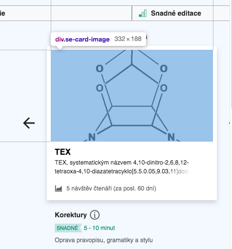
(i) Update the card image dimensions to width:332px and height:188px (for close to the 16:9 aspect ratio)
(ii) This also means updating the total card width according, done by adjusting the class .suggested-edits-task-card-wrapper to have a width:332px.
(iii) The task explanation below the card also requires adjusting the class .suggested-edits-task-explanation-wrapper width so that the text aligns with the text inside the card... which can be done by adding 8px to padding left and right on this class.
(iv) The task explanation (class .suggested-edits-task-explanation-wrapper) should also have reduced top and bottom padding, reducing from 24px padding top and bottom to 16px
(v) The space between the suggested edits pager and the top of the card is reduced to 8px. This is achieved by changing the margin-bottom on class .suggested-edits-pager from margin:11px to margin;8px, and removing the padding-top:5px from the class .suggested-edits-card-wrapper
(vi) Add a box-shadow:inset 0px 0px 2px #c8ccd1 on the image (class .se-card-image) for so that there is an boundary for when there is an image with white edges:
Current  | Proposed with inset box-shadow  |
Note: changes proposed here may impact the need for T238598
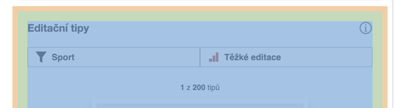
Issue B. Suggested edit module footer
Having the border set to transparent makes the footer appear to be 'floating' below the module.
Current 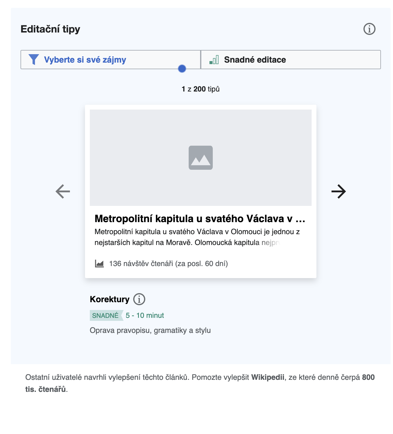 | Proposed change 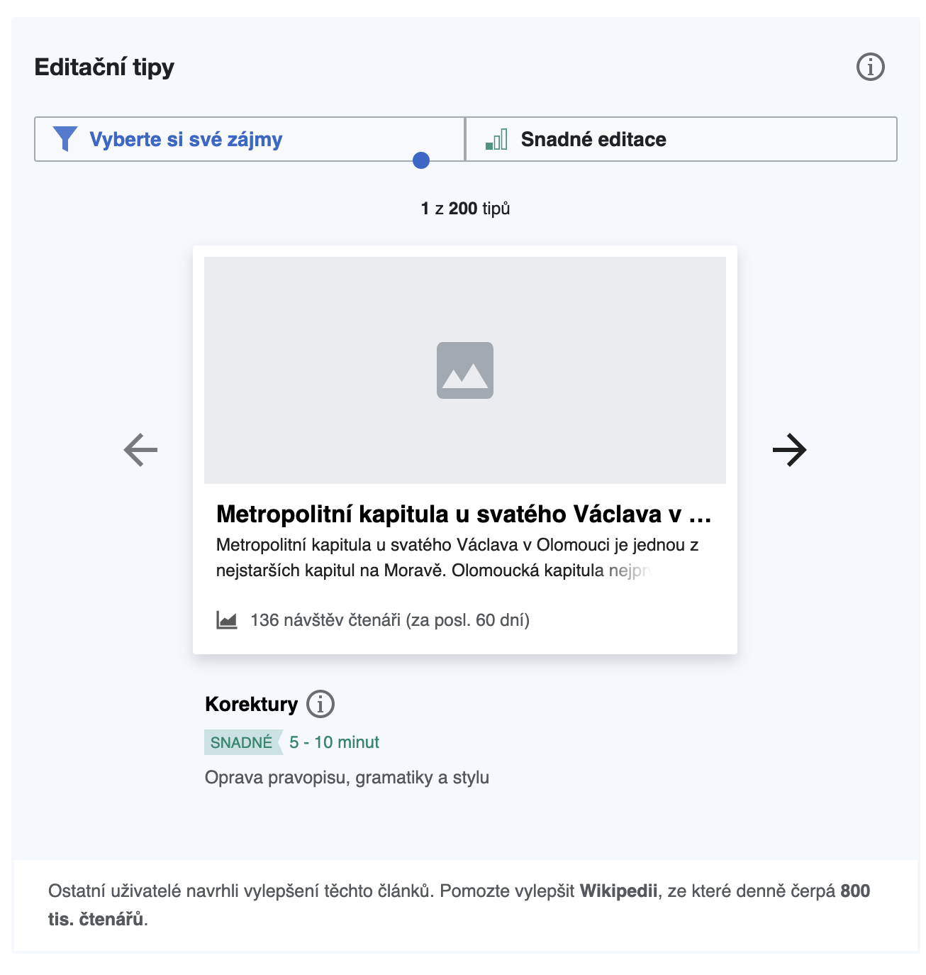 |
Add a border with 2px radius to the SE footer {border: solid 2px rgba(234,243,255,.5); border-radius:0 0 2px 2px}
Issue C. Suggested edit module header
The addition of the header info icon appears to have added unintended padding around the SE module header on the top, bottom and right.This is noticeable when compared with the Zeplin mocks:
| Header Top padding | SE module header with unexpected extra space over the 16px top padding  | Expected header text top position with top padding  |
| Info icon right padding |  | Expected RHS padding 16px 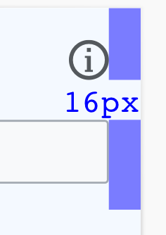 |
| Bottom padding (actual) | 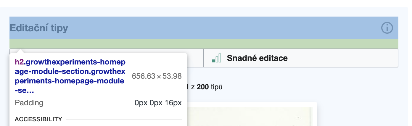 | Expected 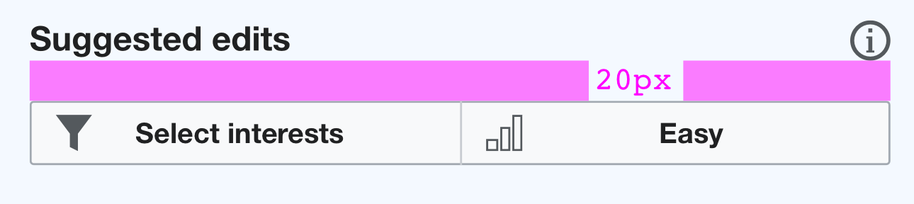 |
Proposed fixes: Adjust how the info icon is being placed inside the module so that the padding for both header text and info icon is reduced to the expected.