Page MenuHomePhabricator

Topic Subscriptions: Improve user interface element for subscribing and unsubscribing to topics on Talk Pages
Closed, ResolvedPublic

Description

Problem:

The current prototype for topic subscriptions includes a text treatment for subscribing to topics, however, ideally this would be replaced with an intuitive icon treatment. Previous attempts (such as Flow) at creating an affordance for this chose to use a star icon. While we could use this same treatment, we need to consider that the star is currently used on wiki to suggest Watchlist subscriptions. One of the reasons that this worked for Flow was that Flow allowed for topic subscription management through the watchlist, however we are not going that route for now [i]

current text treatment on the prototype

Screen Shot 2021-04-02 at 10.38.49 AM.png (183×772 px, 69 KB)

star icon on Flow

flowstar.png (97×653 px, 14 KB)

User Stories

Primary
As a Junior or Senior Contributor who is: a) viewing a talk page and b) interested in knowing about new activity in specific conversation(s)
I want to know what to do to start and stop receiving notifications about said "new activity"
So that I can feel informed about topics that are relevant to me and know whether it is necessary for me to say or do something.

Secondary
As a Junior or Senior Contributor viewing a talk page
I want to be able to quickly identify the conversations I am and NOT subscribed to
So that I can feel confident knowing what activity I am and am NOT being notified about on said page

Implementation

The Abonnieren / Abbestellen affordance on desktop will:

  • Be located on the right side of talk pages in LTR languages and on the left side of talk pages in RTL laguages
  • Be styled to appear like all other link affordance on talk pages (e.g. [ reply ] / [ edit ] / [edit | edit source]

More in T279149#7059340.

Open questions

  • 1. How will we manage/accommodate the future scenario where some people will see the text-based subscription affordance and others will see the visual affordance we'll be implementing as part of the work on topic containers happening in T269950?
    • We will answer this question in T269950; see the Section title actions section of the ===Requirements section.

Erledigt

  • Create a mockup of the topic subscription affordance in its "Subscribed" and "Unsubscribed" state on desktop and mobile
  • Implement what is pictured in the == Mockup == section above
  • Alle === Open questions are answered
  • @ppelberg posts updated screenshot to T274193 ---

i. T273911#6882727

Related Objects

Event Timeline

There are a very large number of changes, so older changes are hidden. Show Older Changes

@iamjessklein can you please fill in the task description's ===Done section?

@ppelberg - I've added in the Done criteria in the "Description" - please review.

@ppelberg - I've added in the Done criteria in the "Description" - please review.

Thank you, @iamjessklein. I made some tweaks to:

  • The ===User Stories section
  • The ===Done section

...provided the above look good to you; I think this task description is all set.

Considering that we currently don't have an opinion on T279312, and we don't have a dashboard of some sort for notifications, and aren't planning on bringing topic subscription into the Watchlist, I think we should default to using the same visual language as Flow (star).

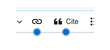
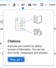
One thing that we might want to consider is introducing "blue dots" for guidance for the first few uses of the feature and provide an educational tip to explain the feature.

example screenshots of blue dots

image.png (71×156 px, 1 KB)
image-1.png (359×295 px, 44 KB)

@iamjessklein: are you able to describe the connection you see between these reasons [i] and the proposed path forward [ii]?

Reason I ask: I'd been thinking that on 4-March [iii] we came to decide that, for now, we would consider new comment notifications as distinct from watchlist entries. As such, re-using the same icon (the "Star") in these two contexts could lead people to think these two actions ("Watching" and "Subscribing") are related in ways that they are not [currently].


i.

Considering that we currently don't have an opinion on T279312, and we don't have a dashboard of some sort for notifications, and aren't planning on bringing topic subscription into the Watchlist...

ii.

...I think we should default to using the same visual language as Flow (star).

iii. T273911#6882727

So for the medium term we aren't putting anything in the watchlist or having a subscription dashboard, which means there's no holistic way for contributors to manage all of their topics. I recognize that the star could potentially be confusing for senior contributors, but I don't think we should introduce any new iconography (and possibly new language is a bad idea as well) if in the long term we do end up having some sort of topic management system that requires yet another visual language (so we would we end up changing it many times).

After a series of conversations which I summarized over in T279150#6981608, we've come to three potential designs for near term implementation.

Option 1: Text/ Subscribe (what's currently implemented)

Screen Shot 2021-04-07 at 4.14.21 PM.png (169×709 px, 20 KB)

Option 2: Text/ Subscribe next to a pipe adjacent to the Edit button

Screen Shot 2021-04-07 at 4.14.36 PM.png (157×682 px, 20 KB)

Reason NOT to do this: we know for sure that this will change when we start working on the topic panel ui treatments so it will be 2 changes that someone will have to get used to.
Reason TO do this: it's not styled and therefore we have time to see how this will relate to the future topic panel design.

Option 3: Overflow to match what's over in Echo Notification dropdown (T279150)

Screen Shot 2021-04-07 at 4.14.45 PM.png (168×686 px, 21 KB)

Reason NOT to do this: It's just an extra click to get to what you want to get to.
Reason TO do this: if we want to think about this overflow menu pattern and expand it into a more robust component later on.

I'd love thoughts on these designs (which can be seen in greater detail in Figma). Do you feel any conviction about which direction we take?
cc/@ppelberg @Esanders

Thank you for posting these, @iamjessklein.

I'd love thoughts on these designs (which can be seen in greater detail in Figma). Do you feel any conviction about which direction we take?

I think we should move forward with Option 2: Text/ Subscribe next to a pipe adjacent to the Edit button.

Reasons:

  • I think this approach will increase the number of Senior Contributors who experiment with topic subscriptions because the "costs" for doing so will be relatively low. [i]
  • This approach aligns with the strategy we've been following, and has proven to be reasonably effective, to-date: 1) Quickly validate the usefulness of new functionality by way of minimally invasive changes in the page's UI [ii] and then, 2) Improve the discoverability of said new functionality. [iii]

Reason NOT to do this: we know for sure that this will change when we start working on the topic panel ui treatments so it will be 2 changes that someone will have to get used to.

  • @iamjessklein: can you share what the "2 changes" you have in mind are?

For context...

While I agree with – what I understand to be – the sentiment underlying the statement above (changes bear costs and those costs should be considered), I think this approach minimizes the number of changes Senior Contributors could potentially need to navigate/cope with considering improvements to the discoverability of the Abonnieren/Abbestellen affordance will happen by way of topic containers (T269950) which people who have the topic subscriptions feature enabled need not use if they do not wish.


i. The decision to try topic subscriptions is "smaller" in so far as there are fewer things you need to consider: "Do I want to try out being able to receive notifications about new comments in specific sections?" rather than "Do I want to try out being able to receive notifications about new comments in specific sections and add a foreign to the page?"
ii. See: the text-only styling of the [ reply ] link and re-use of the page's existing New section link for the New Discussion Tool
iii. See: T249578, T255560, T267444, and T269950

To clarify the 2 changes:

-first someone will have to get used to the word subscribe in text form as well as the proximity
-second they will need to get used to the style and placement should we change/move the item

As I defer to you and @Whatamidoing-WMF about how the roll out strategy, I am alright with this being a first iteration.
Let's hold off on any additional treatment to the Watchlist page (directing Senior Contributors off the page for Topic Subscription notifications) until we validate through testing in T275232
Let's also hold on creating any kind of on-boarding or guided experience (blue dot tours) for this first prototype, and again we can validate through testing if there's a need. With regard to that, I've added a question T279164 is about how well junior contributors understand Edit vs. Subscribe as actions

Interestingly, I think that 2 is the most-complex one to implement, because those links are already meddled with by VE so we'll need to be careful to not trip over each other.

...those links are already meddled with by VE so we'll need to be careful to not trip over each other.

@DLynch can you share more details about the above? What does "meddle" mean in this context?

...those links are already meddled with by VE so we'll need to be careful to not trip over each other.

@DLynch can you share more details about the above? What does "meddle" mean in this context?

Change/modify/add-to

Change/modify/add-to

Yes, we already in VE's Javascript adjust the precise target of those links so that VE takes over. Depending on settings, we also create and add the "edit source" version of the link so there's not just "edit".

Mostly we'll be on talk namespace where VE is suppressed so there's only "edit source"... but since we can trigger DiscussionTools on non-talk-namespace, there'll be ways to have both running at once I assume.

Re: mobile web.

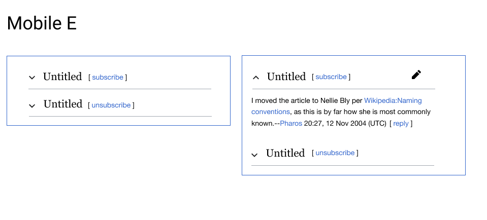
I *think* that the mobile version with this direction should look like:

Screen Shot 2021-04-16 at 1.54.22 PM.png (434×959 px, 32 KB)

Please leave high level feedback here and detailed feedback on the Figma file.

Re: mobile web.

Per the conversation @iamjessklein and I had yesterday (20-April), we are going to finalize the mobile designs in a separate ticket. That ticket is: T280822.

Change 674421 had a related patch set uploaded (by Bartosz Dziewoński; author: Esanders):

[mediawiki/extensions/DiscussionTools@master] WIP Subscribe label buttons

https://gerrit.wikimedia.org/r/674421

@matmarex You've implemented it correctly in T280199 👏

Is it possible to implement what is pictured in the task description's ===Mockups section?

Context: in T279149#6982355 we came to decide on the presenting the Abonnieren / Abbestellen affordance as text next to the existing section [ edit ] links.

Yes, but it hasn't been done yet. The patch I added above is an old one (from March), it just wasn't linked properly to this task.

I've looked into this a bit more and I'm no longer sure it's a good idea to re-use the section edit link area right now:

  • It makes the subscribe feature harder to pick out on the page, and it is grouped in with a tool that performs a very different action (edit)
  • There will be inconsistency across pages and headings:
    • On most talk pages where VE is disabled you will see [ edit | unsubscribe ]
    • On project pages with __NEWSECTIONLINK__ you may see [ edit | edit source | unsubscribe ]
    • Any heading lower than an h2 will only show [ edit ] oder [ edit | edit source ], making it harder to see quickly which sections are subscribe-able.
  • Section edit links are configurable:
    • There's no user preference to disable them, but...
    • They can be disabled for a whole page using the __NOEDITSECTION__ magic word
      • It may be possible to work around this by recreating the section edit link group ourselves, and then just adding one link so you get [ unsubscribe ], but this feels hacky and flaky.

Revision to implementation
Per this today's team meeting, to start, the Abonnieren / Abbestellen affordance on desktop will:

  • Be located on the right side of talk pages in LTR languages and on the left side of talk pages in RTL laguages
  • Be styled to appear like all other link affordance on talk pages (e.g. [ reply ] / [ edit ] / [edit | edit source]

Change 685413 had a related patch set uploaded (by Esanders; author: Esanders):

[mediawiki/extensions/DiscussionTools@master] Subscribe/unsubscribe with plain text links

https://gerrit.wikimedia.org/r/685413

Test wiki created on Patch Demo by ESanders (WMF) using patch(es) linked to this task:

https://patchdemo.wmflabs.org/wikis/5c38ec39c4/w/

This works as expected @Esanders - in terms of looks, in order to match reply and edit "sufficiently plain" buttons it should have brackets.

I think bracket-less might be more plain than with brackets. Without brackets it looks like a prototype, with it looks like we consciously designed it to look like [ edit ] links?

While I default to @iamjessklein to make the final call here, my instinct [i] is to do what she proposed in T279149#7061602 and style the Abonnieren / Abbestellen links to be consistent with the [ reply ] links (read: encapsulate the links in brackets [ ]).

Thinking:

  1. We are striving to present the Abonnieren / Abbestellen affordances in the way Senior Contributors will find to be most consistent with the way talk pages currently appear.
  2. There are precedents for styling talk pages affordances with [i][ii] and without brackets [iii]
  3. Considering "1." and "2." I default to the approach that's consistent with how the [ reply ] and [ edit ] links appear.

i. [ Add topic ] affordance on meta.wiki
Screen Shot 2021-05-04 at 5.23.49 PM.png (588×2 px, 261 KB)
ii. Section watchlist gadget's [ watch ] affordance
Screen Shot 2021-05-04 at 5.24.45 PM.png (534×1 px, 196 KB)
iii. fr.wiki's Ajouter un sujet affordance
Screen Shot 2021-05-05 at 5.36.18 PM.png (1×2 px, 487 KB)

Note: during today's team meeting, I expressed a preference for the "bracketless" approach. As the above indicates, I've since revised the approach I am leaning towards, albeit without strong conviction.

I'm assigning this over to @Esanders to implement the "bracketed approach" @iamjessklein described in T279149#7061602.

Test wiki created on Patch Demo by ESanders (WMF) using patch(es) linked to this task:

https://patchdemo.wmflabs.org/wikis/c647283588/w/

Change 685413 merged by jenkins-bot:

[mediawiki/extensions/DiscussionTools@master] Subscribe/unsubscribe with plain text links

https://gerrit.wikimedia.org/r/685413

Change 674421 abandoned by Esanders:

[mediawiki/extensions/DiscussionTools@master] WIP Subscribe label OOUI buttons

Reason:

Using text labels for now - might be useful in the future.

https://gerrit.wikimedia.org/r/674421

Test wiki created on Patch Demo by JKlein (WMF) using patch(es) linked to this task:

https://patchdemo.wmflabs.org/wikis/91bccd4c6b/w/

ppelberg updated the task description. (Show Details)

Test wiki on Patch Demo by ESanders (WMF) using patch(es) linked to this task was deleted:

https://patchdemo.wmflabs.org/wikis/5c38ec39c4/w/

Test wiki on Patch Demo by ESanders (WMF) using patch(es) linked to this task was deleted:

https://patchdemo.wmflabs.org/wikis/c647283588/w/

Test wiki on Patch demo by JKlein (WMF) using patch(es) linked to this task was deleted:

https://patchdemo.wmflabs.org/wikis/91bccd4c6b/w/