Page MenuHomePhabricator

Homepage: Mentorship module text box should accommodate more text without scrolling
Closed, ResolvedPublic

Description

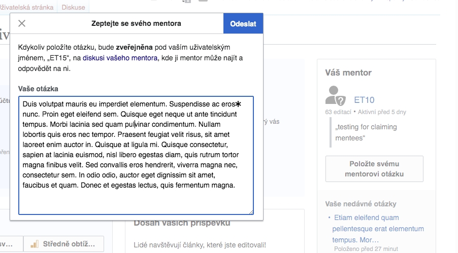
  1. In Mentorship module Special:Homepage click on "Ask your mentor a question" box.
  2. The dialog will be presented with the text field that occupies only a portion of the panel:

Screen Shot 2020-06-30 at 1.42.26 PM.png (492×504 px, 48 KB)

The text entered in the textbox is scrollable to accommodate long text. However, for a better user experience it might be good to consider different ways for displaying long text (an expandable text box, for example).

Event Timeline

MMiller_WMF added a subscriber: Tgr.

Rather than making this box auto-expand, we just want to make the text area larger. Let's make it six lines. @Tgr is going to do this, along with its parent T256002.

FWIW auto-expansion was disabled intentionally in rEGREc765cc063b5e: Help Panel: Fix resizing of textarea as apparently it was accompanied by some quirky behavior.

Change 620772 had a related patch set uploaded (by Gergő Tisza; owner: Gergő Tisza):
[mediawiki/extensions/GrowthExperiments@master] Remove large space in homepage mentor dialog and increase question box

https://gerrit.wikimedia.org/r/620772

Change 620772 merged by jenkins-bot:
[mediawiki/extensions/GrowthExperiments@master] Remove large space in homepage mentor dialog and increase question box

https://gerrit.wikimedia.org/r/620772

Based on the comment, I am moving it for Design review to confirm the auto-expansion behavior

FWIW auto-expansion was disabled intentionally in rEGREc765cc063b5e: Help Panel: Fix resizing of textarea as apparently it was accompanied by some quirky behavior.

Straightforwardly, it works (checked in all browsers that I usually check) - the text can be accommodated - i.e. displayed in full or displayed with a vertical scroll bar. A user can adjust height/width according to their comfortable view.

Screen Shot 2020-08-19 at 2.47.37 PM.png (499×902 px, 130 KB)
Screen Shot 2020-08-19 at 2.47.59 PM.png (446×515 px, 86 KB)

Some issues to review:
(1) The input text box can be resized without any text in it - and the * (for a required field) can be left outside of the area. Actually, the static position of the asterisk is problematic in the two screenshots above.

Screen Shot 2020-08-19 at 2.25.19 PM.png (548×754 px, 128 KB)

(2) I did not see any improvements on mobile. The overlay still has un-utilized white space:

Screen Shot 2020-08-19 at 2.54.36 PM.png (627×347 px, 62 KB)

Thanks @Etonkovidova - I think this is good to move to PM review - Marshall if you wanted to make the call on my minor suggestion below in response to issue (1).

Based on the comment, I am moving it for Design review to confirm the auto-expansion behavior

FWIW auto-expansion was disabled intentionally in rEGREc765cc063b5e: Help Panel: Fix resizing of textarea as apparently it was accompanied by some quirky behavior.

Straightforwardly, it works (checked in all browsers that I usually check) - the text can be accommodated - i.e. displayed in full or displayed with a vertical scroll bar. A user can adjust height/width according to their comfortable view.

Screen Shot 2020-08-19 at 2.47.37 PM.png (499×902 px, 130 KB)
Screen Shot 2020-08-19 at 2.47.59 PM.png (446×515 px, 86 KB)

Some issues to review:
(1) The input text box can be resized without any text in it - and the * (for a required field) can be left outside of the area. Actually, the static position of the asterisk is problematic in the two screenshots above.

Screen Shot 2020-08-19 at 2.25.19 PM.png (548×754 px, 128 KB)

The OOUI text-area input component allows the user to resize horizontally and vertically, which I think makes sense to give users who may wish to type something quite long into a text-area. This may be especially true for certain language scripts where characters take up more physical space.
However, given that in this particular instance the width is the maximum within the bounds of the dialog, one minor CSS addition we could do is add resize:vertical; so users can extend the size vertically only. This would ameliorate the issue with the fixed asterisk position too.

(2) I did not see any improvements on mobile. The overlay still has un-utilized white space:

Screen Shot 2020-08-19 at 2.54.36 PM.png (627×347 px, 62 KB)

I think this is OK. The height is now 6 lines so users can type more than previously, and if you imagine doing this with the keyboard popping up from the bottom it works well at this size.

This is fine the way it is. Thank you!